Building Web Sites All-in-One For Dummies® (81 page)
Read Building Web Sites All-in-One For Dummies® Online
Authors: Claudia Snell


3.
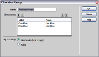
Change the default Name of the check box group.
Make sure you choose a name that makes sense. Remember to not include any spaces or special characters in the name.
4.
Rename each Label and Value.
The Label is what users see, whereas the Value is what is transmitted with the data. If, for example, the group is a list of popular magazines, name one Label and Value
People
, and another Label and Value
Us
. You have two check boxes in the group, by default.
5.
Click the plus sign (+) button to add additional check boxes to the group.
6.
Rename the Label and Value of the new check boxes.
At this stage, you probably want to rearrange the check boxes to appear in alphabetical order.
7.
To change the order in which the check boxes appear, click the check box label and then click â or â to rearrange the list.
8.
Determine how the check boxes will be displayed and select the applicable Lay Out Using radio button to lay out the check boxes with line breaks or in a table.
9.
Click OK.
Now wasn't that easier than the old way? Instead of mucking about in the Property inspector, you quickly create the group and then move onto more pressing matters â like another cup of coffee.
Radio buttons:
Radio buttons are another option to use when you want users to make a choice â but only one choice. A radio button looks like a round dimple in the document that gets filled with black (or another color, if you play with CSS styles) when the user clicks the radio button, instead of a square (check box) that gets filled with a check. But the button doesn't tune into anything. Where they came up with the name
radio button
is beyond us.
For example, say you want the site visitor to choose which method should be used to reply to his query. You set up a group of radio buttons (with the input name of Response) with values of E-mail, Phone, Fax, and so on. The user is limited to only one choice from the group because they all have the same input name. Listing 1-5 shows the code for inserting a radio button in a form.
Listing 1-5: You Can Tune a Radio, but You Can't Tune a Radio Button
If you use Dreamweaver to create your HTML forms, you can add a radio button to a document by choosing InsertâFormâRadio Button. After you add the element to the form, you set the parameters in the Property inspector. Radio buttons have the following parameter choices:
â¢
Radio Button:
By default, Dreamweaver assigns the name
radiobutton
, followed by a number if you have more than one in your form. Unless Doug is working on a drop-dead simple form, he renames the radio button something more descriptive. When you want to restrict a visitor to only one choice from a group, all buttons will have the same name, and the Checked Value will be different.
â¢
Checked Value:
This is the value that's transmitted when the form is sent: in other words, the visitor's choice.
â¢
Initial State:
This determines whether the radio button is selected or not when the form loads in the user's browser.
â¢
Class:
This allows you to apply a class from a CSS style sheet to the radio button.
 If you're a visual kind of designer, you can drag any form type from the Insert palette and drop it into the desired place in your form.
Radio groups
If you want to limit visitors to one choice, insert a group of radio buttons. The buttons all have the same input name but have different values. Therefore, a user can select only one radio button per group to be submitted with the form. Listing 1-6 shows the code for a group of radio buttons with charge card type choices, all neatly housed in a table. Notice the name of each button is the same.
Listing 1-6: No Multiple Choice For You!
If you use Dreamweaver to create your HTML forms, you can easily insert a radio group as follows:
1.
Open an existing document in Dreamweaver and position your cursor where you want the radio group to appear.
2.
Choose Insert
â
Form
â
Radio Group.
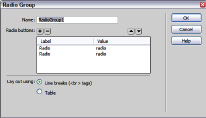
The Radio Group dialog box appears. (See Figure 1-12.)
3.
Change the default Name of the radio group.
Give the group a name that makes sense. Just remember that you can't use spaces or special characters in the name.
4.
Rename each Label and Value.
The Label is what users see, whereas the Value is what is transmitted with the data. For example, if the group is a list of credit cards, you could name one Label and Value
Visa
, and name another Label and Value
MasterCard
. You have two buttons in the group, by default.
Figure 1-12:
Look! It's a radio group.

5.
Click the plus sign (+) button to add additional buttons to the group.
6.
Rename the Label and Value of the new buttons.
At this stage, you probably want the buttons to appear in alphabetical order.
7.
To change the order in which the buttons appear, click the button label and then click â or â to rearrange the list.
8.
Determine how the buttons will display, and select the applicable Lay Out Using radio button to lay out the buttons with line breaks or in a table.
9.
Click OK.
Look, Ma! I created a radio group without writing any code!
Drop-down lists
Drop-down lists are cool. They take up one little slot on your Web page, but click the little down arrow, and a list of choices appears. You can use drop-down lists anywhere in a form where you need to give the visitor lots of choices but don't want to waste a lot of real estate doing it.
When you create a drop-down list, you can enable the user to select multiple items. Listing 1-7 shows the code needed to create a drop-down list. Notice the lines of code that start with
. These are the choices on the drop-down list.
Listing 1-7: Code for a Drop-Dead Gorgeous Drop-Down List
by phone
by phone
You can write out your own code, but if you've read this chapter from the start, you know there's a better way to build this mousetrap in Dreamweaver. Here's how you do it:
1.
Open an existing document in Dreamweaver and position your cursor where you want the drop-down list to appear.
2.
Choose Insert
â
Form
â
List/Menu.
3.
In the Input Tag Accessibility Attributes dialog box that appears (refer to Figure 1-5), fill in the desired values and then click OK.
A drop-down list is born.
4.
In the Property inspector, click the List Values button.
The List Values dialog box appears, as shown in Figure 1-13. Your cursor is hovering in the Item Label field, signifying that the dialog box is ready for you to do your thing.
5.
Type the name for the first Item Label.
This is what visitors will see in your drop-down list. You have the option of displaying an initial value. This is a great way for you to tell visitors what you want them to do.
6.
Press the Tab key and then type a name for the Value.
7.
Click the plus sign (+) button to add another option to the list.
Yep, you guessed it. You have to type another value for the Label and Value. Figure 1-13 shows a drop-down list under construction.
Figure 1-13:
This List Values dialog box is filled with choices.

8.
Click the Item Label of a button and then click â or â to rearrange the order in which the buttons appear in the list.
9.
Click OK.
Dreamweaver inserts the drop-down list in your form.
10.
In the Property inspector, choose the rest of your options. (See Figure 1-14.)
a. Enter a name for the list in the text field in the upper-left corner of the Property inspector.
Dreamweaver gives the list a default name, such as select. It's considered good practice to give the object a name that reflects what it does in the document. The name can't contain spaces or special characters.
