101 Excel 2013 Tips, Tricks and Timesavers (33 page)
Read 101 Excel 2013 Tips, Tricks and Timesavers Online
Authors: John Walkenbach

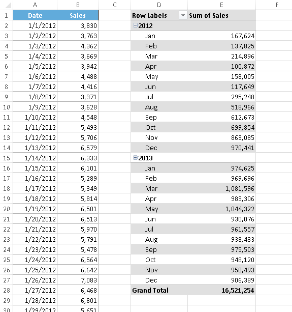
Figure 81-4:
The pivot table, after grouping by months and years.
Notice that the Grouping dialog box contains other time-based units. For example, you can group the data into quarters. Figure 81-5 shows the data grouped by quarters and years.
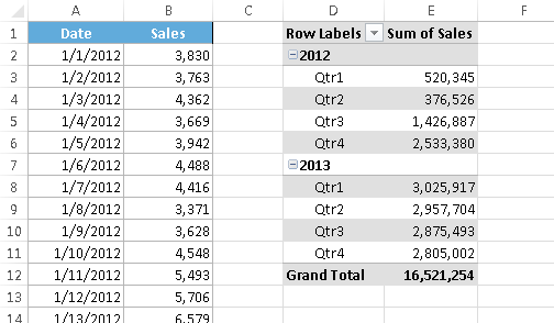
Figure 81-5:
The pivot table, after grouping by quarters and years.
Tip 82: Creating Pivot Tables with Multiple Groupings
If you’ve created multiple pivot tables from the same data source, you may have noticed that grouping a field in one pivot table affects the other pivot tables. Specifically, all the other pivot tables automatically use the same grouping. Sometimes, this is exactly what you want. Other times, it’s not at all what you want. For example, you may want to see two pivot table reports: one that summarizes data by month and year, and another that summarizes the data by quarter and year.
The reason grouping affects other pivot tables is because all the pivot tables are using the same pivot table
cache.
Unfortunately, there’s no direct way to force a pivot table to use a new cache. But there
is
a way to trick Excel into using a new cache. The trick involves assigning multiple range names to the source data.
For example, if your source range is named
Table1
, give the same range a second name:
Table2
. The easiest way to name a range is to use the Name box, to the left of the Formula bar. Select the range, type a name in the Name box, and press Enter. Then, with the range still selected, type a different name, and press Enter. Excel will display only the first name, but you can verify that both names exist by choosing Formulas⇒Define Names⇒Name Manager (see Figure 82-1).
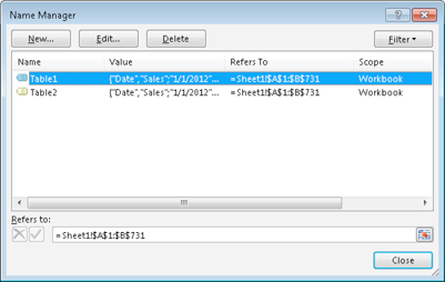
Figure 82-1:
A range has two names.
When you create the first pivot table, specify
Table1
as the Table/Range in the Create PivotTable dialog box (see Figure 82-2). When you create the second pivot table, specify
Table2
as the Table/Range. Each pivot table will use a separate cache, and you can create groups in one pivot table, independent of the other pivot table.
Figure 82-2:
Using a named range as the Table/Range.
You can use this trick with existing pivot tables. Make sure that you give the data source a different name. Then select the pivot table and choose PivotTable Tools⇒Analyze⇒Data⇒Change Data Source. In the Change PivotTable Data Source dialog box, type the new name that you gave to the range. This will cause Excel to create a new pivot cache for the pivot table.
Figure 82-3 shows two pivot tables (with different groupings) created from the same data source. One pivot table is grouped by quarters and years, and the other is grouped by months and years.
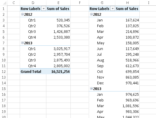
Figure 82-3:
These pivot tables were created from the same data source, but use different groupings.
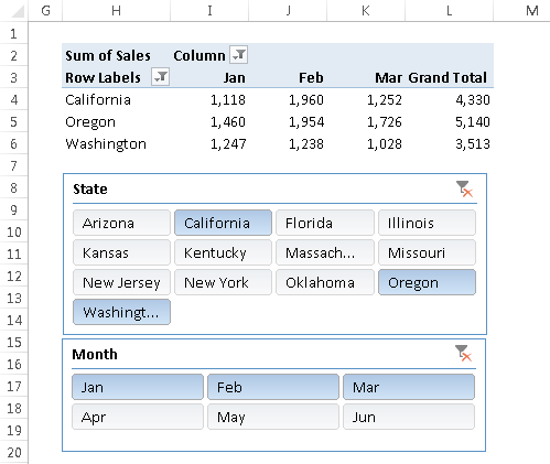
Tip 83: Using Pivot Table Slicers and Timelines
If you’ve worked with pivot tables, filtering data in a pivot table is fairly easy. Just click the filter button for a field, and remove the check mark from items that you don’t want to see. This tip describes two ways to simplify pivot table filtering: slicers and timelines. These methods are most useful when the worksheet will be viewed by novices, or for those who prefer things very simple.
Using slicers
Figure 83-1 shows an unfiltered pivot table that summarizes bank account information by three fields: Customer Type (either New or Existing), Branch (either Central, North County, or Westside), and OpenedBy (either New Accts or Teller).
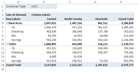
Figure 83-1:
The normal way to filter items in a pivot table.
A
slicer
is an interactive control that makes it easy to apply simple filters to data in a pivot table. Figure 83-2 shows a pivot table with three slicers. Each slicer represents a particular field in the pivot table. In this case, the pivot table is displaying data for existing customers, opened by tellers at the Central branch.
The same type of filtering can be accomplished by using the field labels in the pivot table, but slicers are intended for those who might not understand how to filter data in a pivot table. Slicers can also be used to create an attractive and easy-to-use interactive
dashboard.
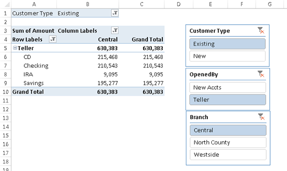
Figure 83-2:
Using slicers to filter the data displayed in a pivot table.
To add one or more slicers to a worksheet, start by selecting any cell in a pivot table. Then choose Insert⇒Filter⇒Slicer. The Insert Slicers dialog box appears, with a list of all fields in the pivot table. Place a check mark next to the slicers you want, and then click OK.
 In Excel 2013, slicers aren’t limited to pivot tables. You can also use slicers with a table (created with Insert⇒Tables⇒Table).
Slicers float on the worksheet’s drawing layer, and they can be moved and resized. You can change the look and also specify multiple columns of buttons.
To use a slicer to filter data in a pivot table, just click a button in the slicer. To display multiple values, press Ctrl while you click the buttons. Press Shift and click to select a series of consecutive buttons.
To remove the effects of filtering by a particular slicer, click the icon in the slicer’s upper-right corner.
Figure 83-3 shows a pivot table with two slicers to enable filtering the data (by State and by Month). In this case, the pivot table and pivot chart show only the data for California, Oregon, and Washington for the months of January through March. Slicers provide a quick-and-easy way to create an interactive chart.