B0041VYHGW EBOK (128 page)
Authors: David Bordwell,Kristin Thompson

Like other kinds of expectations, stylistic ones derive from both our experience of the world generally (people talk; they don’t chirp) and our experience of film and other media. The specific film’s style can confirm our expectations, or modify them, or cheat, or challenge them.
Many films use techniques in ways that conform to our expectations. For example, the conventions of the classical Hollywood cinema and of specific genres provide a firm basis for reinforcing our prior assumptions. Other films ask us to narrow our expectations somewhat. Keaton’s
Our Hospitality
accustoms us to expect deep-space manipulations of figures and objects, while Jean Renoir’s
Grand Illusion
builds up specific expectations about the likelihood of camera movements. Still other films make highly unusual technical choices, and to follow them we must construct new stylistic expectations. The editing discontinuities in Sergei Eisenstein’s
October
and the use of voice-over narration in
The Prestige
in effect teach us how to understand the style.
In other words, a director directs not only the cast and crew. A director also directs us, directs our attention, shapes our reaction. Thus the filmmaker’s technical decisions make a difference in what we perceive and how we respond.
Style, then, is the patterned use of techniques across the film. Any one film will tend to rely on particular technical options in creating its style, and these are chosen by the filmmaker within the constraints of historical circumstances. We may also extend the term
style
to describe the characteristic use of techniques made by a single filmmaker or group of filmmakers. The spectator may not consciously notice film style, but it nonetheless contributes to his or her experience of the film.
As viewers, we register the effects of film style but seldom notice it. If we want to understand how these effects are achieved, we need to look and listen carefully. Since the previous four chapters have shown how we can pay attention to stylistic features, let’s consider four general steps in analyzing style.
The first step is to understand how the film is put together as a whole. If it is a narrative film, it will draw on all the principles discussed in
Chapter 3
. That is, it will have a plot that cues us to construct a story; it will manipulate causality, time, and space; it will have a distinct pattern of development from opening to closing; it may use parallelism; and its narration will choose between restricted and more unrestricted knowledge at various points. (Not all films tell stories. We’ll discuss other types of form in
Chapter 10
.)
Here the analysis will draw on our survey of technical possibilities in
Chapters 4
–
7
. You need to be able to spot things such as color, lighting, framing, cutting, and sound, which most viewers don’t consciously notice. Once you notice them, you can identify them as techniques—such as nondiegetic music or a lowangle framing.
CONNECT TO THE BLOG
We discuss
Indiana Jones and the Kingdom of the Crystal Skull
and some aspects of Steven Spielberg’s editing and use of light in “Reflections in a crystal eye,” at
www.davidbordwell.net/blog/?p=2379
.
But noting and naming are only the beginning of stylistic analysis. The analyst must develop an eye for
salient
techniques. Salience will partly be determined by what techniques the film relies heavily on. The jerky forward zoom in
Wavelength
and the rapid, discontinuous editing of
October
invite scrutiny because they play a central role in the overall effect of each film.
In addition, what is salient depends partly on the analyst’s purpose. If you want to show that a film’s style is typical of one approach to filmmaking, you may focus on how the technique conforms to stylistic expectations. The 180-degree editing of
The Maltese Falcon
isn’t obvious or emphasized, but adherence to rules of classical continuity is a characteristic of the film’s style. Our purpose in
Chapter 6
was to show that the film is typical in this respect. If, however, you want to stress unusual qualities of the film’s style, you can concentrate on the more unexpected technical devices. Eisenstein’s use of editing in
October
is unusual, representing choices that few filmmakers would make. It was the originality of these devices that we chose to stress in
Chapter 6
. From the standpoint of originality, costume in
October
is not as salient a stylistic feature as editing because it is more in accord with conventional practice. The analyst’s decision about what techniques are salient will thus be influenced partly by what the film emphasizes and partly by the analyst’s purpose.
Once you’ve identified salient techniques, you can notice how they are patterned. Techniques will be repeated and varied, developed and paralleled, across the whole film or within a single segment.
Chapters 4
–
7
have shown how this occurs in some films.
You can zero in on stylistic patterns in two ways. First, you can reflect on your responses. If a scene begins with a track-in, do you expect that it will end with a track-out? If you see a character looking left, do you assume that someone or something is offscreen and will be revealed in the next shot? If you feel a mounting excitement in an action scene, is that traceable to a quickening tempo in the music or to accelerating editing?
A second tactic for noticing stylistic patterns is to look for ways in which style reinforces patterns of formal organization. Filmmakers often deliberately design the film’s stylistic system to underscore developments in the drama. We have seen how shifting color schemes reflect three stages of the plot’s development in
Women in Love
(
4.41
–
4.43
). For
Amistad,
Steven Spielberg and his cinematographer, Janusz Kaminski, traced the slaves’ progress toward freedom by lighting and shooting the four courtroom scenes in markedly different ways, from greenish, smoky light and somewhat scattershot camera work to a final scene in the Supreme Court, with crisp illumination and smooth camera movements.
In designing
Portrait of a Lady,
Jane Campion and her cinematographer, Stuart Dryburgh, keyed colors to the protagonist’s maturation. Isabel starts as an idealistic and somewhat headstrong young woman, and the background is an English summer, with bright green and yellow tones dominating. In Siena, as she becomes captivated by the sinister fortune hunter Osmond, the palette is richer and warmer, with orange and coral dominant. Years later, she is unhappily married to Osmond, and the color scheme is steeped in pale blues. The closing scenes return to the English countryside, recalling the opening, but now, as the wiser, remorseful Isabel confronts her future, the snowy landscape is bathed slightly in blue, suggesting that memories of her marriage still haunt her.
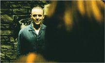
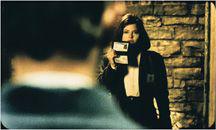
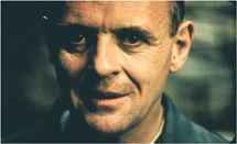
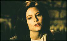
Even within a shorter span, style can create a subtle sense of narrative progression. A scene will usually have a dramatic pattern of encounter, conflict, and outcome, and the style will often reflect this, with the cutting becoming more marked and the shots coming closer to the characters as the scene progresses. In
The Silence of the Lambs,
for example, the scenes between Clarice Starling and Hannibal Lecter tend to begin with conventional shot/reverse-shot conversations. The characters, filmed in medium shot, look off to the right or the left of the camera
(
8.3
,
8.4
).
As their conversations become more intense and intimate, the camera positions move closer to each one and shift subtly toward the axis of action until each person is looking directly into the lens
(
8.5
,
8.6
).

8.3 During the initial conversation in
The Silence of the Lambs,
shooting in depth with the foreground character’s head prominent in the frame …

8.4 … emphasizes the distance between the pair.

8.5 Later in the scene, closer shots …

8.6 … deemphasize that distance.
As we saw in
Grand Illusion
(
pp. 208
–210), style may create associations between situations, as when the camera movements suggest the prisoners’ unity. It may also reinforce parallels, as do the tracking shots comparing Rauffenstein’s war trophies and Elsa’s. Later we’ll see how style can also reinforce the organization of non-narrative films.
Sometimes, however, stylistic patterning will not respect the overall structure of the film. Style can claim our attention in its own right. Since most stylistic devices have several functions, a technique may interest the analyst for different reasons. In
6.130
and
6.131
, a cut from a washline to a living room acts as a transition between scenes. But the cut is of more interest for other reasons, since we don’t expect a narrative film to treat objects as flat patches of color to be compared across shots. Such attention to graphic play is a convention of abstract form. Here, in a passage from Ozu’s
Ohayo,
a stylistic choice comes forward because it goes beyond its narrative function. Even here, though, stylistic patterns continue to call on the viewer’s expectations and to draw the spectator into a dynamic process. Anyone who notices the graphic match on red objects in
Ohayu
will most likely be intrigued at such an unconventional way of editing. And, if stylistic patterns do swerve off on their own, we still need a sense of the film’s narrative organization in order to show how and when that happens.
