B0041VYHGW EBOK (57 page)
Authors: David Bordwell,Kristin Thompson

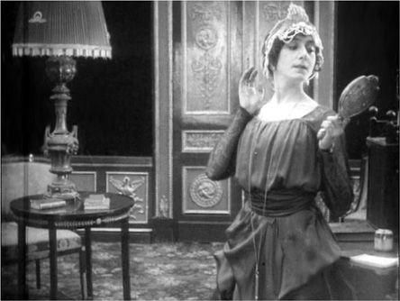
4.119 She admires herself in a mirror, in a notably decentered framing.
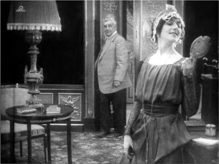
4.120 As the ballerina lowers her arm, the door opens and her father appears.
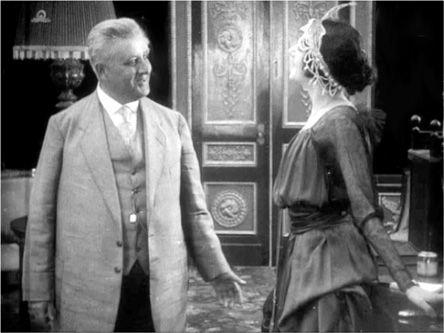
4.121 Her father comes to the front area and balances the composition.
The filmmaker can guide our attention by use of another time-tested strategy, the principle of contrast. Our eyes are biased toward registering differences and changes. In most black-and-white films, light costumes or brightly lit faces stand out while darker areas tend to recede
(
4.122
).
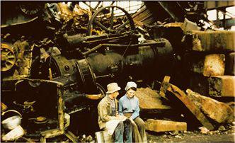
If there are several light shapes in the frame, we’ll tend to look from one to the other. But if the background is light, black elements will become prominent, as Sandro’s hair does in our
L’Avventura
scene (
4.110
). The same principles work for color. A bright costume element shown against a more subdued setting is likely to draw the eye. Jir˘í Menzel exploits this principle in
Larks on a String
(
4.123
).
Another pertinent principle is that when lightness values are equal, warm colors in the red-orange-yellow range tend to attract attention, while cool colors like purple and green are less prominent. In Yilmaz Güney’s
Yol,
for example, the setting and the characters’ outfits are already quite warm in hue, but the hot pink vest of the man in the central middle ground helps make him the primary object of attention
(
4.124
).
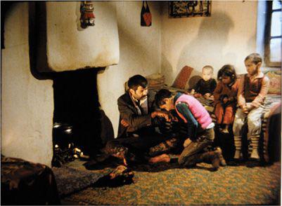
4.122 In V. I. Pudovkin’s
Mother,
the spectator concentrates on the man’s face rather than on the darkness surrounding it.
4.123 In
Larks on a String,
the junkyard setting provides earthy grays and blacks against which the characters’ lighter clothes stand out sharply.
4.124 Warm colors guide the eye in
Yol.
Color contrasts don’t have to be huge, because we’re sensitive to small differences. What painters call a
limited palette
involves a few colors in the same range, as in our earlier example from Fellini’s
Casanova
(
4.39
). Peter Greenaway’s
The Draughtsman’s Contract
employs a limited palette from the cooler end of the spectrum
(
4.125
).
An extreme case of the principle is sometimes called
monochromatic
color design. Here the filmmaker emphasizes a single color, varying it only in purity or lightness. We’ve already seen an example of monochromatic mise-en-scene in the white décor and costumes of
THX 1138
(
4.40
). In a monochromatic design, even a fleck of a contrasting color will catch the viewer’s attention. The color design of
Aliens
is dominated by metallic tones, so even a dingy yellow can mark the stiltlike loader as an important prop in the narrative
(
4.126
).
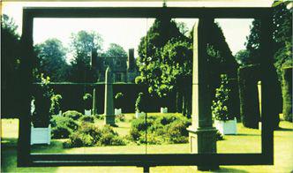
4.125
The Draughtsman’s Contract
uses a limited palette of green, black, and white.
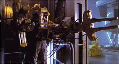
4.126
Aliens
uses warm colors like yellow sparingly.
Film has one resource that painting lacks. Our tendency to notice visual differences shifts into high gear when the image includes
movement.
In the
L’Avventura
scene, the turning of Claudia’s head became a major event, but we are sensitive to far smaller motions in the frame. Normally, for instance we ignore the movement of scratches and dust on a film. But in David Rimmer’s
Watching for the Queen,
in which the first image is an absolutely static photograph
(
4.127
),
the jumping bits of dust on the film draw our attention. In
4.128
, from Yasujiro Ozu’s
Record of a Tenement Gentleman,
many items compete for our attention. But the moment that a scrap of newspaper flaps in the wind, it immediately attracts the eye because it is the only motion in the frame.
4.127
Watching for the Queen
emphasizes scratches and dust.
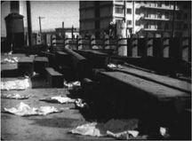
4.128 A tiny movement in
Record of a Tenement Gentleman.