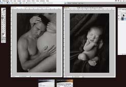
The Art of Pregnancy Photography (17 page)
Read The Art of Pregnancy Photography Online
Authors: Jennifer George
Tags: #Health & Fitness, #Pregnancy & Childbirth, #Photography, #Subjects & Themes, #Portraits, #Techniques, #General

BORDER EFFECTS
Compositing a pregnancy portrait with an image of an artistic border is a quick and easy way to change the mood and overall impact of an image. This is one of the easiest effects to achieve, and one of the most beautiful treatments. Here’s how it’s done:
- First, we opened our beautiful natural-light maternity image in Photoshop.
- Next, the stock border image (courtesy of Mercury Megaloudis, a prominent Australian photographer) was opened.
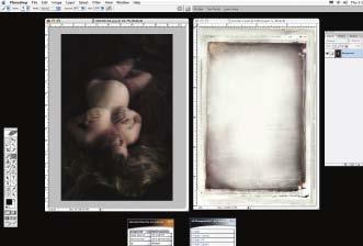
To composite a portrait with an artistic border photo, first open both image files in Photoshop.
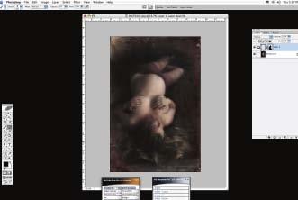
A layer mask is created on the border image layer, and the portrait, which lies just below the border image, is revealed.
3. The border image was pulled on top of the pregnancy portrait and resized using the Edit>Transform function to ensure that it matched the dimensions of the pregnancy portrait.
4. The Eraser tool was used at several different opacity settings to blend the border into the image. The opacity from the outside of the border into the image was increased so that the border overlapping the image was almost completely erased.
FANTASY IMAGES
For expectant parents, a sonogram provides an exciting opportunity to “preview” the baby in the womb. Through the technological advances that digital imaging offers, photographers can now help clients to preserve the magical feeling that comes from catching a glimpse of the baby in the uterus. You can use the process outlined below to create a composite portrait that super-imposes an image of the baby onto the mother’s stomach, creating a fantasy portrait that’s highly desirable to your clients.
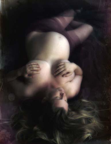
Here is the final composite pregnancy portrait.
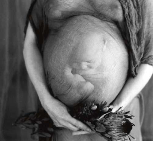
Many new parents cherish composite photos. Creating them involves importing the newborn baby’s photo into Photoshop and working a little digital magic.
Photographing the Belly
. When photographing the mother’s belly, be sure to capture it at its widest point. Depending upon how the mother is carrying, this usually is from the front, but in the case of the twins, the best angle may be from the side. The lighting should illuminate the main portion of the belly but should not be so intense that detail is lost in the highlights.
It is important to hold the texture of the skin, as this will add to the realistic feel of the image. Lighting from the side of the subject and using a lighting ratio of 3:1 or greater will help you sculpt the subject’s figure and enhance the feeling of dimension in the image.
When creating an image to be used in a composite like this, take care that the mom’s hands and any props do not cut into the view of the tummy. This will facilitate compositing the images in Photoshop. There is one notable exception to this rule: it can be a good idea to cover the belly with a sheer, almost transparent fabric. The fabric layer adds to the natural transition between the belly and the baby. Without the fabric, it can be difficult to achieve a smooth transition, and the image may end up looking too contrived.
Photographing the Baby
. The second component of the fantasy image is the newborn portrait. Portraits of babies who are six days to three weeks old seem to work best. At this age, the babies can be easily brought into the studio. Also, by this time, the mom and baby will have an established and effective feeding pattern; this can help ensure the baby is calm, and sleepy, for the image. A sleeping baby appears more like a baby in the womb.
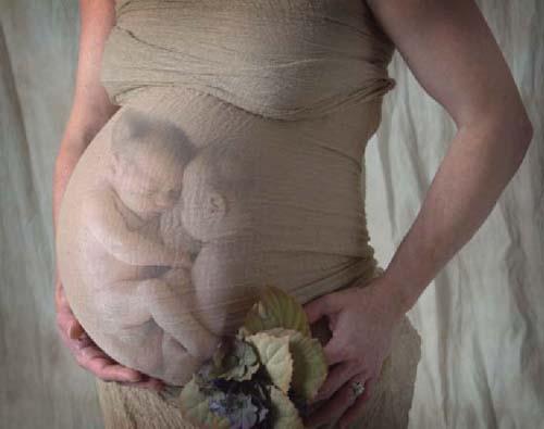
Creating this “twins in the womb” portrait was fairly easy. We started with a portrait that allowed for an unobstructed view of the shape of the tummy and then created a portrait of the twins nestled closely as they would have been in the uterus. To ensure the best-possible effect when creating an image like this, you will want to capture the pregnancy at the latest date possible so the tummy size appears appropriate for a full-term baby (or babies). The timing can be tricky: in this case, the session was held four weeks before the due date, since twins traditionally come early. As it turned out, this mother went into labor immediately after the session.
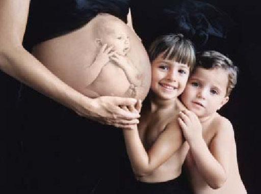
Though sleeping babies usually appear more realistic when digitally imposed on the mommy’s tummy, there are times when an expression works perfectly with the mood of the image. Here, the baby’s expression works well with the older siblings’ expressions. Additionally, the little hands of the baby, positioned close to the face, harmonize with the hands of the mom and siblings.
The fabrics used in the pregnancy session will help you determine which fabrics to photograph the infant against. Try to photograph the baby against a fabric that matches the mother’s skin tone as closely as possible for easier blending once the images are combined.
The easiest way to photograph the baby is to place the background fabric over the mother, then place the newborn in her arms. Have the mother curl the baby into a tight little ball, simulating the way the baby would appear in the womb. Take several images from various angles. If possible, ensure that the quality and direction of the light used in the pregnancy portrait is recreated in the image of the baby. If this is not possible, you may be able to flip the image in Photoshop or do a little image editing to ensure the two images are better matched.
In the following sections, we will review the specific strategies used to create composites.
Baby Makes Three
The portrait of the father and mother was captured at the client’s home approximately one month before the baby was born. The image of the newborn was captured about ten days after birth. To create the newborn’s portrait, we draped the mother in fabric and placed the baby in her arms.
- Both images were opened in Photoshop.
- A duplicate layer (Layer>Duplicate Layer) was created, and some minor retouching was done.
- The varied skin tones of these three subjects made the image a good candidate for a color to black & white conversion. To accomplish this, the image was flattened (Layer>Flatten Image), then the Kubota Artistic Actions Vol. Two New B&W action was selected in the Actions palette, and the effect was applied by hitting the Play button.
- The image of the baby was flattened and resized to suit the size of the mom’s stomach. The portrait was dragged above the layer containing the pregnancy portrait. Next, the Eraser tool, set to various opacities, was used to erase the fabric the baby was photographed upon. The baby was moved into the desired position on the belly. Note how well the position of the baby complements the position of the father’s face and expression.
- The background layer was renamed Layer 0 to unlock it so that the layer with the baby could be dragged below the pregnancy portrait layer. A layer mask was created on the pregnancy portrait layer, and with the Brush tool set to black and with an opacity of 73%, the baby was revealed. (
Hint:
Take care to reveal only what is needed to tell the story of the image.) - Finally, the image was flattened (Layer>Flatten Image), then the Kubota Artistic Actions Vol. Two Edge Burner action was selected in the Actions palette, and the effect was applied by hitting the Play button.
