Building Web Sites All-in-One For Dummies® (17 page)
Read Building Web Sites All-in-One For Dummies® Online
Authors: Claudia Snell

â¢
Create a flexible file structure that can handle your site now and into the future.
Most likely, you'll want to add to your site at some point. Make sure you structure your site in a way that makes that easy. Consider how much of a particular type of content you intend to have. If you think you'll have a lot of multimedia elements, put them in a folder. Start off with subcategories within that folder. It might look and sound strange when you initially launch your site to have a folder with other folders in it for only a few multimedia files, but when you start adding files, you'll see a great benefit in having planned ahead.
Implementing Information Architecture
Information architecture
involves building the structure of your site from a content standpoint â that is, deciding what information to put in each section. Part of organizing and designing your site entails deciding how to present the content. Upfront, you must determine how to treat images and graphics (whether or not to use captions, for instance); how to handle text and other content (presented in tables or bulleted lists); and, of course, how to handle overall site organization (placing information where it's easy to find but not confusing or crowded).
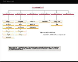
Information architecture sounds complicated, and it can be for larger sites. Generally, though, it's just deciding what works best as a group. Organize content in groups, which become the sections of your site. For example, in the site map in Figure 3-2, you can see that this site has sections named About Us, Our Services, Our Products, Company Tour, Directions, and Contact Us.
Figure 3-2:
The site map showing major sections of a site.

Those groups are then broken into smaller groups to become the page-level content. In Figure 3-2, for example, you can see that the About Us section includes a History page, an Our Offices page, and a Jobs/Careers page, among others. Organize this information in a logical way, somewhat like if you were creating an outline.
If your information architecture plan for your site is successful, site visitors (as well as your Web staff) can find what they're looking for easily. If you've done a poor job of planning the structure of your site, visitors can get lost and frustrated. For instance, it's not a good idea to hide your contact information in a section filled with games, where your users can't find it. And remember that someone has to maintain the site after it goes live. Structuring the site in a way that makes sense also makes it easier to maintain. If things are in odd places, you'll have a harder time finding what you need.
On the back end, make your folder structure consistent with your site map. Keep the content for each section in its own folder, with subfolders (if needed) that contain the page-level content. That way, everything is easy to find when you need to make updates. The folder structure should match the site navigation. This is not to say, though, that you must create a navigation button for each folder in your structure. Some folders contain elements such as documents, multimedia, style sheets, and graphics.
Developing section-level information architecture
Like with your page-level information architecture, within your sections are main pages and subordinate pages. While you're considering how to structure your information, keep in mind that users don't like having to click through too many links. About three levels of information are sufficient. This means that from the home page of a site, a user should have to click through only two pages
maximum
to reach the deepest level of your content.
From the home page, you drive your traffic to your section content areas. Make sure your section page and secondary pages reward your users with useful information. Make sure it's high-level, summary-type information so that you can quickly fill the needs of visitors. The summary approach also benefits visitors by letting them know that they're headed down the right path. For instance, on the home page, you can feature a teaser with some marketing-type language about caring for house plants. Include a picture of a beautiful plant with an enticing blurb about what the visitor can find in the House Plants section of your Web site. End the blurb with a
Click here to get more information about caring for house plants
(or similar) link.
The included link, naturally, takes the visitor to the House Plants section and the promised information about caring for house plants. Also, from these secondary pages, you can include links to deeper information about the topic. With the house plant example, you'd link to main pages about specific types of plants or groups of plants (such as cacti or ivy).
So, still using the example of the House Plants section with a page about cacti, you can include general information about cacti and other succulents and add links to a specialized page with specific information â say, a customized aloe vera plant page. If you have a large amount of deeper information, you can offer a bit more content on this page than on the upper-level pages. You might also choose to deliver the more detailed information as downloadable documents so that users can download, print, and read at their leisure.
This method of structuring content produces a
drill-down
. Users drill down from the summary on the main page through successively deeper information until they get to the level they need. This makes your site more useful to a wider variety of viewers.
Arranging page-level information
The page layout phase of site design is easiest if you first organize your content. That way, you know how much information you need to accommodate on each page. When deciding how much information to include on a page, remember that visitors get frustrated with pages that scroll excessively. If a page becomes very long, take a second look at your content to see whether you can reorganize it or break long lists into multiple lists. Alphabetical order works well for most topics.
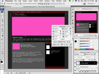
When planning how you'll arrange content on a page, make sure that you design your pages so that the main point of the page is obvious. Lack of focus can create a confusing situation for your users. Lead them to what you want them to see by placing the main idea toward the top of the page so it appears within the browser window. In Figure 3-3, for instance, the main content goes in the large space below the names JC New Media. Tertiary information is best placed on the page below everything else. That way, if users don't scroll to the bottom of the page, they're not missing the important stuff.
Figure 3-3:
Page layout becomes much easier when you group your content first.

Avoiding Content Problems
Other important things to remember about site structure and information architecture follow:
â¢
Make each page deliver real content.
Web site visitors should find that even pages that are at the higher levels â and therefore, made up of more shallow, summary information â provide useful content.
Shallow
and
summary
shouldn't mean
useless.
Sometimes, useful information is concise â such as,
Click here to learn about cacti!
Simplicity is appropriate if you know your users will understand what they'll get when they click a link.
If you think your higher-level information needs a little explanation, include a short paragraph to get users interested. There are no truly hard rules with this other than you should think about what your users will need in order to decide what they're going to do after they find your site.
â¢
Avoid compiling lists of links.
Sometimes, you can group a few links effectively, but we can't think of very many good reasons (other than search results or possibly task lists for groups or students) that a visitor to your site should click a link only to be confronted by another list of links or â even worse â a list of links that don't include any explanations.
The worst site design mistake is a happy invitation to
Click here for information
that sends users to a page that invites them to
Click here for more information
, and so on, until users get tired of clicking and not finding what they want. Users will find a different site to visit if they find that your site doesn't have any actual information, just a series of links to nothing.
 In other words, make sure you allow your users to drill down to the level of information they want. Keep the vague
Click here
links to a minimum, and ideally, don't use them. Try to use link text that tells the user what they will get when they click it, include the link directly in your content by making the relevant phrase into a link. This will invite your users to follow the trail of information deeper into your topic.
â¢
Don't include unfinished work on your site.
Most people agree that clicking a link and finding an
Under Construction
or
Coming Soon
page is a waste of time. It's all right to allude to features that you intend to add to your site, if you like. This gets people excited about making repeat visits to your site. However, we advise against including links on your page to
Under Construction
pages or sections. If the content isn't ready to roll out, don't include it in any navigational element.
â¢
Announce an upcoming new feature shortly before its launch.
Frequent users notice when an announcement is up for a prolonged period. They also notice when you announce a new feature that doesn't materialize. Sometimes, planned features just don't work out â or they aren't ready as soon as you intend them to be. Don't make promises that you might not be able to fulfill.
â¢
Give your visitors the ability to customize their experience as much as possible.
Simply making sure they can flow through your information in different ways makes your site more useful and interesting. Be creative about how you help visitors flow through your site. Give them options that allow them to choose their own path while also rewarding them with useful content along the way.
Look for opportunities within your content to make it easier for visitors to get what they need. If you had a site about dogs that included a page about Afghan Hounds, it would be useful to include links to a grooming tips page, to a page with information about where to buy an Afghan Hound, and to a page offering products to help care for an Afghan Hound. If all the pages relate, link them and let your visitors browse their way to what they need. Your visitors will feel helped, not “sold” on your products. It makes their online shopping experience better.
â¢
Avoid hiding your content under a pile of lists.
Presenting users with large lists of links with little or no explanation about what they get when they click will not produce a good user experience. You'll want to guide people through your information, gently, by including links to broader content areas within your site's navigational areas. Use links within your text to guide people into deeper information.
