Building Web Sites All-in-One For Dummies® (69 page)
Read Building Web Sites All-in-One For Dummies® Online
Authors: Claudia Snell

Modifying the workspace
The layout of the Flash workspace suits most designers. You can also choose a different workspace. Essentials is the default workspace, but alternatively, you can choose Classic, Debug, Designer, or Developer. There are also options to reset the current workspace. You can, however, modify the workspace by opening panels and docking them or by placing them in a convenient position. If you really like your changes, you can save them as a custom workspace. This is also a handy option if you work with another designer on the same computer. If the other designer is a gal and you're a guy â you know, the Mars and Venus thing? â you can change the workspace to suit your style of working, save it as a workspace, and then let your femme fatale Flash cohort in crime do the same. Here are a few things you can do to customize the workspace:
â¢
Undock a panel.
Click its title and drag it into the workspace.
â¢
Dock a floating panel.
Click its title bar and drag it to one of the interface sides. When you see an opaque vertical bar, release the mouse button, and the panel will develop a magnetic attraction to a side of the workspace. When you see an opaque horizontal black bar, release the mouse to dock the panel with the top or bottom of the workspace.
â¢
Dock one floating panel with another.
Drag its title bar toward the other panel. When an opaque blue overlay appears over the other panel, release the mouse button; the panels are joined at the title bar. If you see an opaque blue line appear over the panel to which you are docking, the panel you are moving is docked on top of the other panel.
â¢
Resize a panel.
Move your cursor toward a corner. When it becomes a line with a dual-headed arrow, click and drag to resize the panel.
â¢
Go retro.
(Imagine that you're a Flash veteran who feels bereft because of the new default workspace.) Choose WindowâWorkspaceâClassic.
When the workspace is just the way you want it, choose WindowâWorkspaceâNew Workspace, which opens the New Workspace dialog box. Enter a name for the workspace (Doug calls his Flash Space Nine) and then click OK. Your new workspace is ready to use and also appears on the Workspace menu.
 If someone plays a nasty trick on you while you're at lunch and rearranges your custom workspace, choose WorkspaceâReset
the name of your custom workspace,
and everything will be where it was when you saved the workspace.
 If you feel the need to rename or delete a workspace, choose WindowâWorkspacesâManage Workspaces, which opens the Manage Workspaces dialog box. Select the workspace you want to manage, and then click Rename to open the Rename Workspace dialog box, or click Delete to delete the workspace.
Building Flashy Navigation
You can do so many things with Flash, and creating a
très
cool navigation is one of them. You can indeed create cool navigation with HTML, but Flash lets you take it a step further. If you want animated buttons (for instance, a button that makes noise), Flash is your answer. In this section, we show you how to create cool (
Flashy,
if you will) navigation.
Creating the navigation menu document
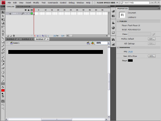
Before you can create a Flash navigation menu, you create a document to be the base for your menu. Before you create this document, you must know the size of the area in which you plan to place the navigation menu. Typically, this is the width of your site banner and the height you want for your menu. Choose a background color that's harmonious with the Web page in which the menu will be placed. For this example, we create a menu 600 pixels wide and 25 pixels high with a black background, using the default frame rate of 24 fps. (Variety is the spice of life!) Figure 1-14 shows the Classic workspace. Notice that the document is set up for Flash ActionScript 2.0. There are two reasons for this. If you use Flash only for creating animations and navigation, there's no need to learn a new programming language. The second reason is that showing you how to use ActionScript 3.0 would require many more pages than we've been allocated. (If you only knew how huffy editors get when you go over the specified page count. But that's a story for another day.) Now, on with the subject at hand: creating flashy navigation.
Figure 1-14:
Creating a document for the Flashy navigation menu.

Creating buttons in Flash
Navigation menus need buttons. Flash gives you all the tools to create some really cool buttons. If you haven't created Flash buttons before, consider this your baptism by fire. To create a button for your menu, follow these steps:
1.
Choose Insert
â
New Symbol.
The Create New Symbol dialog box appears.
2.
Type a name for your symbol and choose the Button behavior.
You're creating a menu, and the obvious place to start a menu is with the Home button. Therefore, name the button
Home
. (See Figure 1-15.)
3.
Click OK.
4.
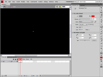
Flash enters symbol-editing mode. (See Figure 1-16.)
Notice that you have one layer as well as four states: Up, Over, Down, and Hit. These states determine what displays when the user's cursor is not over the button (Up), when the user passes his cursor over the button (Over), and when the user clicks the button (Down). The final state, Hit, determines the target area of the button. You add the Hit state only if you have a particularly small button that might be hard to select.
Figure 1-15:
A take-me-home kinda button, Jenson.

Figure 1-16:
Welcome to symbol-editing mode.

5.
If it's not already open, choose Window
â
Properties to open the Property inspector.
6.
Create the shape for your button.
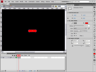
When creating buttons, use the Rectangle tool with a corner radius of 50 pixels to get a generic pill shape. Before creating the shape, change the Rectangle Options value in the Property inspector to 50. Choosing ViewâRulers enables you to create an object that's the approximate size of the button.
7.
Type the desired dimensions for your button in the width and height fields.
 To figure out what size to make each button, divide the width of your navigation menu by the number of buttons. In this example, we're creating six buttons for a navigation (nav) menu that's 600 pixels wide and 25 pixels high. Therefore, each button is 100 pixels wide and 25 pixels high. (See Figure 1-17.)
8.
Select and then align the button to the center of the Stage.
Press Ctrl+K (Windows) or
Ã
+K (Mac) to open the Align panel. Click the To Stage icon, and then click the icons that center the button vertically and horizontally.
9.
Click the New Layer button.
Flash creates a new layer. Layers help you organize your work. For the button, we create a separate layer for button text.
10.
Double-click the layer title.
This opens a text box into which you can type a new name for the second layer. It's not imperative, but crafting an intuitive name now helps you decipher later which layer is used for what when you're creating a complex movie or symbol.
11.
Enter a name for the layer.
Text
is as good a name as any. While you're at it, rename the layer on which the button resides.
Button shape
is a good name.
Figure 1-17:
The button takes shape.

