Building Web Sites All-in-One For Dummies® (44 page)
Read Building Web Sites All-in-One For Dummies® Online
Authors: Claudia Snell

window.open(theURL,winName,features);
}
//-->
6.
Cut all the code that starts with
function
and ends with the second curly brace, like this:
function MM_openBrWindow(theURL,winName,features) { //v2.0
window.open(theURL,winName,features);
}
_fmt.jpeg) The curly brace is very important. If you don't have that curly brace, the code will be broken!
The curly brace is very important. If you don't have that curly brace, the code will be broken!
7.
Paste this code into the new JavaScript file.
The remaining code looks like this:
8.
Remove the comments and add a link to the JavaScript file:
 You can add this code to any of the pages of your site, and it will make the open browser window behavior available on that page, too.
The second piece of code that makes this work is in the body section of your HTML document:
This piece of code creates the link text that triggers the open browser window. It also sends instructions to the code called
parameters,
which tell the code how large the window should be, what URL should be displayed, and whether there should be scroll bars â all the things you set in the Open Browser Window dialog box. You can make changes to this code, if you like, by typing directly into this code. The JavaScript gets the new instructions and follows them. No need to open the JavaScript file at all. It's been built using variables that await the instructions that are passed by the preceding code.
About extensions and the Extension Manager
Extensions
are bits of code and other plug-ins created by Adobe or third parties and made available for download through the Adobe Exchange Web sites. You can download and install these extensions to add functionality to Dreamweaver, Flash, Fireworks, and/or other Adobe software. Some extensions are available for a fee, and others are free. Make sure you read the license agreements and user reviews before you download files. They can help you choose the most helpful tool for the task at hand.
To install behaviors or other items downloaded from the Adobe Exchange Web sites:
1. Double-click the MXP file.
.mxp
is the file type of Adobe extension files.
Extension Manager launches and handles the installation. Extension Manager also has additional information about the file you installed, sometimes including copyright information or tips for use. You can also
manage
your extensions â enable and disable them and keep track of which extensions you have installed â for your Adobe products. The image that follows shows the Extension Manager, which is actually a separate program that manages any extensions you collect for all of your Adobe products.
2. Restart Dreamweaver for the new extension to be available.
You must restart. The same goes for all the Adobe products.
Editing a behavior via the Behaviors panel
If you're not comfortable messing with the code (as we show you in the preceding section), you can use the Behaviors panel to alter behaviors. Just follow these steps:
1.
Select the trigger code in the body of the HTML document.
2.
In the Behaviors panel, double-click the Edit Behavior button.
It looks like a little yellow gear, next to the name of the behavior.
3.
In the Attributes dialog box that opens, make your edits.
4.
Click OK to accept the changes.
Another thing you can edit is the type of interaction that triggers your behavior.
You will notice that the behavior has some code that looks like
onClick
or
onLoad
. These are actions that trigger the code. In other words,
onClick
means that when someone clicks the spot you designated, the behavior executes. And
onLoad
means that the script will execute as soon as the page or other trigger element loads into the visitor's browser. You can change the trigger action by selecting a new one from the drop-down menu next to the edit gear in the Behaviors panel.
Creating a pop-up message
Another behavior that might come in handy is the pop-up message (also known as an
alert box
). If you've browsed the Web, you've seen alert boxes before. They're the little windows that pop up to give you some extra information. These windows require some acknowledgement from users that they have seen them: In other words, users have to click OK before the alert lets them proceed. Pop-ups are most often used to tell users that they need to include some extra information in a form and other things of that sort.
 Although many users don't like pop-ups, they can be a valuable tool when you need to convey information. Just make sure you don't overuse them because they can lose their effect. Sometimes, users won't see the vital information; all they see is just another roadblock while they try to use your site. Also, make sure your message is easy to understand and concise, and doesn't include a lot of technical detail. Remember, it's just a quick alert, not a minisite. Be considerate of your users, and they will pay attention to your messages.
To include a pop-up message on your page, follow these steps:
1.
Open the document to which you're adding the message and then place the cursor in the body section of the document.
Alternatively, you can highlight a section of the code.
2.
In the Behaviors panel, click the Add Behavior button (the plus sign) and select Popup Message.
3.
In the Popup Message dialog box that appears (see Figure 6-13), type the message and then click OK.
Dreamweaver adds this code to the head of your document:
Figure 6-13:
Type what you want users to see in a pop-up message.

It also adds this code to the body of your document:
This particular example tells the browser to create an alert message box when the page loads and display the text:
This is a popup message.
You can edit the message by changing the text in the code. You can also change the trigger and content of this behavior in the way we describe in the “Including the Open Browser Window behavior” section earlier in this chapter.
Chapter 7: Creating a Web Page from a Photoshop File
In This Chapter
Finishing a wire frame design
Dealing with graphics: Slicing and optimizing
Creating a transparent image
Planning and wire framing can save you a lot of headaches later because it's easier to fix mistakes before the whole site is built. In Book II, Chapter 2, we show you how to create a Photoshop wire frame that you can use for a page layout. In this chapter, we show you how to take that wire frame to the finished product. Creating a wire frame helps you decide what belongs on the screen, figure out the underlying structure of your site, and make adjustments as necessary before committing to a whole design. We also show you how to develop a layout, slice a document, and prepare graphics for use on your Web page.
Taking a Wire Frame to a Finished Design
With a complete wire frame, follow these steps to create your page layout:
1.
Launch Photoshop.
2.
Open your wire frame file.
3.
Choose your color scheme.
When choosing colors for the Web site, check whether the client has already chosen colors for its communications. If so, ask for the RGB or hexadecimal codes for the colors to ensure that you use the correct ones. Book IV, Chapter 1 has more details about the different types of colors and why you need RGB or hexadecimal colors instead of CMYK.
_fmt.jpeg) Some designers advise you to use the Photoshop Eyedropper tool to get the colors from a CMYK document, but this isn't a good way of getting the colors. It can be unreliable, and the resulting colors can be incorrect.
Some designers advise you to use the Photoshop Eyedropper tool to get the colors from a CMYK document, but this isn't a good way of getting the colors. It can be unreliable, and the resulting colors can be incorrect.
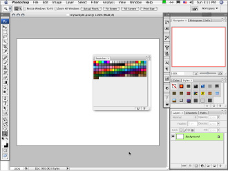
If no set of graphics standards exists or if the site you're designing needs a unique look, you have to choose the colors yourself. If you need information about choosing a good color scheme, read Book II, Chapter 4. You can also make a custom panel (see Figure 7-1), a process that is explained further in the “Managing colors with customer panels” sidebar.
Figure 7-1:
Create a custom panel to make the production process easier.

4.
Create placeholder elements to fill in your layout.
To create the text elements, use the Text tool.
a. With the Text tool (the one that looks like a capital T in the Tools panel) selected, click anywhere in the work area window.
Photoshop automatically creates a text layer for your new text.
b. Select a font and color by using the context-sensitive menu that appears at the top of the screen, under the default Photoshop menu bar.
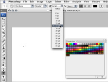
The Text tool menu appears when you select the Text tool or when you double-click an existing text layer to edit. See Figure 7-2 for an example of the menu.
Figure 7-2:
Select your font from the Text tool menu.

c. Select a color from your custom panel by clicking the color chip in the Text menu and then clicking a swatch in your custom panel window.
d. Click the spot in the work area where you want your text. Type the text.
You can edit, move, and change the text later, so don't worry if it's not perfect out of the gate. If you know what some of your headings are, use that text. If not, use some placeholder text â say,
Example Header
â so everyone understands that the text is just for example, not the finished content.
Figure 7-3 shows the color swatches (from Step c), as well as typed text.
Figure 7-3:
Use a custom swatch to change the color of the text.

e. Create headings of at least three sizes for your primary, secondary, and tertiary headings. You want to apply colors, underlines, or any other special treatments you would like for your headings.
Make sure that the priority of the headings is clear. Heading 1 should look more prominent than Heading 2, which is more prominent than Heading 3, and so on.
f. Create a placeholder paragraph with a font that's clear and easy to read.
Verdana is a good font to use for Web content. At this stage, just type some nonsense so that you can see what the paragraphs will look like within your final design. Place a few of them into your design. Make sure you place headings into the layout, too (as discussed in Step e). Doing so gives you an idea of how everything will look together. The point is to make this version of your design look more like the finished product.
g. Create placeholder buttons by using the Rectangle tool to draw the shapes. Note: When you select the Text tool or the Rectangle tool and then click in your working document, a new layer is automatically created for you.
Click the small black triangle in the Rectangle tool area to see other shape tools. Use the Line tool to create borders for your buttons.
After you make the button shapes, double-click the layer that Photoshop made when you created the rectangle; this launches the Layer Effects dialog box. From here, you can apply drop shadows, gradients, patterns, and many other effects. Click the name of an effect to open the options for that effect.
 If you're creating a navigation bar, use just one rectangle and then break it up into buttons visually with the Line tool. This way, you have only one rectangle to contend with when it comes to lining up things, changing effects, or adjusting colors.
h. Create footer text.
Make footer text small and discreet. This text includes important information, such as copyright information and contact information, but it shouldn't overpower the rest of the page.
i. Create banner text.
Banner text should make a big impression. This text is going to be the name of your site, and it's part of your brand. This text must be more eye-catching than other text on the page.
Managing colors with custom panels
A custom panel isn't necessary, but it can certainly make things easier. It allows you to keep colors consistent throughout the project. You can also e-mail the file to other members of the team so they can match the colors.
To make a custom panel, follow these steps:
1. Create a layer.
2. Make boxes with the colors in your color scheme.
3. Choose File
â
Save for Web & Devices.
4. In the color table panel, open the Color Panel menu (by clicking the
twirl-out menu
â the small black triangle icon at the upper-right of the panel).
Figure 7-1 shows you where to find the panel and menu selection.
5. Choose Save Color Table from the pop-up menu.
Photoshop saves it to the Adobe Presets folder called Optimized Colors, by default. You can save the file to your Production Files folder so that it stays with the project, even after you back up the files for storage.
6. Name your file something that is easy to identify.
Using the project's name will help keep things tidy.
Load the custom panel by following these steps:
1. In Photoshop, open the Swatches panel (Window
â
Swatches).
2. From the swatches pop-up menu (found when you click the small black triangle in the upper right of the swatches panel), choose Replace Swatches.
3. Select your panel and click Open.
Note:
Replace Swatches removes the current panel and replaces it with your custom one. If you choose Append instead of Replace Swatches, your custom panel is appended to the end of the list of swatches already available in the swatch panel.
You can bring the default panel back by selecting the twirl-out menu and choosing Reset Swatches â or you can replace it with another panel the same way you loaded your custom swatches.
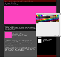
Figure 7-4 gives you an idea of what your design might look like at this point. Making these placeholders helps you make sure your content is readable and that emphasis is on the right elements without cluttering the design with finished artwork. Design is an iterative process: You will layer changes on changes until you have the completed product.
Figure 7-4:
Make some placeholder elements so you can test your colors.

