CSS: The Definitive Guide, 3rd Edition (25 page)
Read CSS: The Definitive Guide, 3rd Edition Online
Authors: Eric A. Meyer
Tags: #COMPUTERS / Web / Page Design

So far, this probably all seems rather
straightforward, and you may be wondering why I said things could be complicated.
There's another side to margins: the negative side. That's right, it's possible to
set negative values for
margins. Doing so results in some interesting effects, assuming that the user
agent supports negative margins at all.
According to the CSS specification, user agents are not required to fully
support negative margins. It says: "Negative values for margin properties are
allowed, but there may be implementation-specific limits." As of this writing,
there are few, if any, such limits in current browsers.
Remember that the total of the seven horizontal properties always equals thewidthof the parent element. As long as all
properties are zero or greater, an element can never be wider than its parent's
content area. However, consider the following markup, depicted in
Figure 7-10
:
div {width: 400px; border: 3px solid black;}
p.wide {margin-left: 10px; width: auto; margin-right: -50px; }
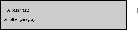
Figure 7-10. Wider children through negative margins
Yes, indeed, the child element is wider than its parent! This is mathematically
correct:
| 10px + 0 + 0 + 440px + 0 + 0 - 50px = 400px |
The440pxis the evaluation ofwidth:auto, which
is the number needed to balance out the rest of the values in the equation. Even
though it leads to a child element sticking out of its parent, the specification
hasn't been violated because the values of the seven properties add up to the
required total. It's a semantic dodge, but it's valid behavior.
Now, let's add some borders to the mix:
div {width: 400px; border: 3px solid black;}
p.wide {margin-left: 10px; width: auto; margin-right: -50px;
border: 3px solid gray;}
The resulting change will be a reduction in the evaluated width ofwidth:
| 10px + 3px + 0 + 434px + 0 + 3px - 50px = 400px |
If you were to introduce padding, then the value ofwidthwould drop even more.
Conversely, it's possible to haveautoright
margins evaluate to negative amounts. If the values of other properties force the
right margin to be negative in order to satisfy the requirement that elements be
no wider than their containing block, then that's what will happen. Consider:
div {width: 400px; border: 3px solid black;}
p.wide {margin-left: 10px; width: 500px; margin-right: auto;
border: 3px solid gray;}
The equation will work out like this:
| 10px + 3px + 0 + 500px + 0 + 3px - 116px = 400px |
The right margin will evaluate to-116px.
Even if you'd given it another value, this would be the case because of the rule
stipulating that if an element's dimensions are overconstrained, the right margin
is reset to whatever is needed to make the numbers work out correctly (except in
right-to-left languages, where the left margin would be overruled).
Let's consider another example, illustrated in
Figure 7-11
, where the left margin is set
to be negative:
div {width: 400px; border: 3px solid black;}
p.wide {margin-left: -50px; width: auto; margin-right: 10px;
border: 3px solid gray;}
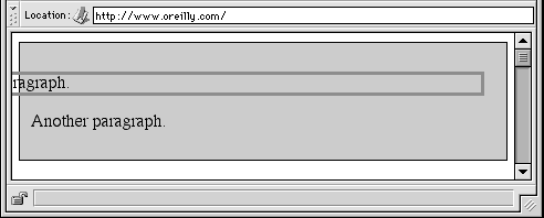
Figure 7-11. Setting a negative left margin
With a negative left margin, not only does the paragraph spill beyond the
borders of thediv, but it also spills beyond
the edge of the browser window itself!
Remember that padding, borders, and content widths (and heights) can never
be negative. Only margins can be less than zero.
When it comes to
percentage values for
the width, padding, and margins, the same basic rules apply. It doesn't really
matter whether the values are declared with lengths or percentages.
Percentages can be very useful. Suppose you want an element's content to be
two-thirds the width of its containing block, the right and left padding to be 5
percent each, the left margin to be 5 percent, and the right margin to take up the
slack. That would be written something like:
playing percentages
The right margin would evaluate to 18 percent (100% - 67% - 5% - 5% - 5%) of
the width of the containing block.
Mixing percentages and length units can be tricky, however. Consider the
following example:
mixed lengths
In this case, the element's box can be defined like this:
| 5em + 0 + 2em + 67% + 2em + 0 + auto = containing block width |
In order for the right margin's width to evaluate to zero, the element's
containing block must be27.272727emwide (with
the content area of the element being18.272727emwide). Any wider than that, and the right margin will
evaluate to a positive value. Any narrower, and the right margin will be a
negative value.
The situation gets even more complicated if you start mixing length values,
like this:
more mixed lengths
And, to make things more complex, borders cannot have percentage widths, only
lengths. The bottom line is that it's impossible to create a fully flexible
element layout based solely on percentages unless you're willing to avoid using
borders.
So far, we've been dealing with the horizontal
formatting of
nonreplaced block-level elements in the normal flow
of text. Replaced block-level elements are a bit simpler to manage. All of the
rules for nonreplaced blocks hold true, with one exception: ifwidthis left asauto, then the width of the element is the content's intrinsic width.
The image in the following example will be 20 pixels wide because that's the width
of the original image:

If the actual image were 100 pixels instead, it would be laid out as 100 pixels
wide.
It's possible to override this rule by assigning a specific value towidth. Suppose you modify the previous example to
show the same image three times, each with a different width value:
This is illustrated in
Figure 7-12
.

Figure 7-12. Changing replaced element widths
Note that the height of the elements also increases. When a replaced element'swidthis changed from its intrinsic width,
the value ofheightis scaled to match, unlessheighthas been set to an explicit value of
its own. The reverse is also true: ifheightis
set, butwidthis left asauto, then the width is scaled proportionately to the
change in height.
Now that you're thinking about height, let's move on to the vertical formatting
of block-level normal-flow elements.