CSS: The Definitive Guide, 3rd Edition (26 page)
Read CSS: The Definitive Guide, 3rd Edition Online
Authors: Eric A. Meyer
Tags: #COMPUTERS / Web / Page Design

Like horizontal
formatting, vertical formatting of block-level elements has its own set of
interesting behaviors. The default height of
an
element is determined by its content. Height is also affected by the width of the
content; the skinnier a paragraph becomes, the taller it must be to contain all of
the inline content within it.
In CSS, it is possible to set an explicit height on any block-level element. If
you do this, the resulting behavior depends on several other factors. Assume that the
specified height is greater than that needed to display the content:
In this case, the extra height has a visual effect somewhat like extra padding.
But suppose theheightis
less
than what is needed to display the content:
When that happens, the browser is supposed to provide a means of viewing all
content without increasing the height of the element box. The browser may add a
scrollbar to the element, as shown in
Figure
7-13
.

Figure 7-13. Heights that don't match the element's content height
In a case where the content of an element is taller than the height of its box,
the actual behavior of a user agent will depend on the value of (and its support for)
the propertyoverflow. This scenario is covered in
Chapter 10
.
Under CSS1, user agents can ignore any value ofheightother thanautoif an element is
not a replaced element (such as an image). In CSS2 and CSS2.1, the value ofheightcannot be ignored, except in one specific
circumstance involving percentage values. We'll talk about that in a moment.
Just as withwidth,heightdefines the content area's height, not the height of the visible
element box. Any padding, borders, or margins on the top or bottom of the element box
are
added
to the value forheight.
properties
As was the case with
horizontal formatting, vertical formatting also has seven related properties:margin-top,border-top,padding-top,height,padding-bottom,border-bottom, andmargin-bottom. These properties are
diagrammed in
Figure
7-14
.
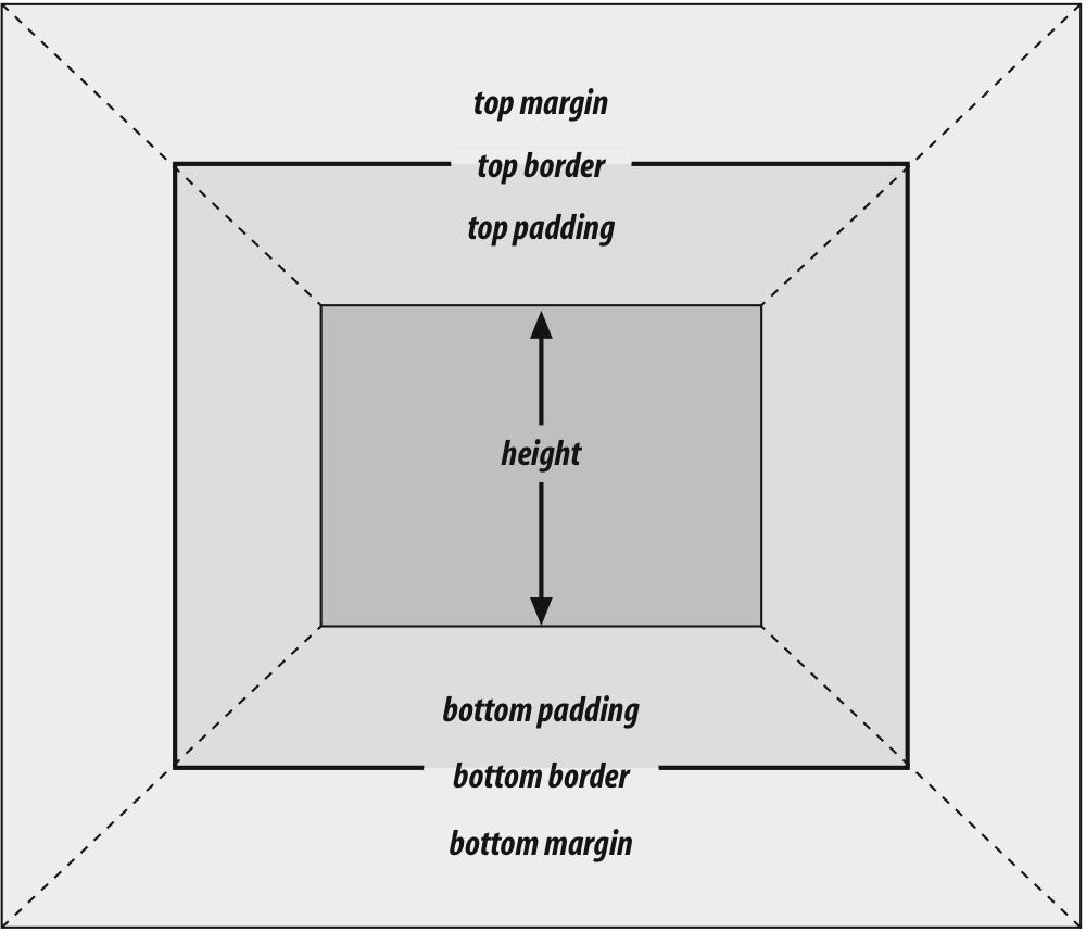
Figure 7-14. The "seven properties" of vertical formatting
The values of these seven properties must equal the height of the
element's containing block. This is usually the value ofheightfor a block-level element's parent (since block-level
elements nearly always have block-level elements for parents).
Only
three of these seven properties may be set toauto: theheightof the element's
content and the top and bottom margins. The top and bottom padding and borders
must be set to specific values or else they default to a width of zero (assuming
noborder-styleis declared). Ifborder-stylehas been set, then the width of the
borders is set to be the vaguely defined valuemedium.
Figure 7-15
provides an illustration for remembering which parts of the box may have a value
ofautoand which may not.
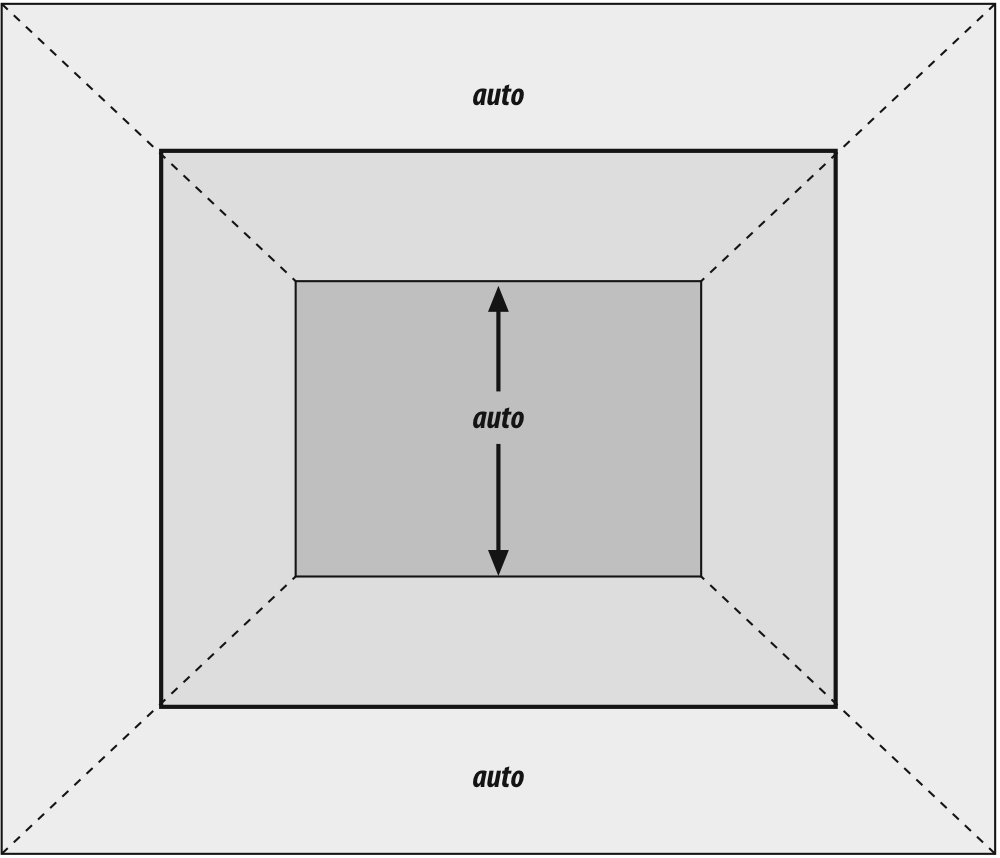
Figure 7-15. Vertical properties that can be set to auto
Interestingly, if eithermargin-topormargin-bottomis set toautofor a block element in the normal flow, it
automatically evaluates to0. A value of0unfortunately prevents easy vertical
centering of normal-flow elements in their containing blocks. It also means that
if you set the top and bottom margins of an element toauto, they are effectively reset to0and removed from the element box.
The handling ofautotop and bottom
margins is different for positioned elements. See
Chapter 10
for more details.
heightmust be set toautoor to a nonnegative value of some type.
heights
You already saw how length-value heights are
handled, so let's spend a moment on percentages. If theheightof a block-level, normal-flow element is set to a percentage,
then that value is taken as a percentage of the height of the containing block.
Given the following markup, the resulting paragraph will be 3em
tall:
Half as tall
Since
setting the top and bottom margins toautowill
give them zero height, the only way to vertically center the element is to set
them both to25%.
However, in cases
where theheightof the containing block is not
explicitly declared, percentage heights are reset toauto. If you changed the previous example so that theheightof thedivisauto, the paragraph will now be exactly as
tall as thedivitself:
NOT half as tall; height reset to auto
These
two possibilities are illustrated in
Figure
7-16
. (The spaces between the paragraph borders and thedivborders are the top and bottom margins on the
paragraphs.)
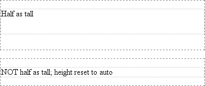
Figure 7-16. Percentage heights in different circumstances
In the simplest case, a block-level, normal-flow element withheight:autois
rendered just high enough to enclose the line boxes of its inline content
(including text).autoheight sets a border on
a paragraph and assumes no padding—expect the bottom border to go just under the
bottom line of text and the top border to go just above the top line of text.
If anauto-height, block-level, normal-flow
element has only block-level children, then its default height will be the
distance from the top of the topmost block-level child's outer border edge to the
bottom of the bottommost block-level child's outer border edge. Therefore, the
margins of the child elements will "stick out" of the element that contains them.
(This behavior is explained in the next section.) However, if the block-level
element has either top or bottom padding, or top or bottom borders, then its
height will be the distance from the top of the outer top margin edge of its
topmost child to the outer bottom margin edge of its bottommost child:
A paragraph!


Another paragraph!
Both of these behaviors are demonstrated in
Figure 7-17
.
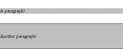
Figure 7-17. Auto heights with block-level children
If you changed the borders to padding in the previous example, the effect on
the height of thedivwould be the same: it
would still enclose the paragraph's margins within it.
One other important aspect of vertical formatting
is the
collapsing
of
vertically adjacent margins. Collapsing behavior applies only to margins. Padding
and borders, where they exist, are never collapsed by anything.
An unordered list, where list items follow one another, is a perfect example of
margin collapsing. Assume that the following is declared for a list that contains
five items:
li {margin-top: 10px; margin-bottom: 15px;}
Each list item has a 10-pixel top margin and a 15-pixel bottom margin. When the
list is rendered, however, the distance between adjacent list items is 15 pixels,
not 25. This happens because adjacent margins are collapsed along the vertical
axis. In other words, the smaller of the two margins is eliminated in favor of the
larger.
Figure 7-18
shows the
difference between collapsed and uncollapsed margins.
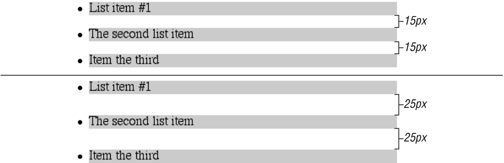
Figure 7-18. Collapsed versus uncollapsed margins
Correctly implemented user agents collapse vertically adjacent margins, as
shown in the first list in
Figure
7-18
, where there are 15-pixel spaces between each list item. The second
list shows what would happen if the user agent didn't collapse margins, resulting
in 25-pixel spaces between list items.
If you don't like the word "collapse," use "overlap." Although the margins do
not really overlap, you can visualize what's happening using the following
analogy. Imagine that each element, (for example, a paragraph), is a small piece
of paper with the content of the element written on it. Around each piece of paper
is some clear plastic, which represents the margins. The first piece of paper (say
anh1piece) is laid down on a canvas. A second
piece of paper (a paragraph) is laid down below it and then slid up until the edge
of its plastic touches the other paper's edge. If the first piece of paper has
half an inch of plastic along its bottom edge, and the second has a third of an
inch along its top, then when they slide together, the first piece's plastic edge
will touch the top edge of the second piece of paper. The two are now positioned
on the canvas, and the plastic attached to the pieces overlaps.
Collapsing also occurs where multiple margins meet, such as at the end of a
list. Adding to the earlier example, let's assume the following rules apply:
ul {margin-bottom: 15px;}
li {margin-top: 10px; margin-bottom: 20px;}
h1 {margin-top: 28px;}
The last item in the list has a bottom margin of 20 pixels, the bottom margin
of theulis 15 pixels, and the top margin of a
succeedingh1is 28 pixels. So once the margins
have been collapsed, the distance between the end of theliand the beginning of theh1is
28 pixels, as shown in
Figure 7-19
.
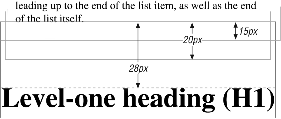
Figure 7-19. Collapsing in detail
Now, recall the examples from the previous section, where the introduction of a
border or padding on a containing block caused the margins of its child elements
to be contained within it. You can see this behavior by adding a border to theulelement in the previous example:
ul {margin-bottom: 15px; border: 1px solid;}
li {margin-top: 10px; margin-bottom: 20px;}
h1 {margin-top: 28px;}
With this change, the bottom margin of thelielement is now placed inside its parent element (theul). Therefore, the only margin collapsing that takes
place is between theuland theh1, as illustrated in
Figure 7-20
.
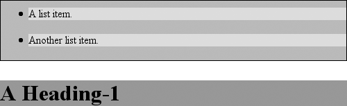
Figure 7-20. Collapsing (or not) with borders added to the mix