Presentation Zen: Simple Ideas on Presentation Design and Delivery, 2nd Edition (Ira Katz's Library) (10 page)
Authors: Garr Reynolds

(Image in slide from iStockphoto.com.)
(Image in slide from iStockphoto.com.)
If you create a proper handout for your presentation during the preparation phase, then you will not feel compelled to say everything about your topic in your talk. Preparing a proper document—with as much detail as you think necessary—frees you to focus on what is most important for your particular audience on your particular day. If you create a proper handout, you will also not worry about the exclusion of charts, figures, or related points. Many presenters include everything under the sun in their slides “just in case” or to show they are “serious people.” It is common to create slides with lots of text and detailed charts, etc., because the slides will also serve as a leave-behind document. This is a big mistake (see the upcoming sidebar, “Create a Document, Not a Slideument”). Instead, prepare a detailed handout, and keep the slides simple. And never distribute a printed version of your slides as a handout. Why? David Rose, expert presenter and one of New York City’s most successful technology entrepreneurs, puts it this way:
“Never, ever hand out copies of your slides, and certainly not before your presentation. That is the kiss of death. By definition, since slides are speaker support material, they are there in support of the speaker... YOU. As such, they should be completely incapable of standing by themselves, and are thus useless to give to your audience, where they will simply be guaranteed to be a distraction. The flip side of this is that if the slides can stand by themselves, why the heck are you up there in front of them?
”
—David S. Rose
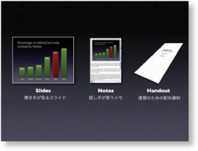
If you remember that there are three components to your presention—the visuals, your notes, and the handout—then you will not feel the need to place so much information in your slides or other multimedia. Instead, you can place that information in your notes (for the purpose of rehearsing or as a backup) or in the handout. This point has been made by presentation experts such as Cliff Atkinson, yet most people still fill their slides with volumes of text and hard-to-see data and simply print out their slides instead of creating a separate leave-behind document.
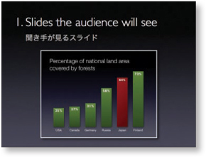
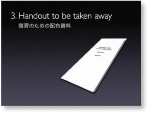
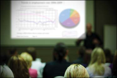
(I have used the four slides on this page while making this point during my live talks on presentation design.)

Create a Document, Not a Slideument
Slides are slides. Documents are documents. They aren’t the same thing. Attempts to merge them result in what I call the “slideument.” The creation of the slideument stems from a desire to save time. People think they are being efficient—a kind of kill-two-birds-with-one-stone approach or
iiseki ni cho
in Japanese. Unfortunately (unless you’re a bird), the only thing “killed” is effective communication. Intentions are good, but results are bad. This attempt to save time reminds me of a more fitting Japanese proverb:
Nito o oumono wa itto mo ezu
or “Chase two hares and get none.”
Projected slides should be as visual as possible and support your points quickly, efficiently, and powerfully. The verbal content, the verbal proof, evidence, and appeal/emotion come mostly from your spoken word. But your handouts are completely different. With those, you aren’t there to supply the verbal content and answer questions, so you must write in a way that provides at least as much depth and scope as your live presentation. Often, however, even more depth and background information are appropriate because people can read much faster than you can speak. Sometimes, a presentation is on material found in a speaker’s book or a long journal article. In that case, the handout can be quite concise; the book or research paper is where people can go to learn more.
Do Conferences Encourage Slideumentation?
As proof that we live in a world dominated by bad presentations, many conferences today require speakers to follow uniform slide guidelines and submit their files far in advance. The conference then takes these “standardized slide decks” and prints and places them in a large conference binder or includes them on the conference DVD for attendees to take home. Conference organizers are implying that a cryptic series of slides with bullet points and titles makes for both good visual support in your live presentation and credible documentation of your presentation content long after your talk has ended. This forces the speaker into a catch-22 situation. The presenter must say to herself: “Do I design visuals that clearly support my live talk, or do I create slides that more resemble a document to be read later?” Most presenters compromise and shoot for the middle,
resulting in poor supporting visuals for the live talk and a series of document-like slides filled with text and other data that do not read well (and are therefore not read). A series of small boxes with text and images on sheets of paper do not a document make.
The slideument isn’t effective, it isn’t efficient, and it isn’t pretty. Attempting to have slides serve both as projected visuals and as stand-alone handouts makes for bad visuals and bad documentation. Yet this is a typical approach. PowerPoint and other digital presentation tools are effective for displaying visual information that helps tell your story, make your case, prove your point, and engage your audience. Presentation software tools
are not
good, however, for making written documents. That’s what word processors are for.
So why don’t conference organizers request that speakers send a written document (with a specified maximum page length) that covers the main points of their presentation with appropriate detail and depth? A Word or PDF document written in a concise and readable fashion with a bibliography and links to even more details for those who are interested would be far more effective. When I get home from a conference, do organizers really think I’m going to attempt to read pages of printed slides? One does not read a printout of a two-month-old slide deck. Rather, one guesses, decodes, and attempts to glean meaning from the series of low-resolution titles, bullets, charts, and clip art—at least they do that for a while...until they give up. With a written document, however, there is no reason for shallowness or ambiguity (assuming one writes well).

To be different and effective, use a well-written, detailed document for your handout and well-designed, simple, intelligent graphics for your visuals. And while it may require more effort on your part, the quality of your visuals and takeaway documents will be dramatically improved.
Avoiding the Slideument
The slide below on the left displays obesity rates for 30 countries in two formats. The table and bar graph were made in Excel and pasted into slideware. It is common for people to take detailed data such as this from Excel or Word documents and paste them into display slides for a presentation. But it’s rarely necessary to include all this data in an on screen visual for a short live talk. If it is necessary to examine so much data during the presentation, put the table and charts in a handout. (The low resolution and limited real estate of display screens makes it difficult to read labels at such small sizes anyway.) It is usually better to use only the data that truthfully and accurately support your point. In this example, the point is to show how the U.S. obesity rate is much higher than the rate in Japan. It is not necessary to show the rates for so many other countries; this information is better included in a handout.
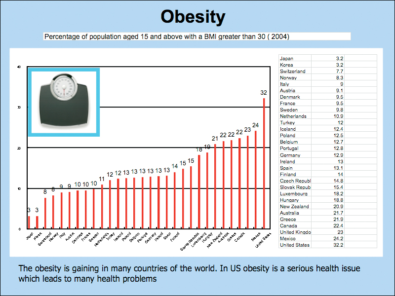
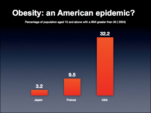
Instead of using a detailed chart that will appear cluttered and difficult to read, try creating a simpler visual for the slide and place the detailed charts and tables in a leave-behind document where you have more space to present the details in a proper layout.