Presentation Zen: Simple Ideas on Presentation Design and Delivery, 2nd Edition (Ira Katz's Library) (7 page)
Authors: Garr Reynolds

Pecha Kucha: A Sign of the Changing Times
Pecha Kucha is a global presentation phenomenon started in 2003 by Tokyo-based expatriate architects Mark Dytham and Astrid Klein. (
Pecha kucha
is Japanese for “chatter.”) Pecha Kucha is an example of the changing attitudes toward presentation and a wonderfully creative and unconventional way to “do PowerPoint.” The Pecha Kucha method of presentation design and delivery is very simple. You must use 20 slides, each shown for 20 seconds, as you tell your story in sync with the visuals. That’s 6 minutes and 40 seconds. Slides advance automatically, and when you’re done you’re done. That’s it. Sit down. The objective of these simple but tight restraints is to keep the presentations brief and focused and to give more people a chance to present in a single night.
PechaKucha Nights are held in more than 80 cities from Amsterdam and Auckland to Venice and Vienna. The PechaKucha Nights in Tokyo are hosted in a hip multimedia space, and the atmosphere on the night I attended was a cross between a cool user group meeting and a popular night club.
If nothing else, the Pecha Kucha method is good training and good practice. Everyone should try Pecha Kucha—it’s a good exercise for getting your story down even if you do not use this exact method for your own live talk. It doesn’t matter whether you can replicate the Pecha Kucha 20 x 20 6:40 method in your own company or school; the spirit behind it and the concept of “restrictions as liberators” can be applied to almost any presentation situation.
This method makes going deep difficult. But if a good discussion arises from a Pecha Kucha type of presentation, then it may work well even inside an organization. I can envision having college students give this kind of presentation about their research followed by deeper questioning and probing by the instructor and class. Which would be more difficult for a student and a better indication of their knowledge: a 45-minute recycled and typical PowerPoint presentation, or a tight 6:40 presentation followed by 30 minutes of probing questions and discussion? On the other hand, if you can’t tell the essence of your story in less than seven minutes, then you probably shouldn’t be presenting anyway.
Check out the PechaKucha website to find a PechaKucha Night near you.

“Do only what is necessary to convey what is essential. [C]arefully eliminate elements that distract from the essential whole, elements that obstruct and obscure.... Clutter, bulk, and erudition confuse perception and stifle comprehension, whereas simplicity allows clear and direct attention.”
Life is about living with limitations of one type or another, but constraints are not necessarily bad. In fact, constraints are helpful, even inspiring as they challenge us to think differently and more creatively about a particular problem. While problems such as a sudden request to give a 20-minute sales pitch or a 45-minute overview of research findings have built-in limitations—such as time, tools, and budget—we can increase our effectiveness by stepping back and thinking long and hard. We can also determine ways to set our own parameters and constraints as we prepare and design our next presentation with greater clarity, focus, balance, and purpose.
As daily life becomes even more complex, and the options and choices continue to mount, crafting messages and making designs that are clear, simple, and concise becomes all the more important. Clarity and simplicity are often all people want or need—yet it’s increasingly rare and all the more appreciated when it’s discovered. You want to surprise people? You want to exceed their expectations? Then consider making it beautiful, simple, clear... and great. The “greatness” may just be found in what you left out, not in what you left in. It takes creativity and the courage to be different. Your audience is praying that you’ll be both creative and courageous.
• Preparing, designing, and delivering a presentation is a creative act, and you are a creative being.
• Creativity requires an open mind and a willingness to be wrong.
• Restrictions and limitations are not the enemy; they are a great ally.
• As you prepare a presentation, exercise restraint and always keep these three words in mind: simplicity, clarity, brevity.


One of the most important things you can do in the initial stage of preparing for your presentation is to get away from your computer. A fundamental mistake people make is spending almost the entire time thinking about their talk and preparing their content while sitting in front of a computer screen. Before you design your presentation, you need to see the big picture and identify a single core message or messages. This can be difficult unless you create a stillness of mind for yourself, something that is hard to do while puttering around in slideware.
Right from the start, most people plan their presentations using software tools. In fact, the software makers encourage this, but I don’t recommend it. There’s just something about using paper and pen to sketch out rough ideas in the “analog world” that seems to lead to more clarity and better, more creative results when we finally get down to representing ideas digitally. Because your presentation will be accompanied by multimedia, you will be spending plenty of time in front of a computer later. I call preparing the presentation away from the computer “going analog,” as opposed to “going digital” at the computer.
Software companies have oversold us on the idea of following templates and wizards, which while sometimes useful, often take us places we do not really want to go. In this sense, visual design expert Edward Tufte is right when he says there is a cognitive style to PowerPoint that leads to an oversimplification of our content and obfuscation of our message. The same could be said of other presentation apps as well. Presentation software applications are wonderful for displaying media in support of our talk, but if we are not careful, these applications also point us down a road that we may not have gone, introducing bells and whistles that may distract more than they help.
More than 25 years ago, Steve Jobs and others in Silicon Valley were talking about the great potential of personal computers and how these tools should be designed and used in a way that enhanced the great potential that exists within each of us. Here’s what Steve Jobs said back then in a documentary called
Memory and Imagination
(Michael Lawrence Films):
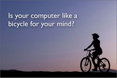
“What a computer is to me is that it’s the most remarkable tool that we’ve ever come up with, and it’s the equivalent of a bicycle for our minds.”
—Steve Jobs
When it comes to locomotion, humans are not such an efficient animal compared to other animals. But a human on a bicycle is the most efficient animal on the planet. The bicycle amplifies our input in an enormously productive way. Isn’t this what a computer—the most magnificent tool of our time—should do?
During the planning stages of a presentation, does your computer function as a “bicycle for your mind,” amplifying your own capabilities and ideas? Or is it more like a “car for your mind” with prepackaged formulas that make your ideas soft? Your mind benefits when you use the computer like a bike, but it loses out when you rely only on your computer’s power the way you rely on your car’s power.
It’s important to understand the principles of presentation creation and design, and not merely follow software application rules. The best software, in many cases, does not so much point the way as it gets out of the way, helping us to amplify our own ideas and abilities. One way to ensure that your computer and your software applications remain great tools of amplification for your ideas and your presentation is to first turn off the computer and walk away from it. You’ll be back soon enough.
(Image in slide from iStockphoto.com.)
My favorite tools for preparing a presentation (or any other project for that matter) usually consist of a large pad of yellow legal paper and colored pens, a moleskin storyboard book, or if I am in my office, a large whiteboard. As wonderful as digital technology is, I don’t think anything is as quick, easy, and immediate as a simple pad and pencil, and nothing gives me space to jot down ideas quite like a massive whiteboard.
Most businesspeople and even college students do all the preparation of their presentations directly in slideware. In this regard, we can learn a lot from professional designers. Most professional designers—even young, new media designers who’ve grown up on computers—usually do much of their planning and brainstorming on paper.
This became very clear to me one day at Apple when I visited a senior director on one of the creative teams to get his input on a project. He said he had sketched out a lot of ideas to show me. I assumed that he had prepared some slides or a movie or at least printed out some color images in Illustrator or Photoshop to show me. But when I arrived at his office, I found that the beautiful Apple Cinema Display on his desk was off. (I learned later that this talented creative director worked for days without ever turning on his Mac.) Instead, he had sketched out his ideas on a scroll of white paper that stretched about five meters across his office wall. This large scroll was a combination of hand-drawn images and text resembling a large comic strip. The creative director started at one end of the “strip” and walked me through his ideas, stopping occasionally to add a word or graphic element. After our meeting, he rolled up his sketches and said “take ’em with you.” Later, I would incorporate his ideas into our internal presentation using a computer.
