Presentation Zen: Simple Ideas on Presentation Design and Delivery, 2nd Edition (Ira Katz's Library) (36 page)
Authors: Garr Reynolds

I’m not a fan of the lectern (also referred to as the podium). Yes, it has its place, and sometimes its use is unavoidable. But in almost every speaking situation, standing behind a lectern is like standing behind a wall.
Lecterns can make a speaker look authoritative and in command. This is why politicians love speaking from behind them. If you aim to look “large and in charge,” then perhaps a lectern is appropriate for you. But for most of us—conference presenters, teachers, sales reps, etc.—the last place we want to be is behind a wall. Also, lecterns are often placed to the side and back from the edge of the stage. In this case, you are not only behind a barrier, any visuals you use are the main focus and your physical presence is very much diminished. It’s possible for both you and the screen to be front and center, which is where people are naturally going to focus their attention.
If you present from behind a lectern, you may, more or less, sound the same and the media may look the same, but it’s not ideal. In fact, it’s far from ideal. The connection is lost. Imagine if your favorite singer performed from behind a lectern. Ridiculous, of course. Imagine, too, if Steve Jobs had given his famous keynotes with the same slides and same video clips, same jeans and black turtleneck, but did all the talking from behind a lectern. He might have sounded the same. The visuals might have looked the same. But the connection and engagement would not be there.
Generally, the lectern is “so last millennium,” but there are times when its use is perfectly acceptable, such as when multiple speakers take turns at center stage during a formal ceremony. Graduation ceremonies are a good example. But when people have walked in that room specifically to hear you, learn from you, and be convinced or inspired by you, then you’ve got to do whatever you can to remove all walls—literally and figuratively—between you and the audience. It’s scary, and takes practice, but it will make all the difference.

A very common scene is shown above. Note the three levels of barriers: First, there is the lectern. Then, there is the computer screen. Finally, there is the ream of notes the presenter is holding. These three items act as walls between the presenter and the audience. The fact that she will be looking down to read and speaking in a more formal, less conversational language, will not help her engagement either. Remove the walls—all of them—as much as possible.
Redux: Presentation Lessons from Steve Jobs
On the morning of October 6, 2011, I sat down at the kitchen counter at our home in Nara, Japan, with a cup of coffee and turned on the news to check the day’s weather forecast. Instead the network issued a special report from the U.S.: “Steve Jobs has died.” My heart sank.
Except for a couple of e-mails and occasionally saying hello to Steve at the Cafe Macs’s salad bar on the Apple campus in Cupertino, I never had much direct contact with him while I worked at Apple. Still, I was deeply, deeply saddened by the news of his passing. If truth be told, it was Steve’s special ability to connect and engage a large audience in such a natural and simple way that first attracted me to Apple a generation ago. I had read all the public speaking and presentation books over the years, of course, but it was Steve Jobs’s presentation skills from which I learned the most by far.
I saw virtually every keynote presentation Steve Jobs ever made since 1997 (and all the archived videos before then), and while I was with Apple I never missed a special employee event or town hall meeting on campus. Although I touched on lessons from Steve Jobs a few times earlier in this book, what follows is a summary of some of the most salient lessons from the master of the keynote presentation.
Know when
not
to use slides.
Multimedia is great for presentations before large groups such as keynote addresses or conference presentations, but in meetings where you want to discuss issues or go over details in depth, slides—especially the bulleted list variety, which are never a good idea—are usually counter productive. Jobs was well known inside Apple for hating slide presentations in meetings. “I hate the way people use slide presentations instead of thinking,” Jobs told biographer Walter Isaacson when describing meetings upon his return to Apple in 1997. “People would confront a problem by creating a presentation. I wanted them to engage, to hash things out at the table, rather than show a bunch of slides. People who know what they’re talking about don’t need PowerPoint.”
Jobs preferred to use the whiteboard to explain his ideas and hash out things with people. There is a difference between a keynote and ballroom style presentations (and TED talks and similar events) and a meeting around a conference table. Most productive meetings are a time for discussion and working things out, not simply going through a bunch of slides. Save the multimedia for the larger presentations. The tips below mainly concern presentations for larger audiences.
Remember that even on stage, multimedia is not always needed.
In cases where you want to create more of a town hall feel and generate discussion with the audience, consider pulling up a stool at the front of the stage to tell your story. The few times that I saw Steve Jobs address employees in the Town Hall Auditorium at 4 Infinite Loop in Cupertino, he did not use multimedia, and instead sat on a stool at the center of the stage to give his report and field questions. This instantly felt more like a conversation. As much as I love multimedia, sometimes it just does not fit the occasion.
Be very clear and very focused.
In the preparation stage you must be ruthless in cutting the superfluous from the talk, both in terms of content and in terms of what visuals you use. Poor presentations, no matter how good the visuals or even delivery may be, result from poor planning and a lack of focus on what your core points are and the key messages that you want people to take a way. Steve Jobs was laser sharp in his focus in almost all business matters, including the planning of his presentations. Focus, as Jobs said when talking about products, means that you often need to say no to things. You can’t cover everything in a presentation; have the courage to cut the non-essential. Most presentations that fail do so because they include too much information and display it in a cluttered way that does not engage the brain.
Develop rapport with the audience.
Jobs usually walked out on stage, all smiles, without any formal introduction over the PA. Jobs showed his personality, which was confident but humble and friendly, on stage (an image he did not always project during meetings with his employees). People are attracted to confidence—but it must be confidence, combined with humility. Jobs used natural movement on stage, eye contact, and a subtle friendliness to establish a connection with the audience.
Give them an idea of where you’re going.
You do not need an agenda slide, but give people an idea where you’re going, a bit of a road map of the journey you’re taking them on. In Jobs’s case, after a simple, friendly greeting he often began with something like: “I’ve got four things I’d like to talk about with you today. So let’s get started. First...” Jobs often structured his talks around three or four parts with one theme.
Show your enthusiasm.
You may want to tone down your enthusiasm at times, but most presenters show too little passion or enthusiasm, not too much. Each case is unique, but enthusiasm can make all the difference. Jobs’s enthusiasm was subtle, but you could detect it in his tone and the words that he chose. In just the first few minutes on stage Jobs often used superlatives such as incredible, extraordinary, awesome, amazing, revolutionary. You can say his language was over the top, but Steve Jobs believed what he said. He was sincere. Yet the point is not to speak like Steve Jobs—or move around like Steve Ballmer—but to find your own level of passion and bring that honest enthusiasm out in your work for the world to see in your own style.
Be positive, upbeat, humorous.
Jobs was a very serious person, but he came across in presentations as an extremely positive person because he deeply believed in his content. He was upbeat and positive about the future, even in hard times. Reality distortion field or not, this positive energy is the image he projected on stage. You cannot fake this—you must believe in your content or you cannot sell it. Jobs also brought a little humor to his talks. This did not mean telling jokes. His humor was more subtle. Making people laugh occasionally through subtle uses of irony is engaging.
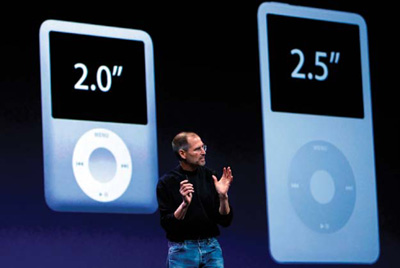
Focus not on the numbers, but on what the numbers mean.
A business keynote by a technology company is different from a scientific presentation at a conference. But isn’t it always about what the numbers mean rather than just the numbers themselves? So your cholesterol is 199, the national average. Is that good or bad? Up or down? Is “average” healthy or unhealthy? And compared to what? When Steve Jobs talked about numbers in his keynotes, he often broke them down. For example, he may have said something like four million iPhones sold is the equivalent of 20,000 per day since the units went on sale. 20 percent market share? In and of itself that does not mean much, but the meaning becomes clear when he compared it to others in the field. When presenting data, always ask yourself “compared to what?”
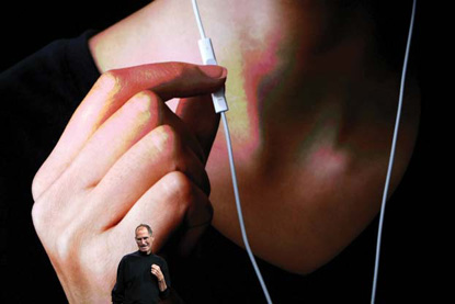
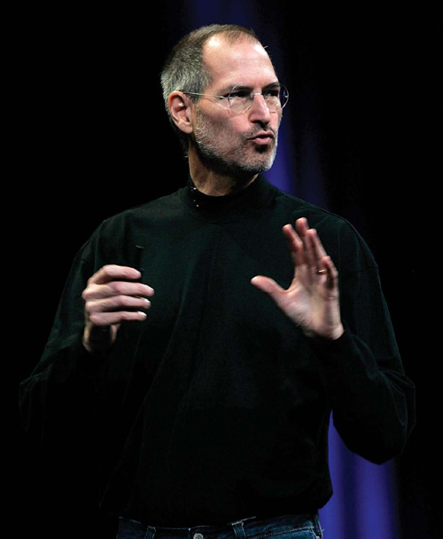
Steve Jobs’s keynotes always featured high-impact visuals.

Jobs balanced his high-impact visuals by occasionally having the screen behind him contain no information at all, the equivalent of placing blank slides or spaces in your visual narrative. This places all eyes on you. (Photos on this page by Justin Sullivan/iStockphoto.com.)
Make it visual.
Jobs used huge screens and large, high-quality graphics for his keynotes and special events. The images were clear, professional, and unique, and never from a template. Charts and graphs were simple and beautifully clear. There was never “death by bullet point.” Jobs used the screen to show visual material and only occasionally for displaying short lists. He displayed data in a way that the meaning was instantly clear. Not every presentation requires photos or movie clips, but if you do use multimedia, make it simple, yet of high quality.
Introduce something unexpected.
Jobs’s presentations always had something new. But he also surprised audiences just a bit each time. Humans love the unexpected. We love some element that makes us go “aah!” The brain loves novelty.
Vary the pace and change techniques.
Jobs was good at varying the pace from fast to slow and changing the flow by using different techniques. He did not stand in one place and lecture, a very bad way to present. Instead, he mixed in video clips, images, stories, data, different speakers, and live hardware and software demos. Just talking about information for one or two hours is much too boring for the audience (and for the presenter). If the talk were only about information and new features, it would be more efficient to give that information out in a handout for people to read when they have the time.
Go the appropriate length.
Jobs never included unnecessary details and finished on time. He was aware that presentations cannot go on too long and got to his points smoothly and quickly. If you cannot explain why your topic is important, interesting, and meaningful in 20 minutes or less, then you do not know your topic well enough. Try to make talks as short as possible while still making the content meaningful, keeping in mind that every case is different. The key is not to fill your audience up; you want them to leave wanting just a little more.
Save the best for last.
People will make an assessment about your performance in the first two minutes, so you have to start strong. But you have to finish even stronger. People best remember the first part and the last part of your presentation. The middle stuff is important, of course, but if you blow it at the beginning or at the end, all may be lost. This is why you have to rehearse your opening and your closing so much. Jobs was famous for his “one more thing” slide where he saved the best for last—after it appeared he was finishing.
Steve Jobs often talked about changing the world, and he
did
change the world in his short 56 years on this planet. His incredible dedication to detail, simplicity, and aesthetics raised the bar for technology, business, design, and beyond. He even raised the bar for presentations. In spite of his mercurial nature, he was a true master. He was a true sensei.
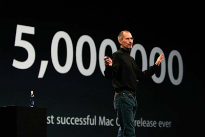
When Jobs showed numbers, they were big and impossible to miss. In this photo taken at Macworld 2008 in San Francisco, he is announcing that over five million copies of Mac OS 10.5 were purchased since its release. (Photo by David Paul Morris/iStockphoto.com.)