The Better Angels of Our Nature: Why Violence Has Declined (48 page)
Read The Better Angels of Our Nature: Why Violence Has Declined Online
Authors: Steven Pinker
Tags: #Sociology, #Psychology, #Science, #Amazon.com, #21st Century, #Crime, #Anthropology, #Social History, #Retail, #Criminology

BOOK: The Better Angels of Our Nature: Why Violence Has Declined
9.14Mb size Format: txt, pdf, ePub
So does that mean that mankind got more warlike or less? There is no single answer, because “warlike” can refer to two different things. It can refer to how likely nations are to go to war, or it can refer to how many people are killed when they do. Imagine two rural counties with the same size population. One of them has a hundred teenage arsonists who delight in setting forest fires. But the forests are in isolated patches, so each fire dies out before doing much damage. The other county has just two arsonists, but its forests are connected, so that a small blaze is likely to spread, as they say, like wildfire. Which county has the worse forest fire problem? One could argue it either way. As far as the amount of reckless depravity is concerned, the first county is worse; as far as the risk of serious damage is concerned, the second is. Nor is it obvious which county will have the greater amount of overall damage, the one with a lot of little fires, or the one with a few big ones. To make sense of these questions, we have to turn from the statistics of time to the statistics of magnitude.
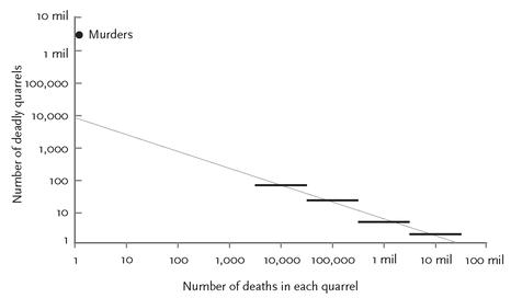
THE STATISTICS OF DEADLY QUARRELS, PART 2: THE MAGNITUDE OF WARSRichardson made a second major discovery about the statistics of deadly quarrels. It emerged when he counted the number of quarrels of each magnitude—how many with death tolls in the thousands, how many in the tens of thousands, how many in the hundreds of thousands, and so on. It isn’t a complete surprise that there were lots of little wars and only a few big ones. What was a surprise was how neat the relationship turned out to be. When Richardson plotted the log of the number of quarrels of each magnitude against the log of the number of deaths per quarrel (that is, the magnitude itself), he ended up with a graph like figure 5–7.
Scientists are accustomed to seeing data fall into perfect straight lines when they come from hard sciences like physics, such as the volume of a gas plotted against its temperature. But not in their wildest dreams do they expect the messy data from history to be so well behaved. The data we are looking at come from a ragbag of deadly quarrels ranging from the greatest cataclysm in the history of humanity to a coup d’état in a banana republic, and from the dawn of the Industrial Revolution to the dawn of the computer age. The jaw drops when seeing this mélange of data fall onto a perfect diagonal.
Piles of data in which the log of the
frequency
of a certain kind of entity is proportional to the log of the
size
of that entity, so that a plot on log-log paper looks like a straight line, are called power-law distributions.
51
The name comes from the fact that when you put away the logarithms and go back to the original numbers, the probability of an entity showing up in the data is proportional to the size of that entity raised to some power (which translates visually to the slope of the line in the log-log plot), plus a constant. In this case the power is–1.5, which means that with every tenfold jump in the death toll of a war, you can expect to find about a third as many of them. Richardson plotted murders (quarrels of magnitude 0) on the same graph as wars, noting that qualitatively they follow the overall pattern: they are much, much less damaging than the smallest wars and much, much more frequent. But as you can see from their lonely perch atop the vertical axis, high above the point where an extrapolation of the line for the wars would hit it, he was pushing his luck when he said that all deadly quarrels fell along a single continuum. Richardson gamely connected the murder point to the war line with a swoopy curve so that he could interpolate the numbers of quarrels with death tolls in the single digits, the tens, and the hundreds, which are missing from the historical record. (These are the skirmishes beneath the military horizon that fall in the crack between criminology and history.) But for now let’s ignore the murders and skirmishes and concentrate on the wars.

FIGURE 5–7.
Number of deadly quarrels of different magnitudes, 1820–1952
Number of deadly quarrels of different magnitudes, 1820–1952
Source:
Graph adapted from Weiss, 1963, p. 103, based on data from Richardson, 1960, p. 149. The range 1820–1952 refers to the year a war ended.
Graph adapted from Weiss, 1963, p. 103, based on data from Richardson, 1960, p. 149. The range 1820–1952 refers to the year a war ended.
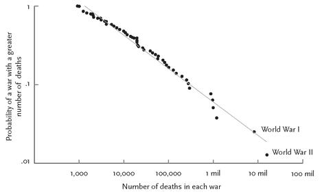
Could Richardson just have been lucky with his sample? Fifty years later the political scientist Lars-Erik Cederman plotted a newer set of numbers in a major dataset of battle deaths from the Correlates of War Project, comprising ninety-seven interstate wars between 1820 and 1997 (figure 5–8).
52
They too fall along a straight line in log-log coordinates. (Cederman plotted the data in a slightly different way, but that doesn’t matter for our purposes.)
53
52
They too fall along a straight line in log-log coordinates. (Cederman plotted the data in a slightly different way, but that doesn’t matter for our purposes.)
53
Scientists are intrigued by power-law distributions for two reasons.
54
One is that the distribution keeps turning up in measurements of things that you would think have nothing in common. One of the first power-law distributions was discovered in the 1930s by the linguist G. K. Zipf when he plotted the frequencies of words in the English language.
55
If you count up the instances of each of the words in a large corpus of text, you’ll find around a dozen that occur extremely frequently, that is, in more than 1 percent of all word tokens, including
the
(7 percent),
be
(4 percent),
of
(4 percent),
and
(3 percent), and
a
(2 percent).
56
Around three thousand occur in the medium-frequency range centered on 1 in 10,000, such as
confidence
,
junior
, and
afraid
. Tens of thousands occur once every million words, including
embitter
,
memorialize
, and
titular.
And hundreds of thousands have frequencies far less than one in a million, like
kankedort
,
apotropaic,
and
deliquesce
.

FIGURE 5–8.
Probabilities of wars of different magnitudes, 1820–1997
Probabilities of wars of different magnitudes, 1820–1997
Source:
Graph from Cederman, 2003, p. 136.
Graph from Cederman, 2003, p. 136.
Another example of a power-law distribution was discovered in 1906 by the economist Vilfredo Pareto when he looked at the distribution of incomes in Italy: a handful of people were filthy rich, while a much larger number were dirt-poor. Since these discoveries, power-law distributions have also turned up, among other places, in the populations of cities, the commonness of names, the popularity of Web sites, the number of citations of scientific papers, the sales figures of books and musical recordings, the number of species in biological taxa, and the sizes of moon craters.
57
57
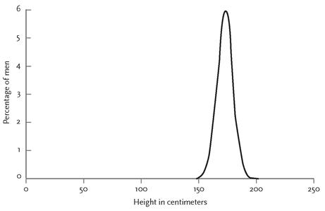
The second remarkable thing about power-law distributions is that they look the same over a vast range of values. To understand why this is so striking, let’s compare power-law distributions to a more familiar distribution called the normal, Gaussian, or bell curve. With measurements like the heights of men or the speeds of cars on a freeway, most of the numbers pile up around an average, and they tail off in both directions, falling into a curve that looks like a bell.
58
Figure 5–9 shows one for the heights of American males. There are lots of men around 5’10” tall, fewer who are 5’6” or 6’2”, not that many who are 5’0” or 6’8”, and no one who is shorter than 1’11” or taller than 8’11” (the two extremes in
The Guinness Book of World Records
). The ratio of the tallest man in the world to the shortest man in the world is 4.8, and you can bet that you will never meet a man who is 20 feet tall.

FIGURE 5–9.
Heights of males (a normal or bell-curve distribution)
Heights of males (a normal or bell-curve distribution)
Source:
Graph from Newman, 2005, p. 324.
Graph from Newman, 2005, p. 324.
But with other kinds of entities, the measurements don’t heap up around a typical value, don’t fall off symmetrically in both directions, and don’t fit within a cozy range. The sizes of towns and cities is a good example. It’s hard to answer the question “How big is a typical American municipality?” New York has 8 million people; the smallest municipality that counts as a “town,” according to
Guinness
, is Duffield, Virginia, with only 52. The ratio of the largest municipality to the smallest is 150,000, which is very different from the less-than-fivefold variation in the heights of men.
Guinness
, is Duffield, Virginia, with only 52. The ratio of the largest municipality to the smallest is 150,000, which is very different from the less-than-fivefold variation in the heights of men.
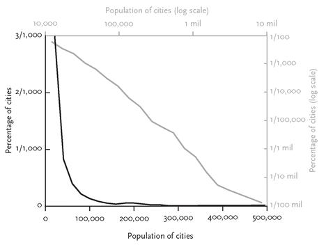
Also, the distribution of sizes of municipalities isn’t curved like a bell. As the black line in figure 5–10 shows, it is L-shaped, with a tall spine on the left and a long tail on the right. In this graph, city populations are laid out along a conventional linear scale on the black horizontal axis: cities of 100,000, cities of 200,000, and so on. So are the proportions of cities of each population size on the black vertical axis: three-thousandths (3/1000, or 0.003) of a percent of American municipalities have a population of exactly 20,000, two thousandths of a percent have a population of 30,000, one thousandth of a percent have a population of 40,000, and so on, with smaller and smaller proportions having larger and larger populations.
59
Now the gray axes at the top and the right of the graph stretch out these same numbers on a logarithmic scale, in which
orders of magnitude
(the number of zeroes) are evenly spaced, rather than the values themselves. The tick marks for population sizes are at ten thousand, a hundred thousand, a million, and so on. Likewise the proportions of cities at each population size are arranged along equal order-of-magnitude tick marks: one onehundredth (1/100, or 0.01) of a percent, one one-thousandth (1/1,000, or 0.001) of a percent, one ten-thousandth, and so on. When the axes are stretched out like this, something interesting happens to the distribution: the L straightens out into a nice line. And that is the signature of a power-law distribution.

FIGURE 5–10.
Populations of cities (a power-law distribution), plotted on linear and log scales
Populations of cities (a power-law distribution), plotted on linear and log scales
Other books
The Pursuit of Other Interests: A Novel by Jim Kokoris
The Undomestic Goddess by Sophie Kinsella
The Christmas Throwaway by RJ Scott
Perfect Harmony by Lodge, Sarah P.
Jethro 3: No Place Like Home by Chris Hechtl
Safe In His Arms (Manhunt) by Herron, Rita
Gold Raven by Keyes, Mercedes
Butterfly Garden by Annette Blair
The Beginning and the End by Naguib Mahfouz
Cataclysm by Karice Bolton
