101 Excel 2013 Tips, Tricks and Timesavers (38 page)
Read 101 Excel 2013 Tips, Tricks and Timesavers Online
Authors: John Walkenbach

Figure 95-2:
Four pie charts.
Simple line charts
Figure 95-3 shows four line charts, with all chart elements removed except for the series and the data labels. Importantly, all four charts use the same vertical scale values (0 through 50). If you allowed Excel to calculate the scale bounds, comparisons among the charts would be difficult.
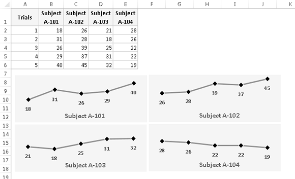
Figure 95-3:
Four line charts.
Using four charts makes it very easy to spot trends. The alternative, four series in a single chart, is shown in Figure 95-4.
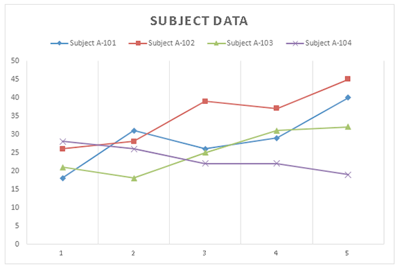
Figure 95-4:
A line chart with four series.
 Another option is to use Sparkline graphics — perhaps the ultimate in minimal charts. Sparklines are small graphics that display directly in a cell.
A gauge chart
Figure 95-5 shows a chart based on a single cell. It’s a pie chart set up to resemble a gauge. Although this chart displays only one value (entered in cell B1), it actually uses three data points (in A4:A6).
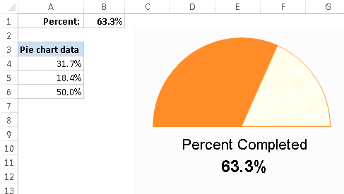
Figure 95-5:
This chart resembles a speedometer gauge and displays a value between 0 and 100 percent.
One slice of the pie — the slice at the bottom — always consists of 50 percent. I rotated the pie so that the 50-percent slice was at the bottom. Then I hid that slice by specifying No Fill and No Border for the data point. The other two slices are apportioned based on the value in cell B1. The formula in cell B4 is
=MIN(B1,100%)/2
This formula uses the MIN function to display the smaller of two values: either the value in cell B1 or 100 percent. It then divides this value by 2 because only the top half of the pie is relevant. Using the MIN function prevents the chart from displaying more than 100 percent.
The formula in cell A5 simply calculates the remaining part of the pie — the part to the right of the gauge’s
needle:
=50%-A4
The chart’s title (Percent Completed) was moved below the half-pie. A linked text box displays the percent completed value in cell B1.
Tip 96: Applying Chart Data Labels from a Range
Excel 2013 introduced a feature that’s been on the wish lists of many users for at least 15 years: the ability to specify an arbitrary range to be used as data labels for a series.
Figure 96-1 shows an XY scatter chart that uses data labels stored in a range to identify the data points. In previous versions of Excel, adding these data labels had to be done manually, or with the assistance of a macro.
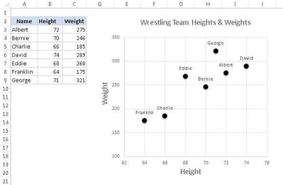
Figure 96-1:
Excel 2013 can add data labels from an arbitrary range.
To specify data labels from a range:
1.
Activate the chart and select the series that will contain data labels.
2.
Click the Chart Elements icon (to the right of the chart) and add data labels.
Excel displays default data labels for the series.
3.
Select the data labels and press Alt+1 to display the Format Data Labels task pane.
4.
In the Label Options section of Format Data Labels task pane, deselect any check boxes that are selected and select the Values from Cells check box.
The Data Label Range dialog box appears, as shown in Figure 96-2.
5.
Specify the range that contains the labels and click OK.
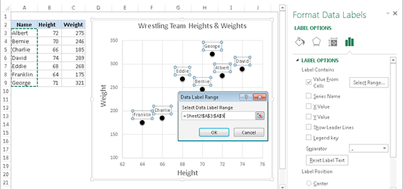
Figure 96-2:
Specifying a range to be used as data labels.
When the data labels are placed on the chart, you can fine-tune the location of each one, if necessary. Click one data label to select them all; then click a single data label and drag it to its new position.
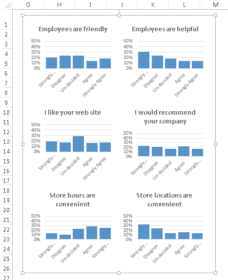
Tip 97: Grouping Charts and Other Objects
If you create a number of charts, you may want to be able to work with them all as a group. For example, move them all, or resize them all. The solution is to group the charts into a single object.
Grouping charts
Start by creating the charts that you’d like to group and then arrange and size them as you like. Then press Shift and click each chart. When the charts are selected, right-click any one of them and choose Group⇒Group.
Figure 97-1 shows six charts that have been grouped. The group name (
Group 14
) appears in the Name box.
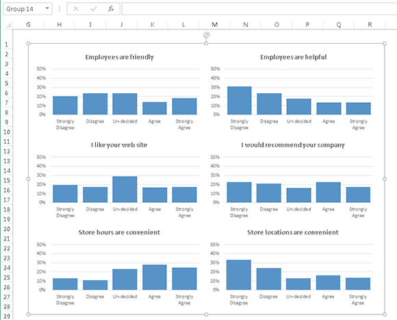
Figure 97-1:
Six charts, combined into a group.
To move the entire group, click anywhere in the group and drag.
If the group is already selected when you click and drag, you will select a particular chart in the group and change its position. Most of the time, this is not what you want. Press Ctrl+Z to undo.
To resize the entire group, click anywhere in the group to select the group. Then drag any of the resizing handles that appear in the group’s outline.
Figure 97-2 shows the grouped charts after I resized the entire group.