CSS: The Definitive Guide, 3rd Edition (35 page)
Read CSS: The Definitive Guide, 3rd Edition Online
Authors: Eric A. Meyer
Tags: #COMPUTERS / Web / Page Design

Once
you've assigned a border a style, the next step is to give it some width using the
propertyborder-width.
border-width
- Values:
[
thin|medium|thick|]{1,4} | inherit- Initial value:
Not defined for shorthand properties
- Applies to:
All elements
- Inherited:
No
- Computed value:
See individual properties (
border-top-style, etc.)
You can also use one of its cousin properties.
border-top-width, border-right-width, border-bottom-width, border-left-width
- Values:
thin|medium|thick|| inherit- Initial value:
medium- Applies to:
All elements
- Inherited:
No
- Computed value:
Absolute length;
0if the style of
the border isnoneorhidden
Each of these properties is used to set the width on a specific border side, of
course, just as with the margin properties.
As of CSS2.1, border widths still cannot be given percentage values, which is
rather a shame.
There are four ways to assign width to a border: you can give it a length value
such as4pxor0.1emor use one of three keywords. These keywords arethin,medium(the
default value), andthick. These keywords don't
necessarily correspond to any particular width but are simply defined in relation to
one another. According to the specification,thickis always wider thanmedium, which is in turn
always wider thanthin.
However, the exact widths are not defined, so one user agent could set them to be
equivalent to5px,3px, and2px, while another sets them
to be3px,2px,
and1px. No matter what width the user agent uses
for each keyword, it will be the same throughout the document, regardless of where
the border occurs. So, ifmediumis the same as2px, then a medium-width border will always be
two pixels wide, whether the border surrounds anh1or apelement.
Figure 8-25
illustrates one way to handle
these three keywords, as well as how they relate to each other and to the content
they surround.

Figure 8-25. The relation of border-width keywords to one another
Let's suppose a paragraph has margins, a background color, and a border style set:
p {margin: 5px; background-color: silver;
border-style: solid;}
By default, the border's width ismedium. You
can change that easily enough:
p {margin: 5px; background-color: silver;
border-style: solid; border-width: thick;}
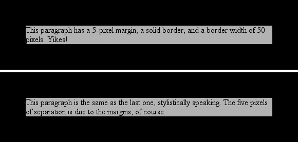
Of course, border widths can be taken to fairly ridiculous extremes, such as
setting 50-pixel borders, as depicted in
Figure
8-26
:
p {margin: 5px; background-color: silver;
border-style: solid; border-width: 50px;}

Figure 8-26. Really wide borders
It's also possible to set widths for individual sides, using two familiar methods.
The first is to use any of the specific properties mentioned at the beginning of the
section, such asborder-bottom-width. The other
way is to use value replication inborder-width,
which is illustrated in
Figure 8-27
:
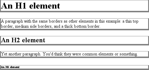
h1 {border-style: dotted; border-width: thin 0;}
p {border-style: solid; border-width: 15px 2px 7px 4px;}

Figure 8-27. Value replication and uneven border widths
So far, we've talked only about using a visible border
style such assolidoroutset. Let's consider what happens when you setborder-styletonone:
p {margin: 5px; border-style: none; border-width: 20px;}
Even though the border's width is20px, the
style is set tonone. In this case, not only
does the border's style vanish, so does its width. The border simply ceases to be.
Why?
If you'll remember, the terminology used earlier in the chapter was that a
border with a style ofnonedoes not exist.
Those words were chosen very carefully because they help explain what's going on
here. Since the border doesn't exist, it can't have any width, so the width is
automatically set to0(zero), no matter what
you try to define. After all, if a drinking glass is empty, you can't really
describe it as being half-full of nothing. You can discuss the depth of a glass's
contents only if it has actual contents. In the same way, talking about the width
of a border makes sense only in the context of a border that exists.
This is important to keep in mind because it's a common mistake to forget to
declare a border style. This leads to all kinds of author frustration because, at
first glance, the styles appear correct. Given the following rule, though, noh1element will have a border of any kind,
let alone one that's 20 pixels wide:
h1 {border-width: 20px;}
Since the default value ofborder-styleisnone, failing to declare a style is exactly
the same as declaringborder-style:none. Therefore, if you want a border to appear, you
must declare a border style.
Compared to the other
aspects of borders, setting the color is pretty easy. CSS uses the single propertyborder-color, which can accept up to four color
values at one time.
border-color
- Values:
[
| transparent]{1,4} |inherit- Initial value:
Not defined for shorthand properties
- Applies to:
All elements
- Inherited:
No
- Computed value:
See individual properties (
border-top-color, etc.)
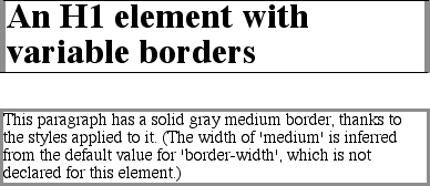
If there are less than four values, value replication takes effect. So if you wanth1elements to have thin black top and bottom
borders with thick gray side borders, and medium gray borders aroundpelements, the following markup will suffice. The
result is illustrated in
Figure 8-28
:
h1 {border-style: solid; border-width: thin thick; border-color: black gray;}
p {border-style: solid; border-color: gray;}

Figure 8-28. Borders have many aspects
A single color value will be applied to all four sides, of course, as with the
paragraph in the previous example. On the other hand, if you supply four color
values, you can get a different color on each side. Any type of color value can be
used, from named colors to hexadecimal and RGB values:
p {border-style: solid; border-width: thick;
border-color: black rgb(25%,25%,25%) #808080 silver;}
As I mentioned earlier in the chapter, if you don't declare a color, the default
color is the foreground color of the element. Thus, the following declaration will be
displayed as shown in
Figure 8-29
:
p.shade1 {border-style: solid; border-width: thick; color: gray;}
p.shade2 {border-style: solid; border-width: thick; color: gray;
border-color: black;}

Figure 8-29. Border colors based on the element's foreground and the value of the
border-color property
The result is that the first paragraph has a gray border, having taken the valuegrayfrom the foreground color of the
paragraph. The second paragraph, however, has a black border because that color was
explicitly assigned usingborder-color.
There are single-side border-color properties as well. They work in much the same
way as the single-side properties for style and width. One way to give headings a
solid black border with a solid gray right border is as follows:
h1 {border-style: solid; border-color: black; border-right-color: gray;}
border-top-color, border-right-color, border-bottom-color, border-left-color
- Values:
| transparent|inherit- Initial value:
The value of
colorfor the
element- Applies to:
All elements
- Inherited:
No
- Computed value:
If no value is specified, use the computed value of the property
colorfor the same element;
otherwise, as specified
borders
As you remember, if a border has no style, then it
has no width. There are, however, situations where you'll want to create an
invisible border. This is where the border color valuetransparent(introduced in CSS2) comes in. This value is used to
create an invisible border that has width.
Let's say you want a set of
three links to have borders that are invisible by default, but appear inset when
the link is hovered. You can accomplish this by making the borders transparent in
the nonhovered
case:
a:link, a:visited {border-style: solid; border-width: 5px;
border-color: transparent;}
a:hover {border-color: gray;}
This
has the effect shown in
Figure
8-30
.

Figure 8-30. Using transparent borders
In a sense,transparentlets you use borders as if they were extra padding, with
the additional benefit of being able to make them visible should you so choose.
They act as padding because the background of the element extends into the border
area, assuming there is a visible background.
Support fortransparentis not present in
versions of IE/Win before IE7. In the affected versions, IE will instead base
the border color on the element'scolorvalue.
