CSS: The Definitive Guide, 3rd Edition (37 page)
Read CSS: The Definitive Guide, 3rd Edition Online
Authors: Eric A. Meyer
Tags: #COMPUTERS / Web / Page Design

Between the borders and the content area, we find the
padding of the element box. It is no surprise that the simplest property used to affect
this area is calledpadding.
padding
- Values:
[
| ]{1,4} | inherit- Initial value:
Not defined for shorthand elements
- Applies to:
All elements
- Inherited:
No
- Percentages:
Refer to the width of the containing block
- Computed value:
See individual properties (
padding-top, etc.)- Note:
Padding can never be negative
As you can see, this property accepts any length value or a percentage value. So if
you want allh1elements to have 10 pixels of padding
on all sides, it's this easy:
h1 {padding: 10px; background-color: silver;}
On the other hand, you might wanth1elements to
have uneven padding andh2elements to have regular padding:
h1 {padding: 10px 0.25em 3ex 3cm;} /* uneven padding */
h2 {padding: 0.5em 2em;} /* values replicate to the bottom and left sides */
It's a little tough to see the padding if that's all you add, though, so let's
include a background color, as shown in
Figure
8-38
:
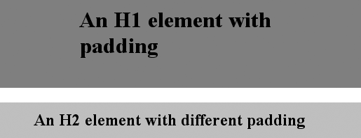
h1 {padding: 10px 0.25em 3ex 3cm; background: gray;}
h2 {padding: 0.5em 2em; background: silver;}

Figure 8-38. Uneven padding with background colors
As
Figure 8-38
illustrates, the
background of an element extends into the padding. As we discussed before, it also
extends to the outer edge of the border, but the background has to go through the
padding before it even gets to the border.
By default, elements have no padding. The separation between paragraphs, for example,
has traditionally been enforced with margins alone. It's also the case that, without
padding, a border on an element will come very close to the content of the element
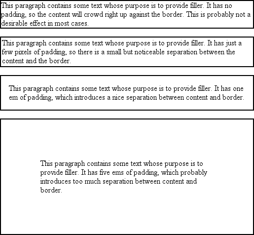
itself. Thus, when putting a border on an element, it's usually a good idea to add some
padding as well, as
Figure 8-39
illustrates.

Figure 8-39. The effect of padding on bordered block-level elements
Even if you aren't using borders, padding can behave in unique ways. Consider the
following rules:
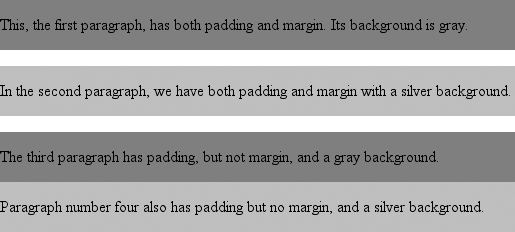
p {margin: 1em 0; padding: 1em 0;}
p.one, p.three {background: gray;}
p.two, p.four {background: silver;}
p.three, p.four {margin: 0;}
Here we have a situation where all four paragraphs have1emtop and bottom padding, and two out of four have1emtop and bottom margins. The results of this style sheet are shown in
Figure 8-40
.

Figure 8-40. Differences between padding and margins
The first two paragraphs have their padding and are separated by one em of space
since their margins collapse. The second and third paragraphs are also separated by one
em of space because of the bottom margin on the second paragraph. The third and fourth
paragraphs are not separated because they have no margins. Note the distance between the
content area of the last two paragraphs, however: it's two ems because padding does not
collapse. The differing background colors show where one ends and the other begins.
Therefore, using padding to separate the content areas of elements can be trickier
than using margins, although it's not without its rewards. For example, to keep
paragraphs the traditional "one blank line" apart with padding, you'd have to write:
p {margin: 0; padding: 0.5em 0;}
The half-em top and bottom padding of each paragraph butt up against each other and
total one em of separation. Why would you bother to do this? Because then you could
insert separation borders between the paragraphs, should you so choose, and side borders
will form the appearance of a solid line. Both of these effects are illustrated in
Figure 8-41
:
p {margin: 0; padding: 0.5em 0; border-bottom: 1px solid gray;
border-left: 3px double black;}

Figure 8-41. Using padding instead of margins
As I mentioned earlier, it's possible to set percentage values for the padding of
an element. As with margins, percentage padding values are computed in relation to
the width of the parent element, so they can change if the parent element's width
changes. For example, assume the following, which is illustrated in
Figure 8-42
:
p {padding: 10%; background-color: silver;}

This paragraph is contained within a DIV that has a width of 200 pixels,
so its padding will be 10% of the width of the paragraph's parent element.
Given the declared width of 200 pixels, the padding will be 20 pixels on
all sides.


This paragraph is contained within a DIV with a width of 100 pixels,
so its padding will still be 10% of the width of the paragraph's parent.
There will, therefore, be half as much padding on this paragraph as that
on the first paragraph.

Figure 8-42. Padding, percentages, and the widths of the parent
Note that the top and bottom padding are consistent with the right and left
padding; in other words, the percentage of top and bottom padding is calculated with
respect to the element's width, not its height. You've seen this before, of course—in
the earlier section "
Margins
," in case
you don't remember—but it is worth reviewing again, just to see how it
operates.
You guessed it: there are properties that let you set the
padding on a single side of the box without affecting the others.
padding-top, padding-right, padding-bottom, padding-left
- Values:
| | inherit- Initial value:
0- Applies to:
All elements
- Inherited:
No
- Percentages:
Refer to the width of the containing block
- Computed value:
For percentage values, as specified; for length values, the absolute
length- Note:
Padding can never be negative
These properties operate as you'd expect. For example, the following two rules
will give the same amount of padding:
h1 {padding: 0 0 0 0.25in;}
h2 {padding-left: 0.25in;}
There is one major difference between margins and padding when it comes to inline
elements. To illustrate, let's start with right and left padding. Here, if you set
values for the left or right padding, they will be visible, as
Figure 8-43
demonstrates:
strong {padding-left: 10px; padding-right: 10px; background: silver;}

Figure 8-43. Padding on an inline nonreplaced element
Note the extra space background that appears on either end of the inline
nonreplaced element. There's your padding. As with margins, the left padding is
applied to the beginning of the element, and the right padding to the end of it;
however, padding is
not
applied to the right and left side of
each line. The same holds true for replaced elements as well, although of course such
elements don't break across lines.
In theory, an inline
nonreplaced element
with a background color and padding could have a background that extends above and
below the element:
strong {padding-top: 0.5em; background-color: silver;}
Figure 8-44
gives you an idea of what
this might look like.

Figure 8-44. More padding on an inline nonreplaced element
The line height isn't changed, of course, but since padding does extend the
background, it should be visible, right? Right. It is visible, and it overlaps the
lines that come before—which is the expected result.
