CSS: The Definitive Guide, 3rd Edition (41 page)
Read CSS: The Definitive Guide, 3rd Edition Online
Authors: Eric A. Meyer
Tags: #COMPUTERS / Web / Page Design

Finally, we turn to length values for
positioning. When you supply lengths for the position of the origin image, they
are interpreted as offsets from the top-left corner of the element's padding area.
The offset point is the top-left corner of the origin image; thus, if you set the
values20px 30px, the top-left corner of the
origin image will be 20 pixels to the right of, and 30 pixels below, the top-left
corner of the element's padding area, as shown in
Figure 9-25
:
p {background-image: url(yinyang.gif);
background-repeat: no-repeat;
background-position: 20px 30px;
border: 1px dotted gray;}
Figure 9-25. Offsetting the background image using length measures
This is quite different from percentage values because the offset is simply
from one top-left corner to another. In other words, the top-left corner of the
origin image lines up with the point specified in thebackground-positiondeclaration. You can combine length and
percentage values, though, to get a "best of both worlds" effect. Let's say you
need a background image that extends all the way to the right side of an element
and 10 pixels down from the top, as illustrated in
Figure 9-26
. As always, the horizontal
value comes first:
p {background-image: url(bg23.gif);
background-repeat: no-repeat;
background-position: 100% 10px;
border: 1px dotted gray;}

Figure 9-26. Mixing percentages and length values
In versions of CSS prior to 2.1, you could
not
mix
keywords with other values. Thus,top 75%was not valid, and if you used a keyword, you were stuck using only keywords.
CSS2.1 changed this to make authoring easier and to keep up with other browsers
that had already allowed it.
If you're using lengths or percentages, you can use negative values to pull the
origin image outside of the element's background area. Consider the example with
the very large yin-yang symbol for a background. At one point, you centered it,
but what if you only want part of it visible in the top-left corner of the
element's padding area? No problem, at least in theory.
First, assume that the origin image is 300 pixels tall by 300 pixels wide.
Then, assume that only the bottom right third of it should be visible. You can get
the desired effect (shown in
Figure
9-27
) like this:
p {background-image: url(bigyinyang.gif);
background-repeat: no-repeat;
background-position: -200px -200px;
border: 1px dotted gray;}

Figure 9-27. Using negative length values to position the origin image
Or, say you want just the right half of it to be visible and centered within
the element:
p {background-image: url(bigyinyang.gif);
background-repeat: no-repeat;
background-position: -150px 50%;
border: 1px dotted gray;}
Negative percentages are also possible in theory, although there are two issues
involved. The first is the limitations of user agents, which may not recognize
negative values forbackground-position. The other is that negative
percentages are somewhat interesting to calculate. The origin image and the
element are likely to be very different sizes, for one thing, and that can lead to
unexpected effects. Consider, for example, the situation created by the following
rule and illustrated in
Figure 9-28
:
p {background-image: url(pix/bigyinyang.gif);
background-repeat: no-repeat;
background-position: -10% -10%;
border: 1px dotted gray;
width: 500px;}
Figure 9-28. Varying effects of negative percentage values
The rule calls for the point outside the origin image defined by-10% -10%to be aligned with a similar point for each
paragraph. The image is 300 × 300 pixels, so we know its alignment point can be
described as 30 pixels above the top of the image, and 30 pixels to the left of
its left edge (effectively-30pxand-30px). The paragraph elements are all the same width
(500px), so the horizontal alignment point
is 50 pixels to the left of the left edge of their padding areas. This means that
each origin image's left edge will be 20 pixels to the left of the left padding
edge of the paragraphs. This is because the-30pxalignment point of the images lines up with the-50pxpoint for the paragraphs. The difference
between the two is 20 pixels.
The paragraphs are of differing heights, however, so the vertical alignment
point changes for each paragraph. If a paragraph is 300 pixels high, to pick a
semi-random example, then the top of the origin image will line up exactly with
the top of the element's padding area, because both will have vertical alignment
points of-30px. If a paragraph is 50 pixels
tall, then its alignment point would be-5pxand the top of the origin image will actually be 25 pixels
below
the top of the padding area.
The same issues can arise with positive percentage values (imagine what would
happen if you aligned an origin image to the bottom of an element shorter than the
image), so this isn't to say that you shouldn't use negative values. It's just a
reminder that there are, as always, issues to consider.
Throughout this section, every example has had a repeat value ofno-repeat. The reason for this is simple: with only a
single background image, it's much easier to see how positioning affects the
placement of the first background image. You don't have to prevent the background
image from repeating, though:
p {background-image: url(bigyinyang.gif);
background-position: -150px 50%;
border: 1px dotted gray;}
So, with the background repeating, you can see from
Figure 9-29
that the tiling
pattern starts
with the position specified bybackground-position.
Figure 9-29. Use of the background-position property sets the origin of the tiling
pattern
This illustrates once more the concept of the origin image,
which is very important to understanding the
next section.
In the previous section on repetition, we explored the valuesrepeat-x,repeat-y,
andrepeat, and how they affect the tiling of
background images. In each case, however, the tiling pattern always started from the
top-left corner of the containing element (e.g.,p). This isn't a requirement, of course; as we've seen, the default values
forbackground-positionare0% 0%. So, unless you change the position of the origin
image, that's where the tiling starts. Now that you know how to change the position
of the origin image, though, you need to figure out how user agents will handle the
situation.
It's easiest to show an example and then explain it. Consider the following
markup, which is illustrated in
Figure
9-30
:
p {background-image: url(yinyang.gif);
background-position: center;
border: 1px dotted gray;}
p.c1 {background-repeat: repeat-y;}
p.c2 {background-repeat: repeat-x;}
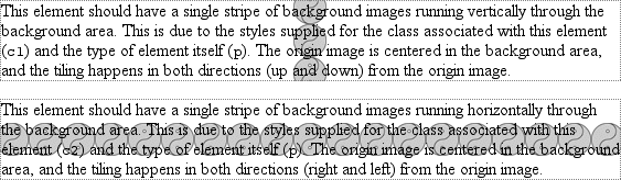
Figure 9-30. Centering the origin image and repeating it
So there you have it: stripes running through the center of the elements. It may
look wrong, but it isn't.
The examples shown in
Figure 9-30
are
correct because the origin image has been placed in the center of the firstpelement and then tiled along the
y
-axis
in both directions—
in other words,
both up
and
down. For the second paragraph, the images are
repeated to the right and left.
Therefore, setting a large image in the center of thepand then letting it fully repeat will cause it to tile in all
four
directions: up, down, left, and right. The only
differencebackground-positionmakes is in
determining where the tiling starts.
Figure
9-31
shows the difference between tiling from the center of an element and
from its top-left corner.
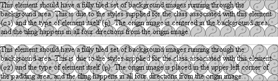
Figure 9-31. The difference between centering a repeat and starting it from the top left
Note the differences along the edges of the element. When the background repeats
from the center, as in the first paragraph, the grid of yin-yang symbols is centered
within the element, resulting in consistent "clipping" along the edges. In the second
paragraph, the tiling begins at the top-left corner of the padding area, so the
clipping is not consistent. The variations may seem subtle, but you'll likely need to
use both approaches at some point in your design career.
In case you're wondering, there is no way to control the repeat any more than
we've already discussed. There is norepeat-left,
for example, although such a value could be added in some future version of CSS. For
now, you get full tiling, horizontal tiling, vertical tiling, or no tiling at
all.