CSS: The Definitive Guide, 3rd Edition (42 page)
Read CSS: The Definitive Guide, 3rd Edition Online
Authors: Eric A. Meyer
Tags: #COMPUTERS / Web / Page Design

So, now you can place the origin image for the
background anywhere in the background of an element, and you can control (to a
degree) how it tiles. As you may already have realized, though, placing an image in
the center of thebodyelement may mean, given a
sufficiently long document, that the background image won't be initially visible to
the reader. After all, a browser provides only a window onto the document. If the
document is too long to be displayed in the window, then the user can scroll back and
forth through the document. The center could be two or three "screens" below the
beginning of the document, or just far enough down to push most of the origin image
beyond the bottom of the browser window.
Furthermore, even if you assume that the origin image is initially visible, it
always scrolls with the document—it'll vanish every time a user scrolls beyond the
image's location. Never fear: there is a way to prevent this scrolling.
background-attachment
- Values:
scroll|fixed|inherit- Initial value:
scroll- Applies to:
All elements
- Inherited:
No
- Computed value:
As specified
Using the propertybackground-attachment, you
can declare the origin image to befixedwith
respect to the viewing area and therefore immune to the effects of scrolling:
body {background-image: url(bigyinyang.gif);
background-repeat: no-repeat;
background-position: center;
background-attachment: fixed;}
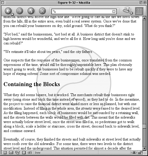
Doing this has two immediate effects, as you can see from
Figure 9-32
. The first is that the origin
image does not scroll along with the document. The second is that the placement of
the origin image is determined by the size of the viewing area, not the size (or
placement within the viewing area) of the element that contains it.

Figure 9-32. Nailing the background in place
In a web browser, the viewing area can change as the user resizes the browser's
window. This will cause the background's origin image to shift position as the window
changes size.
Figure 9-33
depicts several
views of the same document. So, in a certain sense, the image isn't fixed in place,
but it will remain fixed as long as the viewing area isn't resized.

Figure 9-33. The centering continues to hold
There is only one other value forbackground-attachment: the default valuescroll. As you'd expect, this causes the background to scroll along with
the rest of the document when viewed in a web browser, and it doesn't necessarily
change the origin image's position as the window is resized. If the document width is
fixed (perhaps by assigning an explicit width to thebodyelement), then resizing the viewing area won't affect the placement
of a scroll-attachment origin image at all.
effects
In technical terms, when a background image has
beenfixed, it is positioned with respect to
the viewing area, not the element that contains it. However, the background will
be visible only within its containing element. This has a rather interesting
consequence.
Let's say you have a document with a tiled background
that actually looks like it's tiled, and anh1element with the same pattern, only in a different color. Both thebodyandh1elements are set to havefixedbackgrounds,
resulting in something like
Figure
9-34
:
body {background-image: url(grid1.gif); background-repeat: repeat;
background-attachment: fixed;}
h1 {background-image: url(grid2.gif); background-repeat: repeat;
background-attachment: fixed;}

Figure 9-34. Perfect alignment of backgrounds
How is this perfect alignment possible? Remember, when a background isfixed, the origin element is positioned with
respect to the viewport. Thus, both background patterns begin tiling from the
top-left corner of the viewport, not the individual elements. For thebody, you can see the entire repeat pattern. For theh1, however, the only place you can see its
background is in the padding and content of theh1itself. Since both background images are the same size, and they
have precisely the same origin, they appear to "line up," as shown in
Figure 9-34
.
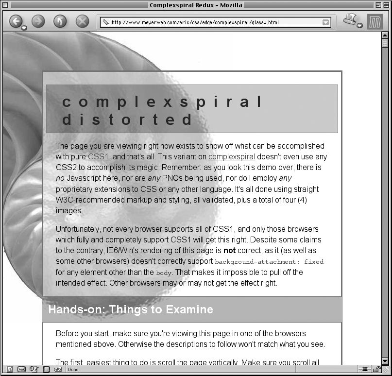
This capability
can be used to create some very sophisticated effects. One of the most famous
examples is the "complexspiral distorted" demonstration (
http://www.meyerweb.com/eric/css/edge/complexspiral/glassy.html
), which
is illustrated in
Figure
9-35
.

Figure 9-35. The complexspiral distorted
The visual effects are created by assigning different fixed-attachment
background images to non-bodyelements. The
entire demo is driven by one HTML document, four JPEG images, and a style sheet.
Because all four images are positioned in the top-left corner of the browser
window, but are visible only where they intersect with their elements, the images
effectively interleave to create the illusion of translucent rippled
glass.
Internet Explorer for Windows up through IE6 does not properly handle
fixed-attachment backgrounds on non-bodyelements. In other words, you get the expected effect for a fixedbodybackground, but not for other elements. This
wrecks the alignment effects seen in
Figure 9-34
and
Figure
9-35
. Internet Explorer 7 supports fixed-attachment backgrounds for all
elements.
It is also the case that in paged media, such as printouts, every
page generates its own viewport. Therefore, a fixed-attachment background should
appear on every page of the printout. This could be used for effects such as
watermarking all the pages in a document, for example. The problems are twofold:
there is no way to force background images to print with CSS, and not all browsers
properly handle the printing of fixed-attachment backgrounds.
Just as with the font
properties, the background properties can all be brought together in a single
shorthand property:background. This property can
take a single value from each of the other background properties, in literally any
order.
background
- Values:
[
|| || || || ] | inherit- Initial value:
Refer to individual properties
- Applies to:
All elements
- Inherited:
No
- Percentages:
Values are allowed for
- Computed value:
See individual properties
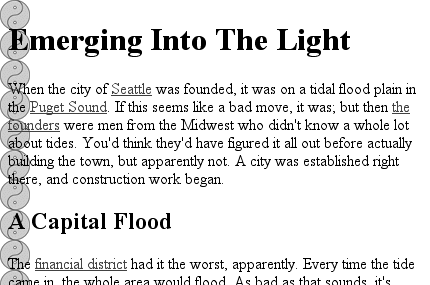
Therefore, the following statements are all equivalent and will have the effect
shown in
Figure 9-36
:
body {background-color: white; background-image: url(yinyang.gif);
background-position: top left; background-repeat: repeat-y;
background-attachment: fixed;}
body {background: white url(yinyang.gif) top left repeat-y fixed;}
body {background: fixed url(yinyang.gif) white top left repeat-y;}
body {background: url(yinyang.gif) white repeat-y fixed top left;}

Figure 9-36. Using shorthand
Actually, there is one slight restriction on how the values are ordered inbackground: if you have two values forbackground-position, they must appear together and, if
they are length or percentage values, they must be ordered horizontal first, then
vertical. This probably isn't a surprise, but it is important to remember.
As is the case for shorthand properties, if you leave out any values, the defaults
for the relevant properties are filled in automatically. Thus, the following two are
equivalent:
body {background: white url(yinyang.gif;}
body {background: white url(yinyang.gif) top left repeat scroll;}
Even better, there are no required values forbackground—as long as at least one value is present, you can omit all the
rest. Therefore, it's possible to set just the background color using the shorthand
property, which is a very common practice:
body {background: white;}
This is perfectly legal, and in some ways preferred, given the reduced number of
keystrokes. In addition, it has the effect of setting all of the other background
properties to their defaults, which means thatbackground-imagewill be set tonone. This helps ensure readability by preventing other rules (for
example, in the reader style sheet) from setting an image in the background.
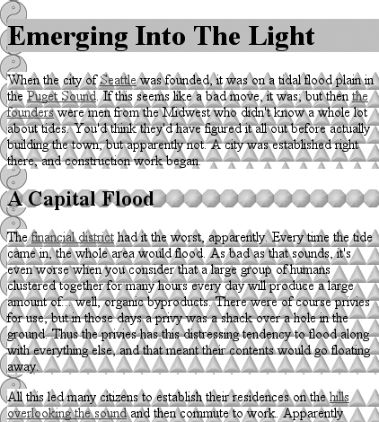
Any of the following rules are also legal, as illustrated in
Figure 9-37
:
body {background: url(yinyang.gif) bottom left repeat-y;}
h1 {background: silver;}
h2 {background: url(h2bg.gif) center repeat-x;}
p {background: url(parabg.gif);}

Figure 9-37. Applying many backgrounds to one document
One final reminder:backgroundis a shorthand
property, and, as such, its default values can obliterate previously assigned values
for a given element. For example:
h1, h2 {background: gray url(thetrees.jpg) center repeat-x;}
h2 {background: silver;}
Given these rules,h1elements will be styled
according to the first rule.h2elements will be
styled according to the second, which means they'll just have a flat silver
background. No image will be applied toh2backgrounds, let alone centered and repeated horizontally. It is more likely that the
author meant to do this:
h1, h2 {background: gray url(trees.jpg) center repeat-x;}
h2 {background-color: silver;}
This lets the background color be changed without wiping out all the other
values.
