HTML The Definitive Guide (142 page)
Read HTML The Definitive Guide Online
Authors: Chuck Musciano Bill Kennedy


15.3 Custom Bullets
One common use of the definition list has nothing to do with definitions, but instead deals with adding custom bullets to an otherwise unordered list. In this trick, leave the
the sidebar
""
For example:
 Pickled Kumquats
  'Quats and 'Kraut
  'Quatshakes
  Liver with Fried 'Quats
The fancier list is shown in Figure 15.1
.
Figure 15.1: Custom bullets for unordered lists
Keep in mind that this trick works well only if your list items are short enough to not wrap within the browser window. If the item does wrap, the next line will start aligned with the left edge of the bullet, not the left edge of the text, as you might hope.
15.2 Trivial or Abusive?
15.4 Tricks with Tables


15.4 Tricks with Tables
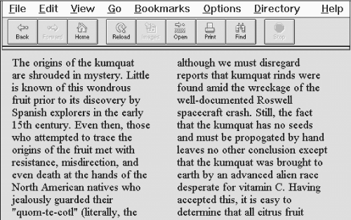
Enough with the cheap tricks. On to some really good ones: tricks with the HTML
| Copy for column 1... | Copy for column 2... |
See
Figure 15.2
for the results.
Figure 15.2: A simple two-column layout
The one thing the browsers won't do is automatically balance the text in the columns, resulting in adjacent columns of approximately the same length. You'll have to experiment with your document, manually shifting text from one column to another until you achieve a nicely balanced page.
Keep in mind, though, that users may resize their display windows and the columns' contents will shift accordingly. So don't spend a lot of time getting the last sentences of each column to line up exactly; they're bound to be skewed in other browser window widths.
Of course, you can easily convert the example layout to three or more columns by dividing the text among more cells in the table. But keep in mind that pages with more than three columns may prove difficult to read on small displays where the actual column width might be quite small.
