Revolution in the Valley: The Insanely Great Story of How the Mac Was Made (45 page)
Read Revolution in the Valley: The Insanely Great Story of How the Mac Was Made Online
Authors: Andy Hertzfeld
Tags: #Business & Economics, #General, #Industries, #Computers & Information Technology, #Workplace Culture, #Research & Development, #Computers, #Operating Systems, #Macintosh, #Hardware

But Burrell had never done a custom chip before. He was counting on experts working with our partner VLSI Design, mainly Doug Fairbairn and Martin Haeberli, who successfully made a custom chip for an optical mouse, but they had never really worked against commercial deadlines, and a lot of tension began to build as the schedule started to slip.
Some more of the details of the Integrated Burrell Machine project are told elsewhere, but eventually, after the first silicon from an early version didn't work as expected, Burrell became frustrated and decided that it was too risky to continue. He realized that he could do a design with PALs that achieved most of the gains from the Integrated Burrell Machine, without needing the custom chip. So, in August 1982, he quickly designed the fifth iteration of the Macintosh, the one that actually shipped in January 1984, by adapting his earlier PAL-based design to one that had a 16-bit memory bus with a 512 by 342 display and some other features invented for the custom chip.
Busy Being Born
by Andy Hertzfeld
The Macintosh User Interface wasn't designed all at once; it was actually the result of almost five years of experimentation and development at Apple, starting with graphics routines that Bill Atkinson began writing for Lisa in late 1978. Like any evolutionary process, there were lots of false starts and blind alleys along the way. It's a shame that these tend to be lost to history, since there is a lot that we can learn from them.
Fortunately, the main developer of the user interface, Bill Atkinson, was an avid, lifelong photographer, and he had the foresight to document the incremental development of the Lisa User Interface (which more or less became the Mac UI after a few tweaks) with a series of photographs. He kept a Polaroid camera by his computer, and took a snapshot each time the user interface reached a new milestone, which he collected in a loose-leaf notebook. I'm excited to be able to reproduce and annotate them here, since they offer a fascinating, behind the scenes glimpse of how the Mac's breakthrough user interface was crafted.
The images are scaled so they easily fit onto a typical screen, but you can click on them for larger versions that show more detail.
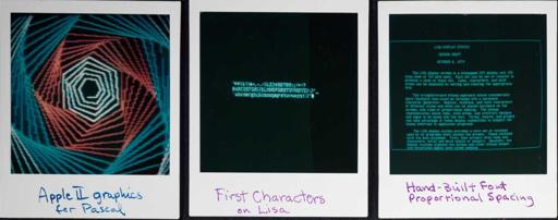
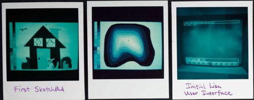
The first picture in Bill's notebook is from Bill's previous project, just before starting work on the Lisa: Apple II Pascal. The high performance graphics routines that Bill wrote for Apple II Pascal in the fall of 1978 led right into his initial work on the Lisa.
The center and right photos, from the spring of 1979, were rendered on the actual Lisa Display system, featuring the 720 by 360 resolution that remained constant all the way through to the shipping product. No Lisa existed yet; these were done on a wired wrapped prototype card for the Apple II. The middle picture shows the very first characters ever displayed on a Lisa screen; note the variable-width characters. The rightmost picture has more proportional text, about the Lisa display system, rendered in a font that Bill designed by hand.
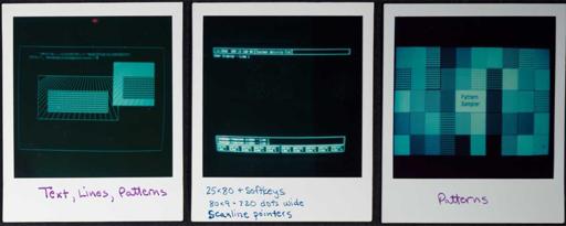
The leftmost picture illustrates the first graphics primitives that Bill wrote for LisaGraf (which was eventually renamed to QuickDraw in 1982) in the spring of 1979, rendering lines and rectangles filled with 8x8 one-bit patterns. The power and flexibility of the patterns are illustrated in the rightmost shot, which were our poor man's substitute for color, which was too expensive (at the required resolution) in the early eighties.
The middle picture depicts the initial user interface of the Lisa, based on a row of "soft-keys", drawn at the bottom of the screen, that would change as a user performed a task. These were inspired from work done at HP, where some of the early Lisa designers hailed from.
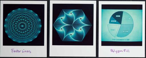
Here are some more demos of the initial graphics routines. Bill made line-drawing blindingly fast with an algorithm that plotted "slabs" of multiple pixels in a single memory access. The rightmost picture shows how non-rectangular areas could be filled with patterns, too.
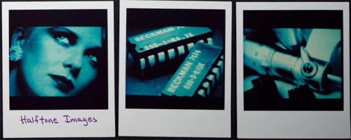
Here are some scanned images, showing off Lisa's impressive resolution for the time, which Bill scanned using a modified fax machine. He was always tweaking the half-toning algorithm, which mapped gray scales into patterns of monochrome dots. Bill had made versions of these for the Apple II that Apple distributed on demo disks, but these higher resolution Lisa versions were much more impressive.
The left and middle pictures show off the first sketch program, an early ancestor of MacPaint, that allowed mouse-based drawing with patterns and a variety of brush shapes. I think these are perhaps a bit out of sequence, done in early 1980. The rightmost picture shows the final soft-key based UI, which is about to change radically...
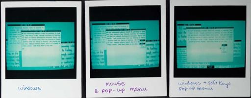
...into a mouse/windows based user interface. This is obviously the biggest single jump in the entire set of photographs, and the place where I most wish that Bill had dated them. It's tempting to say that the change was caused by the famous Xerox PARC visit, which took place in mid-December 1979, but Bill thinks that the windows predated that, although he can't say for sure.
The leftmost picture shows different fonts in overlapping windows, but we didn't have a window manager yet, so they couldn't be dragged around. The middle window shows the first pop-up menu, which looks just like SmallTalk, as does the simple, black title bar. The rightmost picture shows that we hadn't given up on the soft-keys yet.
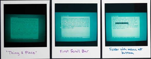
By now, it's the spring of 1980 and things are starting to happen fast. The leftmost picture shows the earliest text selection, using a different highlighting technique than we ended up with. It also shows a "command bar" at the bottom of the screen, and that we had started to use non-modal commands (make a selection, then perform an action, instead of the other way around).
The middle picture shows the very first scroll bar, on the left instead of the right, before the arrow scroll buttons were added. It also has a folder-tab style title bar, which would persist for a while before being dropped (Bill says that at that point, he was confusing documents and folders). The right most photo shows that we adopted the inverse selection method of text highlighting.
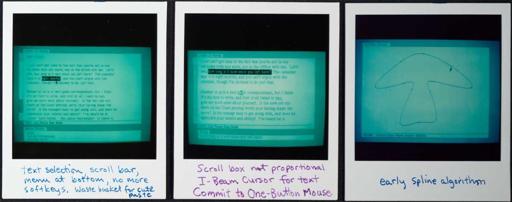
By the summer of 1980, we had dropped the soft-keys. The leftmost photo shows that we had mouse-based text editing going, complete with the first appearance of the clipboard, which at that point was called "the wastebasket". Later, it was called the "scrap" before we finally settled on "clipboard." There was also a Smalltalk style scrollbar, with the scroll box proportional to the size of the document. Note there are also two set of arrows, since a single scrollbar weirdly controlled both horizontal and vertical scrolling.
