Read The Resume.Com Guide to Writing Unbeatable Resumes Online
Authors: Warren Simons,Rose Curtis
The Resume.Com Guide to Writing Unbeatable Resumes (7 page)

Step-by-Step Guide to Resume Formatting
Your professional resume serves as a billboard to hirers, making them stop in their tracks and take notice of what you are selling: your talents, skills, and accomplishments. Every effective billboard utilizes advertising techniques that years of research have validated. People will be more receptive to messages depending on the way a page is set up and organized, and the hirers who read your resume are no different: The same rules apply. By taking advantage of proven advertising techniques, Resume.com’s resumes attract hirers and keep their interest.
In this chapter, we will guide you through the different tools and selections you will use to create a resume on your computer.
Rule 1 is not to be intimidated by a word-processing program. Most word-processing programs are packed with valuable styling and editing tools, and we will explain how to use them even if you have very little experience with computers. We’ll start with the general areas of formatting your resume. As we proceed throughout the overall construction of your resume, we’ll be guiding you through the easiest way to build a professional document. We’ve decided to use Microsoft Word to demonstrate numerous formatting and writing tools that you can use to create your own unbeatable resume.

To begin, open a new Word document by Selecting File, New, and Save As.

Save this document as your “last name, first name” (Doe, Jane) to make the title easily identifiable to a potential hirer. Whether you are a novice or an experienced user of Microsoft Word, this should be the first step you follow whenever you create a resume. Remember to save the document regularly.
The Microsoft Word Ruler: Setting Up Margins and Tabs

The importance of using adequate white space and correct margins on a resume cannot be overstated. Your resume is half content and half presentation. Too little white space makes your document appear cramped and difficult to read; too much leaves your resume looking empty and inadequate. If the document is hard to read, a prospective employer will bypass the information, and an ugly format almost certainly will eliminate you from consideration.
To manipulate your margins, Select File, Page Setup, and then Margins.

The left and right margins should always be set at 1 inch. This is the standard for all Resume.com resumes, as it has proved to be the most successful. The top and bottom margins can vary from a minimum 0.5 inch to a maximum of 1 inch, depending on how much content will appear in your resume. After you have selected these margins, hit OK.
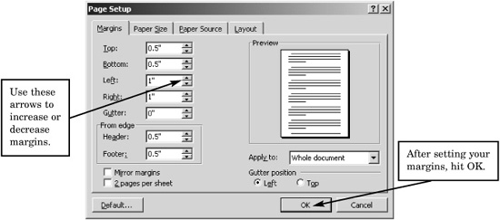
Try adjusting the top and bottom margins to fashion the length and overall appearance of the resume. Remember, this is a key element of your resume’s appeal and success.
There are a few rules governing the practicality of
font types
and
font sizes
. Some examples of
font type
include Times New Roman, Garamond, Arial, and
Script.
Font size determines the size of each letter, for example:

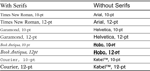
Extensive research has shown that people are much more likely to read and understand content when it is written in a font with serifs; an example would be this book, which is written in Times New Roman, a font with serifs.
Font size also plays a key role in the appearance of a resume. If the font size is too small or the typeface is difficult to read, chances are that a person will pass right over the content or have a difficult time retaining the information.
As a rule of thumb, your document should use at least a 10-point font, and a 12-point font is ideal. Although the contents of a resume are always vital to its success, it is essential to ensure that your document is as aesthetically pleasing as it is strongly worded. You can tell a font with serifs by the curves and accents on certain letters, such as t’s and p’s. An easy comparison of two fonts is that between Times New Roman and Arial. Times New Roman is easy to read and pleasing to the eye. Arial is a font that has no design variation or distinction between strokes.
Some Examples of Font Sizes and Type Sizes
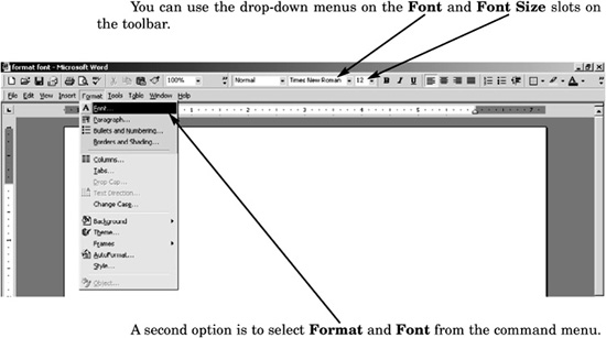
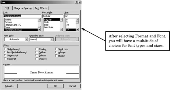
To select a font type for your resume, you can use two options:
Although research indicates that fonts with serifs lead to better results, fonts without serifs are gaining popularity because of the increasing use of computers in the job application process. Fonts without serifs often are preferred, as computers frequently have a difficult time translating e-mailed documents sent from one computer to another when the documents are written in serifs. This often happens when one person is using a personal computer (PC) and another is using a Macintosh (Mac). Although both documents may appear perfect on the screen when they are being written, they can appear jumbled or incoherent when viewed after being e-mailed.