Presentation Zen: Simple Ideas on Presentation Design and Delivery, 2nd Edition (Ira Katz's Library) (20 page)
Authors: Garr Reynolds

You can see the picture superiority effect used widely in marketing communications, such as posters, billboards, brochures, annual reports, etc. Keep this effect in mind, too, when designing slides with images and text that support a narrative. Visual imagery is a powerful mnemonic tool that helps learning and increases retention compared to, say, witnessing someone read words off a screen.
Images are a powerful and natural way for humans to communicate. The key word here is
natural
. We are hardwired for understanding images and using them to communicate. Something inside of us—even from a very young age—seems to yearn to draw, paint, photograph, or otherwise show the ideas in our heads.
In 2005, Alexis Gerard and Bob Goldstein published
Going Visual: Using Images to Enhance Productivity, Decision-Making and Profits
(Wiley). Gerard and Goldstein urge us to use visuals to tell a story or prove a point. However, the authors do not suggest using imaging technology because it is “cool” or “modern.” Going visual is about using images to improve communication and business. For example, you could write about or talk about how a recent fire impacted production—but wouldn’t it be far more powerful to send pictures with a smaller amount of text (or spoken words) to describe the situation? What would be more memorable? Which would have more impact?
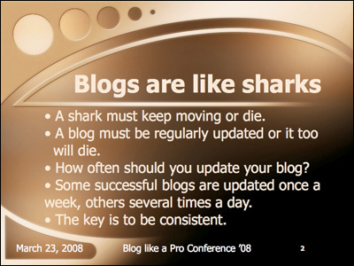
A traditional slide that duplicates the presenter’s words is more of a reading test than a visual.

This slide does a much better job of enhancing the presenter’s spoken words. The photo has impact and makes the point clearly. Which slide is more memorable? Plus, since people are not reading, they can actually listen to you.
(Photo of shark from iStockphoto.com.)
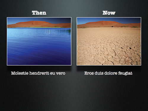
Using images is an efficient way to compare and contrast changes, such as the effects of drought in this simulated example. (The original embedded image of the dry lake bed from iStockphoto.com.)
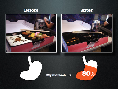
This tongue-in-cheek example shows the actual bento mentioned in
Chapter 1
as the genesis for this book. Before-and-after and then-and-now visual comparisons are easy to create and remember. Al Gore used many then-and-now visual comparisons in his presentations and in the movie
An Inconvenient Truth
to show physical changes over time.
Ask yourself this: What information are you representing with the written word on a slide that you could replace with a photograph (or other appropriate image or graphic)? You still need text for labeling and other things. But if you are using text on a slide for describing something, you probably could use an image more effectively.
Images are powerful, efficient, and direct. Images can also be used very effectively as mnemonic devices to make messages more memorable. If people cannot listen and read at the same time, why do most presentation slides contain far more words than images? One reason, historically, is that businesspeople have been limited by technology. Visual communication and technology go hand in hand. Today, however, most people do have the basic tools available—for example, digital cameras and editing software—for easy-to-place, high-quality images in presentations.
No more excuses. It just takes a different way of looking at presentations. It takes the realization that modern presentations with slides and other multimedia have more in common with cinema (images and narration) and comics (images and text) than they do with written documents. Today’s presentations increasingly share more in common with a documentary film than an overhead transparency.
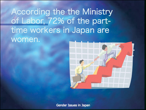
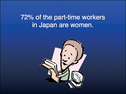
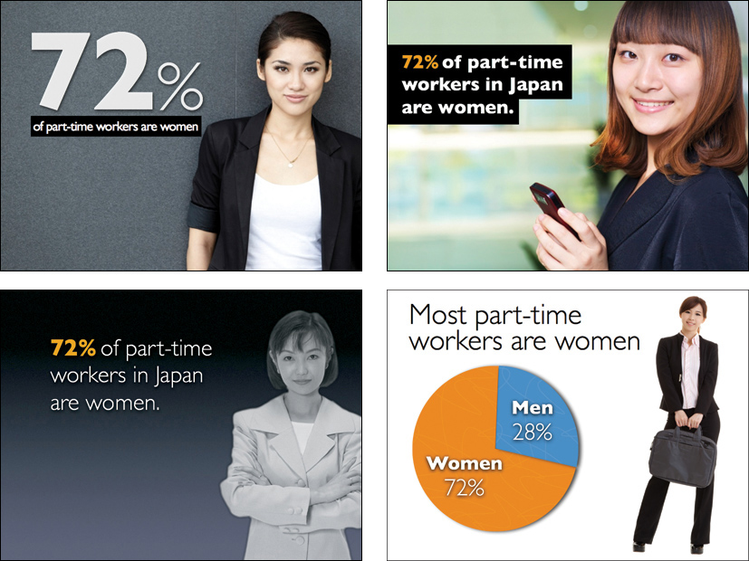
On the following pages you will see a few slides that demonstrate different visual treatments in support of a single message. The context is a presentation on gender and labor issues in Japan. The purpose of the slides was to support visually the claim that “72% of the part-time workers in Japan are women.” This statistic is from the Japanese Ministry of Labor. The presenter wanted the audience members to remember the 72% figure as it was discussed again in the presentation. So we designed a subtle, simple, memorable slide that fit into an appealing and attractive theme.
The original slide showcases various problems: the clip art does not reinforce the simple statistic, nor does it fit the theme of women in the Japanese labor market; the background is a tired, overused PowerPoint template; and the text is difficult to read.
While the text on this slide is easy to read and the clip art is a bit more appropriate to the subject, it still does not give the slide a strong visual impact or a professional look and feel.
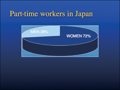
This slide displays the same information in a typical pie chart. The chart’s 3D effects and extra lines, however, do not improve the impact or readability of the information.
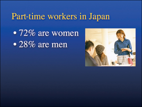
In this case, the two bullet points are easy to read in an instant. The photo of an actual female part-time worker in Japan is a step in the right direction, but it could still be much better.
ABOVE
The four slides above are different treatments of the message communicated in the slides on the previous page. All these slides would nicely complement the presenter’s narration. (Notice that the two slides without the word “Japan” would be virtually meaningless without the presenter’s narration.)