Presentation Zen: Simple Ideas on Presentation Design and Delivery, 2nd Edition (Ira Katz's Library) (22 page)
Authors: Garr Reynolds

A white background is placed behind the text as if it were a piece of paper. This helps the text pop out from the background, making it easier to read and giving it a more analog texture.
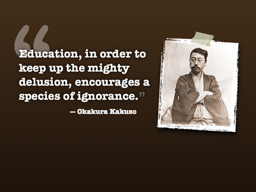
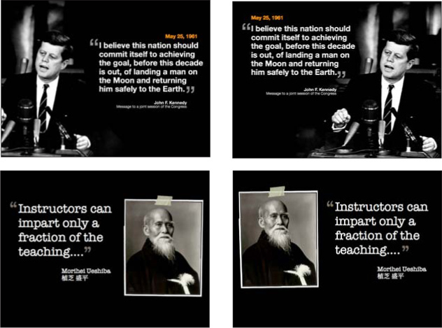
Here, a photo of the person being quoted helps enliven the text. Note that Kakuzo-san is gazing toward the quote.

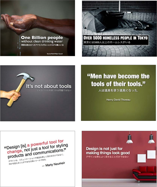
This quote is presented over two slides. The text on the second slide is rather long, but the key phrase is highlighted in red. You do not want to use too many visuals with long quotes like this. However, if you introduce them only occasionally, and you do not rush through the quote, longer quotes can be useful for providing context. Note that the type is large enough to be seen from the back of the room. Most people may not read the text onscreen—they may just listen to you. Nonetheless, type that is too small to read is maddening to audience members.
Combining languages on a slide can be effective—as long as the text is in different sizes. One language needs to be visually subordinate to the other. When I present in Japanese, the Japanese text is larger than the English text (but in a way that creates a harmonious fit). If my talk is in English, the English text is larger. When text from both languages is the same size, it creates visual discord as the type elements compete with each other for attention. The technique of placing text from one language in a clearly dominant position is commonly used in signage for public transportation and in advertising. On general principle, we need to keep text to a minimum in visuals; when creating bilingual slides, we have to be extra careful with limiting the text. Samples from my own presentations appear on the opposite page.
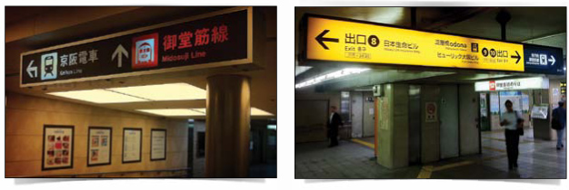
The technique of placing text from one language in a clearly dominant position is commonly used in signage for public transportation and in advertising.
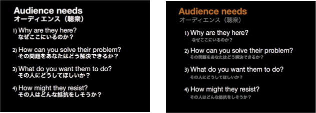
In the first example on the left, all the text is very close to the same size and color. In the second example, the Japanese text is subordinate. Which is easier to scan in an instant?
Emptiness which is conceptually liable to be mistaken for sheer nothingness is in fact the reservoir of infinite possibilities.
—Daisetz T. Suzuki
Empty space, also called negative space or white space, is a concept that is supremely simple, yet the most difficult for people to apply. Whether designing a document or slide, the urge to fill empty areas with more elements is just too great. One of the biggest mistakes typical businesspeople make with presentation slides (and documents) is going out of their way to seemingly use every centimeter of space, filling it with text, boxes, clip art, charts, footers, and the ubiquitous company logo.
Empty space implies elegance and clarity. This is true with graphic design, but you can see the importance of space (both visual and physical) in the context of, say, interior design as well. High-end brand shops are always designed to create as much open space as possible. Empty space can convey a feeling of high quality, sophistication, and importance.
Empty space has a purpose. But those new to design may only see the positive elements, such as text or a graphic, without ever “seeing” the empty space and using that space to make the design more compelling. It is the empty space that gives a design air and lets the positive elements breathe. If it was true that empty space in a design is “wasted space,” then it would make sense to remove such waste. However, empty space in a design is not “nothing.” It is, indeed, a powerful “something,” which gives the few elements on your slide their power.
In the Zen arts, you will find an appreciation for empty space. A painting, for example, may be mostly “empty” except for two to three elements, but the placement of the elements within that space forms a powerful message. You can apply the same approach to a room. Many Japanese homes have a
washitsu
, a traditional room with tatami mats, that is simple and mostly empty. The empty space allows for the appreciation of a single item, such as a single flower or a single wall hanging. The emptiness is a powerful design element itself. In this case, the more we add, the more diluted and less effective the design of a graphic, slide, document, or living space, becomes.
The blue slide at top right is very typical, with several bullet points and an image related to the topic. Rather than making good use of empty space, the blue slide has trapped space in areas around the image. Instead of using one busy slide, I broke the flow of the content into six slides for the introduction of the “Hara hachi bu” concept. Since it is not necessary to put all the words spoken by the presenter on the slides, much of the onscreen text was removed. The slides have a clean white background with plenty of active empty space that helps guide viewers’ eyes. When a new slide is revealed, the eyes are naturally drawn to the image first (it’s larger, colorful) and then quickly go to the text element.

(Images in slides on this page from iStockphoto.com.)
The Power of Faces to Get Attention and Guide Viewers’ Eyes
We are amazingly good at seeing faces. We are so good at spotting faces that we even see them where they do not exist. In fact, said Carl Sagan, “As an inadvertent side effect, the pattern-recognition machinery in our brains is so efficient in extracting a face from a clutter of other detail that we sometimes see faces where there are none.” This explains why people see an image of Mother Teresa in a cheese sandwich or a face on Mars. Faces—and things approximating images of faces—get our attention. Graphic designers and marketers know this very well, which is why you so often see faces in various forms of marketing communication.

Photo: NASA
We are naturally drawn to look in the direction that other people are looking. I noticed that even my baby daughter looks where I look; this tendency starts at an early age.
Using images of faces—even nonhuman faces—can be effective for getting viewers’ attention. This is especially true in mediums such as posters, magazines, and billboards, but this concept can be applied to multimedia and large screen displays as well. Because faces are so effective at getting attention, they must be used with discretion. One important consideration is the issue of eye gaze and leading the eye of the viewer. For example, the two images below are from a study by James Breeze at
usableworld.com.au,
which used eye-tracking software to determine if the direction the baby looked onscreen influenced the eye gaze of the readers. Not surprisingly, the text on the right got more attention from the eyes when the baby’s eye gaze was in that direction.

An eye-tracking study by James Breeze shows the influence of eye gaze in guiding the viewer’s eye on the page. Eye gaze in presentation visuals may have similar influences on the viewers’ attention.
Whether you use images of people or animals in your visuals is up to you; each context and topic are different. However, if you do, be mindful of the power that images of faces have for getting attention and try to use eye gaze to help guide the viewer’s eye.

If you use images of people, make sure they do not unintentionally guide viewers away from what you want them to see. For example, if a text element or chart is the highest priority, it is important to not have images of people looking in the opposite direction from those elements. How do the images in the slides shown here guide your eyes toward or away from the other elements? While either slide in each pair may be acceptable, notice how the slides on the right lead your eye to the text or chart.

The effect of eye gaze is more obvious in this example. Many people who look at the image on the left report that they can almost feel their eyes being diverted off the slide. The sample on the right shows a much more harmonious fit between the image and the text.

Not only faces of humans that get your attention and lead the eye. In the sample on the left above, the bird is clearly looking in the direction of the type, his beak acting like a pointing finger. In the sample on the right, it is not the face of the bird as much as its orientation—flying up toward the type—that leads the eye like a soaring arrow.
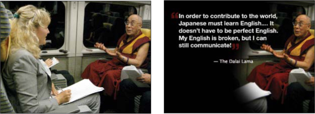
The slide on the left features an image of Judit Kawaguchi, a writer for the
Japan Times,
interviewing the Dalai Lama on the Bullet Train in Japan. The quote displayed in the second slide is from that actual interview on the train. The first slide shows the context, then the second slide fades in (dissolve transition), which results in Judit fading out and being replaced by the text. With this effect, the right third of the slide (the Dalai Lama) never appears to change.