Presentation Zen: Simple Ideas on Presentation Design and Delivery, 2nd Edition (Ira Katz's Library) (25 page)
Authors: Garr Reynolds

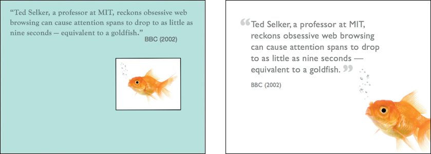
By making the background of the fish photo seem transparent in the slide on the left, the image and text blend together harmoniously into a more unified visual. To make an image seem transparent, you can often simply change the slide background to white.
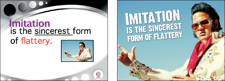
The slide on the left uses a busy template that makes the useful area of the slide about one-third smaller. The slide on the right covers the entire slide with the image. The text is clearly in the foreground while the image serves both as background and foreground, making the overall visual dynamic and unified with a cleaner, more dramatic look.
(Images on this page and opposite page from iStockphoto.com.)
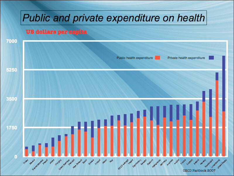
This slide features a typical graph exported from Excel. It is impossible to identify the countries as the text is too small and at an angle. The primary problem is that this is too much data to display. This amount of information would be better presented in a handout.

The text and data are easier to see when the contrast between the foreground and background is improved. Including only key variables allows for larger bars and figures. Information on excluded variables can be distributed in a handout.
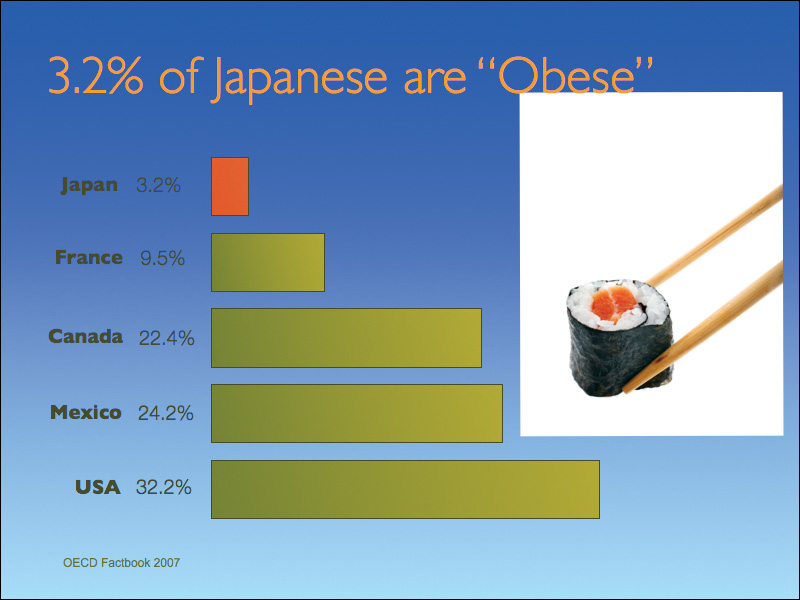
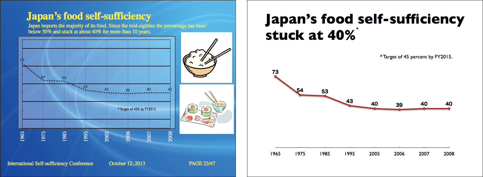
Here, the background color is not only a poor fit with the colors of the bars, but it does not provide enough contrast and makes the text hard to read. The white background on the sushi photo adds unnecessary noise to the visual.
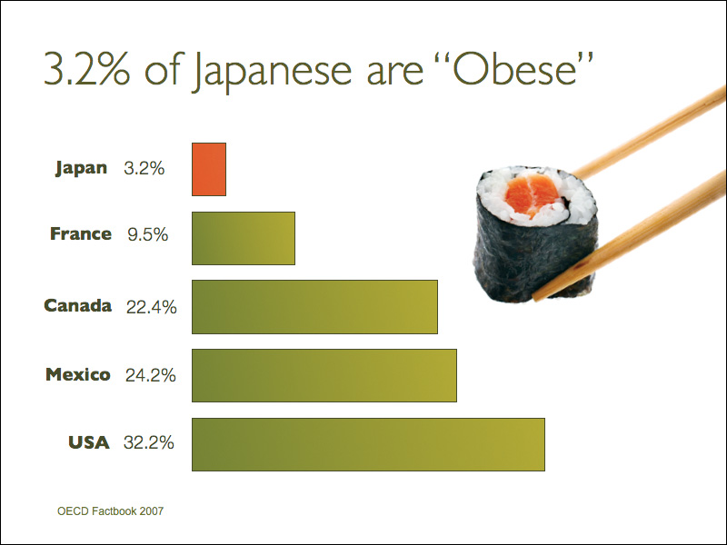
In this revision, the background of the sushi photo “disappears” to match the white background of the slide. The text, bars, and background feature much better contrast and are easier to read.
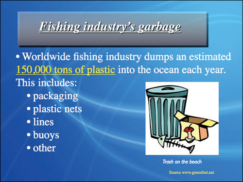
This kind of slide is not unusual but suffers from typical problems such as a generic title, underlined text, and a small graphic that does not amplify the message of the presenter. Yellow text on this kind of blue background has been seen a million times before.
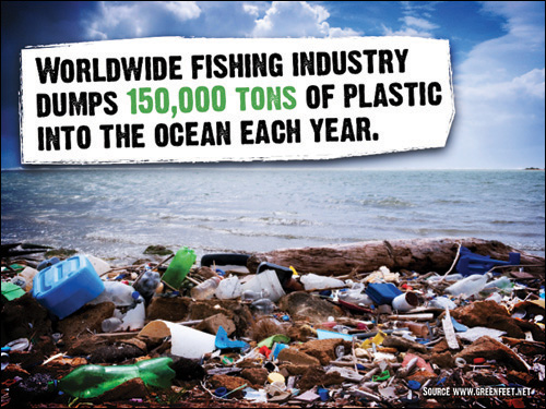
Here the same message as the slide on the left is made but the visual is big and bold and shows the trash problem in a way that illustrates and amplifies the presenter’s story in a more visceral way. The type is gritty and the highlight color (green) subtly matches the tone of green of the plastic bottles.
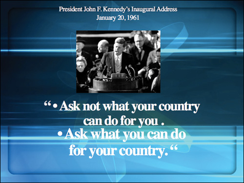
The quote and the photo are epic, yet this slide lacks impact or drama. The background looks very template-like and is too busy, making text hard to read. The type is a mess with the quote appearing as two bullet points. All elements are centered on the slide which results in trapped space. Even though there are few elements, the slide appears cluttered.
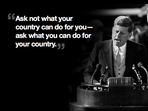
The type is clean and large. The photo is large and makes an impact, taking up the right third of the slide and bleeding off the edge. Distracting background elements of the photo are removed. JFK
’
s sight line is in the direction of the quote. Most viewers
’
eyes will go naturally to the face first and then smoothly to the type.
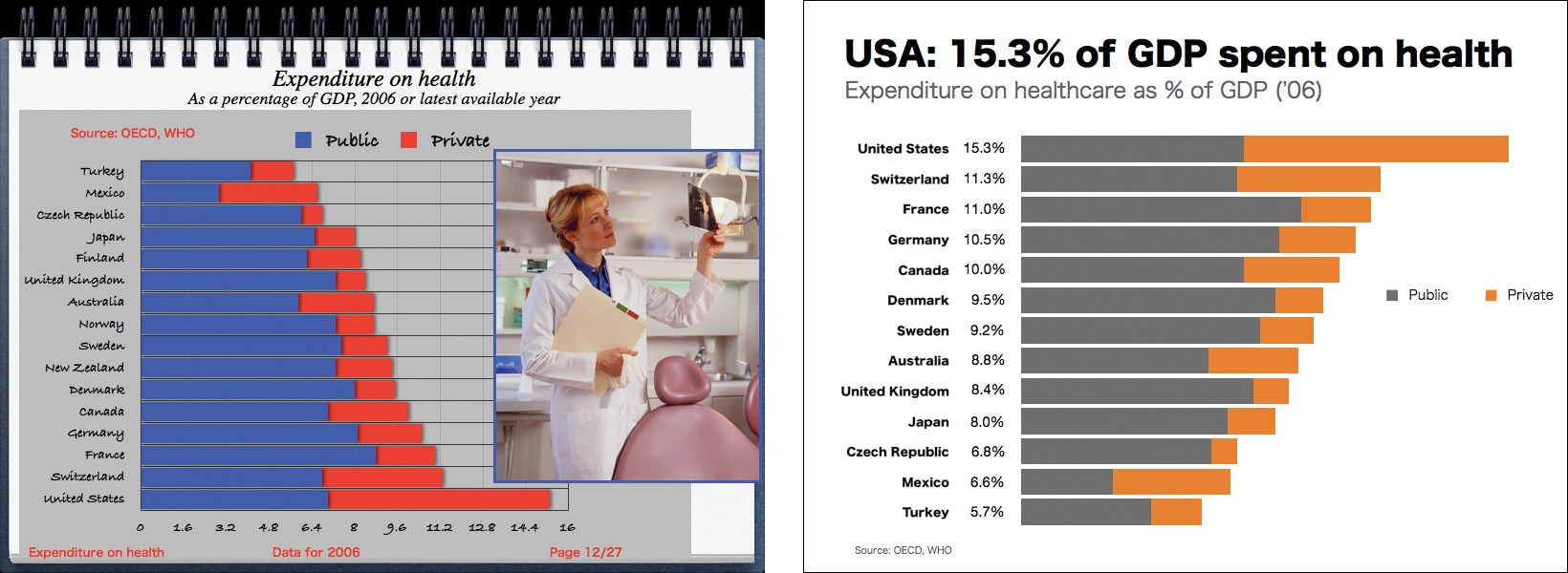
Keeping the principle of Signal vs. Noise in mind, it’s easy to see that the various and hard-to-read fonts, unnecessary lines, and decorative elements on the slide on the left make for a lot of noise. By removing those elements and making a better headline, the signal is enhanced.
