Presentation Zen: Simple Ideas on Presentation Design and Delivery, 2nd Edition (Ira Katz's Library) (23 page)
Authors: Garr Reynolds

Balance is important in a design, and one way to achieve good balance and clarity is through the intelligent use of empty space. A well-balanced design has a clear, single, unified message. A well-designed slide has a clear starting point and guides the viewer through the design. The viewer should never have to “think” about where to look. A visual must never confuse anyone. What are the most important, less important, and least important parts of the design need to be clearly expressed with a clear hierarchy and a good balance of display elements.
Through the careful placement of positive elements, empty space can be dynamic and active. The conscious use of empty space can even bring motion to your design. In this way, the empty space is not passive but active. If you want to bring a more dynamic feel and interest to your slide design, consider using an asymmetrical design. Asymmetrical designs activate empty space and make designs more interesting; they are more informal and dynamic, with a variety of sizes and shapes.
Symmetrical designs feature a strong emphasis along a central vertical axis. Symmetrical balance is vertically centered and equivalent on both sides. Symmetrical designs are more static than asymmetrical designs and evoke feelings of formality or stability. There is nothing wrong with centered, symmetrical designs, although empty space in such designs is generally passive and pushed to the side.
Design is about seeing and manipulating shapes, but if we do not see the empty space in a slide as a shape, then it will be ignored and any use of empty space will be accidental. Consequently, the results will not be as powerful. Good presentations will incorporate a series of presentation visuals that have a mix of slides that are symmetrical and asymmetrical.
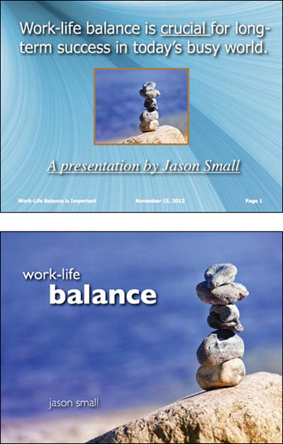
Both slides have good balance. The top slide is a common, symmetrical design that is not very interesting. The bottom slide is asymmetrical, creating a simpler yet more powerful visual.
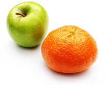
(Image from iStockphoto.com.)

(Images on slides above from iStockphoto.com.)
One way to activate empty space and create a dynamic, asymmetrical slide is to use large images that bleed off the edge. Use the empty space to place small amounts of text or other elements. On the right is another Guy Kawasaki quote—one of my favorites—used in one of my branding talks in Japan. In the first slide, the quote is symmetrical. The other two slides are examples of asymmetrical designs.
For centuries, artists and designers have introduced a proportion called the “golden mean” or “golden ratio” found in nature into their works. The golden section rectangle has a proportion of 1:1.618. There is a belief that we are naturally drawn to images that have proportions approaching the golden section rectangle, just as we are often drawn to things in the natural environment with golden-mean proportions. However, attempting to design visuals according to golden-mean proportions is impractical in most cases. But, the “rule of thirds,” which is derived from the golden mean, is a basic design technique that can help you add balance (symmetrical or asymmetrical), beauty, and a higher aesthetic quality to your visuals.
The rule of thirds is a basic technique that photographers learn for framing their shots. Subjects placed exactly in the middle can often make for an uninteresting photo. A viewfinder can be divided by lines—real or just imagined—so that you have four intersecting lines or crossing points and nine boxes that resemble a tic-tac-toe board. These four crossing points (also called “power points,” if you can believe it) are areas you might place your main subject, rather than in the center.
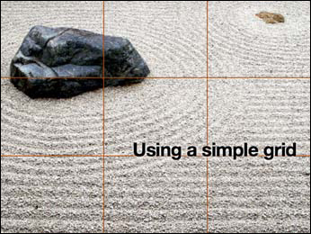
Remember, there is no liberty in absolute freedom when it comes to design. You need to limit your choices so that you do not waste time adjusting every single design element to a new position. I recommend that you create some sort of clean, simple grid to build your visuals upon. Although you may not be aware of it, virtually every Web page and every page in a book or magazine is built atop a grid. Grids can save you time and ensure that your design elements fit more harmoniously on the display. Using grids to divide your slide “canvas” into thirds, for example, is an easy way at least to approach golden-mean proportions. In addition, you can use the grids to align elements and give the overall design balance, a clear flow and point of focus, and a natural overall cohesiveness and aesthetic quality that is not accidental but is by design.
Hokusai’s “Red Fuji” with nine-panel grid laid on top.
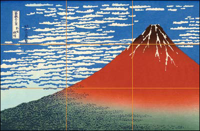
The image on the right is not a slide—it’s a picture of Hokusai Katsushika’s (1760–1849) “Red Fuji” from the ukiyo-e series called
Thirty-six Views of Mount Fuji.
I placed a nine-panel grid over the print to show how the rule of thirds can be seen in the composition. Remember, however, that the rule of thirds is not a rule at all, it is only a guideline. But it is a very useful guideline when you are aiming to achieve a balanced yet asymmetrical look.
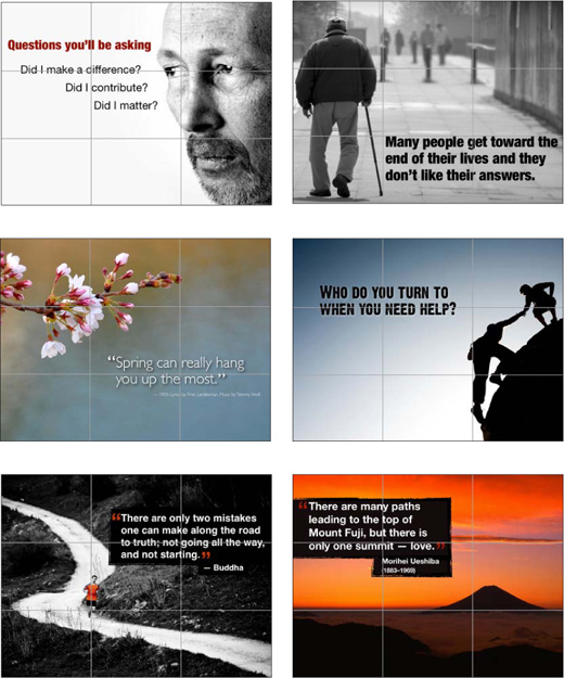
Below are a few examples of presentation visuals designed by either using a nine-panel grid or by just keeping the rule of thirds in mind while placing and cropping the photos and arranging elements. You’ll also notice that the images themselves have pretty good rule of thirds proportions. The iStockphoto images used here were chosen in part based on the photo’s proportions and how the image guides the eye and offers empty space for the design elements.

Create your own visual style. Let it be unique for yourself and yet identifiable for others.
—Orson Welles
These four principles—contrast, repetition, alignment, and proximity—are not all there is to know about graphic design. But, understanding these simple, related concepts and applying them to slide design can make for far more satisfying and effective designs.
Contrast simply means difference. And for whatever reason, we are all wired to notice differences—perhaps our brains think they are still back in the savannah scanning for wild predators. We are not conscious of it, but we are scanning and looking for similarities and differences all the time. Contrast is what we notice, and it’s what gives a design its energy. So you should make elements that are not the same clearly different, not just slightly different.
Contrast is one of the most powerful design concepts because, really, any design element can be contrasted with another. You can achieve contrast in many ways—for example, through the manipulation of space (near and far, empty and filled), through color choices (dark and light, cool and warm), by typeface selection (serif and sans serif, bold and narrow), by the positioning of elements (top and bottom, isolated and grouped), and so on.
Making use of contrast can help you create a design in which one item is clearly dominant. This helps the viewer “get” the point of your design quickly. Every good design has a strong and clear focal point, so it helps to have clear contrast among elements, with one element being clearly dominant. If all items in a design are of equal or similar weight with weak contrast and nothing clearly dominant, it is difficult for the viewer to know where to look. Designs with strong contrast attract interest and help the viewer make sense of the visual. Weak contrast is not only boring, but it can be confusing.