Presentation Zen: Simple Ideas on Presentation Design and Delivery, 2nd Edition (Ira Katz's Library) (26 page)
Authors: Garr Reynolds

The slide on the left is a rather typical PowerPoint slide of yesteryear. The slide on the right strips away the nonessential, revealing a very simple point that will be understood in an instant. Then people can spend their time discussing what the data mean rather than being distracted by a decorative data slide.
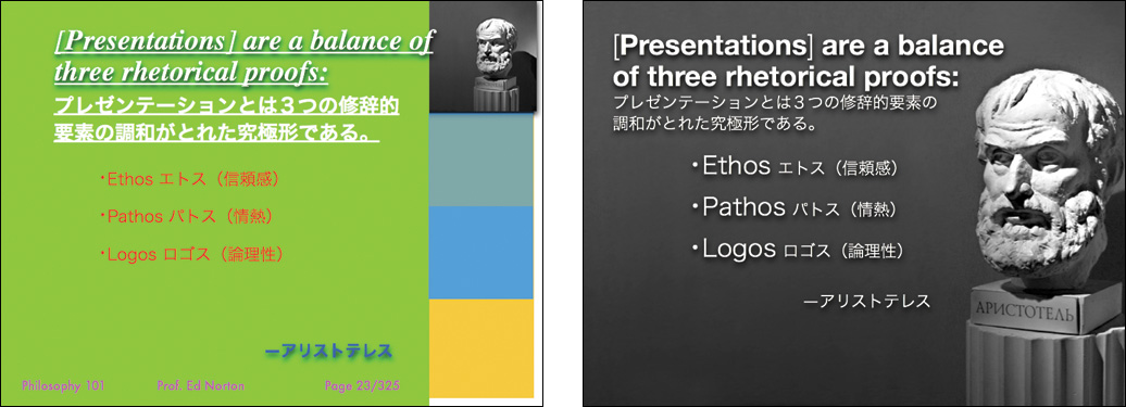
The slide on the left uses too many colors, a tiny graphic, and poor use of type, including underlined text. On the right the visual has more impact, the colors are toned way down, and the mix of English and Japanese is presented in a cleaner, more harmonious fashion.
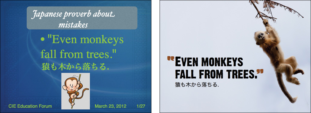
The slide on the left looks amateurish and does not match the feeling of the Japanese proverb. The slide on the right makes good use of empty space, the shade of brown for the quotation marks is the same as the fur of the monkey, and the English and Japanese work in better harmony by having them set in different sizes. The monkey is also moving in the direction of the type.
(Images on this page and opposite page from iStockphoto.com.)
The more strikingly visual your presentation is, the more people will remember it. And more importantly, they will remember you.
—Paul Arden
• Design matters. But design is not about decoration or ornamentation. Design is about making communication as easy and clear for the viewer as possible.
• Keep the principle of signal-to-noise ratio in mind to remove all nonessential elements. Remove visual clutter. Avoid 3D effects.
• People remember visuals better than bullet points. Always ask yourself how you can use a strong visual—including quantitative displays—to enhance your narrative.
• Empty space is not nothing; it is a powerful something. Learn to see and manipulate empty space to give your slide designs greater organization, clarity, and interest.
• Use high-quality photos that make an impact and are easily seen and understood. Consider using full-bleed images and place type elements on top in the simplest, most balanced arrangement possible.
• Use the principle of contrast to create strong dynamic differences among elements that are different. If it is different, make it
very
different.
• Use the principle of repetition to repeat selected elements throughout your slides. This can help give your slides unity and organization.
• Use the principle of alignment to visually connect elements on a slide. Invisible gridlines are very useful for achieving good alignment. Using a grid gives your slides a clean, well-organized look.
• Use the principle of proximity to ensure that related items are grouped together. People tend to interpret items together or near to each other as belonging to the same group.


In this chapter you can review slides from several presenters who often make presentations in the ”real world.” (Because of limited space, only a small number of slides are shown from each presentation.) The sample slides are not all necessarily perfect. However, while we can judge a slide in terms of its adherence to basic design principles, it is difficult to judge the effectiveness of its design without seeing how the visuals are used in the live talk.
Although the content and circumstances are different in each case, what the slides shown in this chapter have in common is that they are simple, highly visual, and served (or could serve) a successful supportive role in a live talk. These slides augment the presenter’s narrative and help make things clear.
Your visuals should be engaging and “part of the show,” but they must also be easy to understand—quickly. If you need to explain something complex, then build (animate) the parts of your chart or diagram in logical and clear steps. Simplicity, restraint, and harmony are important considerations when designing slides and other multimedia. The primary goal is not to make slides look good. The goal is clarity. However, if you design slides while always mindful of the principles of simplicity and restraint—as well as the basic design concepts outlined in
Chapter 6
—your slides will indeed look attractive.
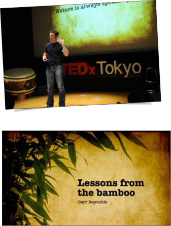
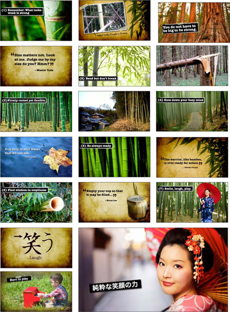
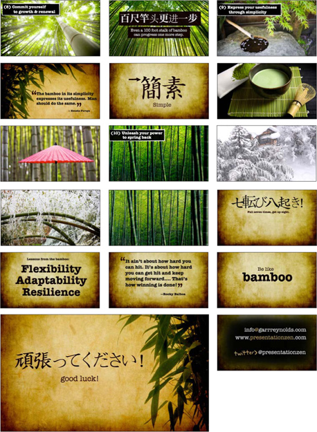
I created the slides shown on the next three pages for my 12-minute presentation at TEDxTokyo. During this fast-paced talk, I shared my thoughts on the lessons we can learn from observing the world around us. Even the humble bamboo, which plays such an integral role in Japanese culture, offers lessons in simplicity, flexibility, and resilience. I made the slide background from composites of simulated washi paper to give the visuals a more earthy, textured look. The aspect ratio of the slides is 16:9 to match the wide screen at the venue in Tokyo. You can find all the slides used in this presentation on Slideshare.net:

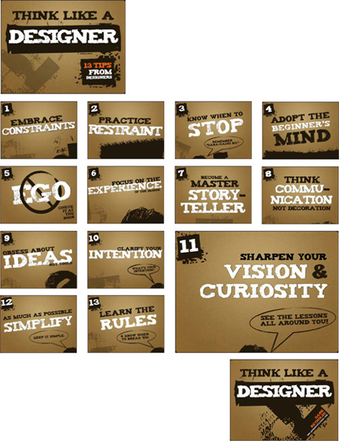
I created these slides quickly and simply with nothing but type and a background. I use these for a 90-minute session introducing basic design concepts to non-designers. Mostly, this session is a back-and-forth discussion with the slides displayed onscreen to simply keep us on track and give structure to the session. I use the whiteboard and handouts to highlight examples for each of the key messages.
Here you can see the first 34 slides (out of more than 100) for my presentation on the issue of branding and transformation. The client—a major international financial firm—asked me to focus on differentiation and engagement. The 35-minute presentation also featured a few short video clips to underscore my points. As I spoke, the slides appeared behind me on a huge backlit screen, at which I rarely glanced. Some of the slides contained quotes and visual examples of what I was talking about. But most of all, I had a point, and I had stories and examples to illustrate that point. The slides provided an important and supportive backdrop that amplified my message.