Read The Bell Curve: Intelligence and Class Structure in American Life Online
Authors: Richard J. Herrnstein,Charles A. Murray
Tags: #History, #Science, #General, #Psychology, #Sociology, #Genetics & Genomics, #Life Sciences, #Social Science, #Educational Psychology, #Intelligence Levels - United States, #Nature and Nurture, #United States, #Education, #Political Science, #Intelligence Levels - Social Aspects - United States, #Intellect, #Intelligence Levels
The Bell Curve: Intelligence and Class Structure in American Life (97 page)

We now need to consider dealing with the relationships between two or more distributions—which is, after all, what scientists usually want to do. How, for example, is the pressure of a gas related to its volume? The answer is Boyle’s Law, which you learned in high school science. In social science, the relationships between variables are less clear cut and harder to unearth. We may, for example, be interested in wealth as a variable, but how shall wealth be measured? Yearly income? Yearly income
averaged over a period of years? The value of one’s savings or possessions? And wealth, compared to many of the other things social science would like to understand, is easy, reducible as it is to dollars and cents.
But beyond the problem of measurement, social science must cope with sheer complexity. Our physical scientist colleagues may not agree, but we believe it is harder to do science on human affairs than on inanimate objects—so hard, in fact, that many people consider it impossible. We do not believe it is impossible, but it is rare that any human or social relationship can be fully captured in terms of a single pair of variables, such as that between the temperature and volume of a gas. In social science, multiple relationships are the rule, not the exception.
For both of these reasons, the relations between social science variables are typically less than perfect. They are often weak and uncertain. But they are nevertheless real, and, with the right methods, they can be rigorously examined.
Correlation and regression, used so often in the text, are the primary ways to quantify weak, uncertain relationships. For that reason, the advances in correlational and regression analysis since the late nineteenth century have provided the impetus to social science. To understand what this kind of analysis is, we need to introduce the idea of a scatter diagram.
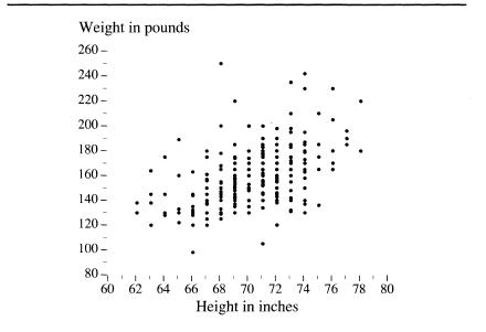
We left your male high school classmates lined up by height, with you looking down from the rafters. Now imagine another row of cards, laid out along the floor at a right angle to the ones for height. This set of cards has weights in pounds on them. Start with 90 pounds for the class shrimp, and in 10-pound increments, continue to add cards until you reach 250 pounds to make room for the class giant. Now ask your classmates to find the point on the floor that corresponds to both their height and weight (perhaps they’ll insist on a grid of intersecting lines extending from the two rows of cards). When the traffic on the gym floor ceases, you will see something like the figure below. This is a scatter diagram. Some sort of relationship between height and weight is immediately obvious. The heaviest boys tend to be the tallest, the lightest ones the shortest, and most of them are intermediate in both height and weight. Equally obvious are the deviations from the trend that link height and weight. The stocky boys appear as points above the mass,
the skinny ones as points below it. What we need now is some way to quantify both the trend and the exceptions.
A scatter diagram
Correlations
and
regressions
accomplish this in different ways. But before we go on to discuss these terms, be reassured that they are simple. Look at the scatter diagram. You can see by the dots that as height increases, so does weight, in an irregular way. Take a pencil (literally or imaginarily) and draw a straight, sloping line through the dots in a way that seems to you to best reflect this upward-sloping trend. Now continue to read, and see how well you have intuitively produced the result of a correlation coefficient and a regression coefficient.
Modern statistics provides more than one method for measuring correlation, but we confine ourselves to the one that is most important in both use and generality: the Pearson product-moment correlation coefficient (named after Karl Pearson, the English mathematician and biometrician). To get at this coefficient, let us first replot the graph of the class, replacing inches and pounds with standard scores. The variables are now expressed in general terms. Remember:
Any
set of measurements can be transformed similarly.
The next step on our way to the correlation coefficient is to apply a formula (here dispensed with) that, in effect, finds the best possible straight line passing through the cloud of points—the mathematically “best” version of the line you just drew by intuition.
What makes it the “best”? Any line is going to be “wrong” for most of the points. For example, look at the weights of the boys who are 64 inches tall. Any sloping straight line is going to cross somewhere in the middle of those weights and may not cross any of the dots exactly. For boys 64 inches tall, you want the line to cross at the point where the total amount of the error is as small as possible. Taken over all the boys at all the heights, you want a straight line that makes the sum of all the errors for all the heights as small as possible. This “best fit” is shown in the new version of the scatter diagram below, where both height and weight are expressed in standard scores and the mathematical best-fitting line has been superimposed.
The “best-fit” line for a scatter diagram
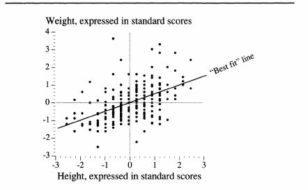
This scatter diagram has (partly by serendipity) many lessons to teach about how statistics relate to the real world. Here are a few of the main ones:
- Notice the many exceptions.
There is a statistically substantial relationship between height and weight, but, visually, the exceptions
seem to dominate. So too with virtually all statistical relationships in the social sciences, most of which are much weaker than this one. - Linear relationships don’t always seem to fit very well.
The best-fit line looks as if it is too shallow. Look at the tall boys, and see how consistently it underpredicts how much they weigh. Given the information in the diagram, this might be an optical illusion—many of the dots in the dense part of the range are on top of each other, as it were, and thus it is impossible to grasp visually how the errors are adding up—but it could also be that the relationship between height and weight is not linear. - Small samples have individual anomalies.
Before we jump to the conclusion that the straight line is not a good representation of the relationship, remember that the sample consists of only 250 boys. An anomaly of this particular small sample is that one of the boys in the sample of 250 weighed 250 pounds. Eighteen-year-old boys are very rarely that heavy, judging from the entire NLSY sample, fewer than one per 1,000. And yet one of those rarities happened to be picked up in a sample of 250. That’s the way samples work. - But small samples are also surprisingly accurate, despite their individual anomalies.
The relationship between height and weight shown by the sample of 250 18-year-old males is identical to the third decimal place with the relationship among all 6,068 males in the NLSY sample.
4
This is closer than we have any right to expect, but other random samples of only 250 generally produce correlations that are within a few hundredths of the one produced by the larger sample. (There are mathematics for figuring out what “generally” and “within a few hundredths” mean, but we needn’t worry about them here.)
Bearing these basics in mind, let us go back to the sloping line in the figure above. Out of mathematical necessity, we know several things about it. First, it must pass through the intersection of the zeros (which, in standard scores, correspond to the averages) for both height and weight. Second, the line would have had exactly the same slope had height been the vertical axis and weight the horizontal one. Finally, and most significant, the slope of the best-fitting line cannot be steeper than 1.0. The steepest possible best-fitting line, in other words, is one along
which one unit of change in height is exactly matched by one unit of change in weight, clearly not the case in these data. Real data in the social sciences never yield a slope that steep.
In the picture, the line goes uphill to the right, but for other pairs of variables, it could go downhill. Consider a scatter diagram for, say, educational level and fertility by the age of 30. Women with more education tend to have fewer babies when they are young, compared to women with less education, as we discuss in Chapters 8 and 15. The cloud of points would decline from left to right, just the reverse of the cloud in the picture above. The downhill slope of the best-fitting line would be expressed as a negative number, but, again, it could be no steeper than—1.0.
We focus on the slope of the best-fitting line because it
is
the correlation coefficient—in this case, equal to .50, which is quite large by the standards of variables used by social scientists. The closer it gets to ±1.0, the stronger is the linear relationship between the standardized variables (the variables expressed as standard scores). When the two variables are mutually independent, the best-fitting line is horizontal; hence its slope is 0. Anything other than 0 signifies a relationship, albeit possibly a very weak one.
Whatever the correlation coefficient of a pair of variables is, squaring it yields another notable number. Squaring .50, for example, gives .25. The significance of the squared correlation is that it tells how much the variation in weight would decrease if we could make everyone the same height, or vice versa. If all the boys in the class were the same height, the variation in their weights would decline by 25 percent. Perhaps, if you have been compelled to be around social scientists, you have heard the phrase “explains the variance,” as in, for example, “Education explains 20 percent of the variance in income.” That figure comes from the squared correlation.
In general, the squared correlation is a measure of the mutual redundancy in a pair of variables. If they are highly correlated, they are highly redundant in the sense that knowing the value of one of them places a narrow range of possibilities for the value of the other. If they are uncorrelated or only slightly correlated, knowing the value of one tells us nothing or little about the value of the other.
5
Correlation assesses the strength of a relationship between variables. But we may want to know more about a relationship than merely its strength. We may want to know what it is. We may want to know how much of an increase in weight, for example, we should anticipate if we compare 66-inch boys with 73-inch boys. Such questions arise naturally if we are trying to explain a particular variable (e.g., annual income) in terms of the effects of another variable (e.g., educational level). How much income is another year of schooling worth? is just the sort of question that social scientists are always trying to answer.
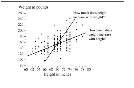
The standard method for answering it is regression analysis, which has an intimate mathematical association with correlational analysis. If we had left the scatter diagram with its original axes—inches and pounds—instead of standardizing them, the slope of the best-fitting line would have been a regression coefficient, rather than a correlation coefficient. The figure below shows the scatter diagram with nonstandardized axes.
What a regression coefficient is telling you