The Puzzle of Left-Handedness (13 page)

So again we find ourselves confronted with a paradox. To see symmetry we must apply a process of mirroring, but that would make it impossible for us to see anything properly. Fortunately, Julesz came up with a solution. He looked at the vast majority of animal species that do not have both their eyes on the front of their heads but one on each side. Looking sideways, they are forced to create mirror images, and they need to do this at the stage when they’re interpreting the half-images from their left and right eyes. It goes like this.
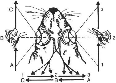
If a butterfly flies past the left side of a rabbit from its back to its front, then the image moves across the retina of the rabbit’s left eye ‘from nose to ear’. If the butterfly passes to the right of the rabbit, then the right eye experiences precisely the same thing. Nothing unusual in that, it would seem. But when they arrive at the projection screen in the rabbit’s brain, the two movements, which were in the same direction, appear to run counter to one another. To allow the rabbit to experience the actual direction of movement in both cases, a correction has to take place somewhere, and it must take the form of mirroring. It becomes clear how important this is if we have the rabbit move as well, running so that the world moves in relation to its eyes. If the animal interpreted the images coming from its two eyes without mirroring, then it would be torn apart inside by the firm conviction that one half of its body was running backwards at the same speed as the other half was moving forwards.
Parallel eyes on the front of the head are the exception, and they may be a fairly recent evolutionary phenomenon. If we go far enough back in time, at least a few tens of millions of years, then we come to our own distant ancestors, who like the rabbit had eyes on the sides of their heads. They must have had a visual system suited to such an arrangement, and here may lie the explanation for our sensitivity to symmetry. We mainly function according to a visual system that is relatively new and does not involve mirroring. Although it is adapted to our parallel, front-facing eyes, Julesz argued that it still contains echoes of characteristics of the much older system that did involve mirroring. It’s possible that this system is so old that rather than being located in the cerebral cortex it’s lodged in the brain stem, which is far more ancient in evolutionary terms – a legacy of the immeasurably deep past in which we still communed with crocodiles, and a feature that now proves fantastically useful. Julesz’s theory is an admirable attempt to find a solution to the mystery of how we recognize symmetry, but it’s probably not the final word on the subject. It has too many weak points for that. For example, the mirroring capacity of animals with eyes on the sides of their heads neutralizes an apparent contradiction between partial images within one half of the visual field, whereas the detection of symmetry concerns the connection between the two halves of the field of vision. Furthermore, the fact that we cease to experience the symmetry of Julesz’s patterns if we focus on a point well away from the axis of symmetry proves that mirroring to detect symmetry has nothing to do with the way rabbits see. To rabbits, butterflies travel in the correct direction even if they are at the very edge of the field of vision, quite apart from the fact that sideways-eyed creatures like the rabbit have no more to gain than we do from a process of mirroring the two halves of the visual field.
As if that were not bad enough, there are at least two other important phenomena about which Julesz’s theory has nothing to say. One is the fact that although in looking at complex patterns we recognize symmetry only if we concentrate our focus at or near the axis of symmetry, simpler symmetries such as those of a baroque vase or a person’s face are always obvious to us. The second point is that we can recognize symmetry between top and bottom, although it takes us slightly more effort.

Were it not for mirroring, two butterflies flying in the same direction (from a to c and from 1 to 3) would appear to the rabbit to be moving in opposite directions.
Perhaps the pigeons described earlier can help us along here. The birds gave a false impression of being able to tell left from right, or to be more precise to tell the difference between two adjacent buttons marked ‘<’ and ‘>’. In reality they had transformed the left–right distinction into a manageable one between top and bottom by tilting their heads to one side. Their approach was to rotate the image their visual system had to process such that it became meaningful. Now of course we must not forget that the pigeons were attempting to differentiate between the two halves of an image, whereas the detection of symmetry requires us to search for similarities. That needn’t worry us, however. Symmetry is after all a form of distinction. It has to do with the systematic difference that we all recognize between an image and its mirror image. Anyone who cannot tell left from right, and therefore cannot distinguish between ‘<’ and ‘>’, will also be unable to detect left–right symmetry.
It’s conceivable that we do something similar to what the pigeons do, only inside our brains. To put it very simply, it may be that our visual system can rotate images on the projection screen and then compare them. This suspicion is reinforced by the fact that we must be able to shift images around, since that’s how we measure the difference between the images from our two eyes that gives us our perception of depth. We know this is how depth-perception works, because based on the same principle we can create an experience of depth in photographs, films and television images by setting up two pictures of an object so that they are slightly offset and presenting one to the left eye and the other to the right. This is usually done with the help of a pair of glasses with differently coloured lenses, each of which filters out one of the two images.
There are further indications of our mental ability to rotate, shift, even bend and deform images. Things need to get pretty extreme before we find ourselves making any real effort to recognize an everyday object such as a chair, irrespective of the position from which we view it. Even if we see a chair from a given angle for the first time, so that we can’t precisely match what we’re looking at to an image stored away in our memories, we immediately know what we’re seeing. That’s only possible if our standard, memorized image of a chair (whatever that may look like) and the image on the projection screen can be turned and moved around until they more or less match. When we succeed in doing this, we conclude: ‘Ah, a chair.’
In recognizing symmetries, the memory and the mental mechanisms that interpret images and store them in our heads as distilled concepts are probably of great importance. Along with our ability to shift images around, this would explain why we have no difficulty recognizing symmetry in any more or less familiar object, even if it’s on the edge of our field of vision. It’s a different story when we’re dealing with something we’ve never seen before, never filed in our memories, especially if it’s com plex and bears no resemblance to anything else. Then our memories are no use to us and we have to resort to mirroring. Julesz managed to produce exactly such uninterpretable, random patterns, and as he was developing them he took care to throw away all test versions that accidentally included something recognizable, the way we see faces in clouds.
Julesz’s random-dot patterns are examples of the most difficult kind of symmetry: extremely complex and lacking prior models or clues. As a result, if we focus far from the axis of symmetry the visual system is poorly equipped to compensate by shifting the image around. It’s conceivable that in such cases it makes a quick check and finds no reason to look for symmetry. The opposite applies, it would seem, with familiar, simpler, or more easily reducible shapes.
The same mechanism might also explain why we have more difficulty with top–bottom symmetry, even though we’re quite good at recognizing it. Apparently we have to do a piece of extra, non-routine work: rotation.
All things considered it seems there’s a link between our capacity to tell left from right and the trick of detecting left–right symmetry, and both have to do with our capacity to perceive depth. This raises a suspicion that the experience of symmetry and the ability to distinguish left from right may be confined to those animals that, like us, have both eyes in the front of their faces. Among land animals, this group is quite small, consisting only of species that rely heavily on sight. They are mainly apes, other primates and felines. Those with eyes to the side generally have less good eyesight and rely more on hearing, smell and touch. It’s therefore none too surprising that such animals are unable to tell left from right. We may indeed wonder whether they can detect symmetry, and even whether they can recognize a chair automatically from the most peculiar of angles as we can. No shortage of conundrums here.
Birds, finally, depend so much on their eyes that they must surely be able to perceive depth. To dispel any doubts on the subject you have only to watch a buzzard snatch a mouse from long grass with deadly precision. Yet most birds have their eyes very much to the sides. It seems their brains have a mechanism that can judge depth based on the independent images from their two eyes or – and this may be a better guess – from a lightning-fast series of images from the same eye. That would work as long as the bird was flying or running, or at least moving its head.
17
Tintin’s Law
Few worlds have been as reliant on superstition and ritual as that of classical theatre. One golden rule in the Western theatrical tradition concerns the entrance of the messenger. A bearer of good news would enter stage left, as seen from the stalls. If he made his entrance on the right, then you could bank on bad tidings. The direction in which the messenger moved therefore indicated to the audience what was about to happen, and spectators were subconsciously aware of that im plicit message.
Few messengers put in an appearance on stage these days, but that certainly doesn’t mean that golden rules are a thing of the past. In fact there are now more of them than ever, as a result of the vast array of technical facilities that are now available. Modern media such as films and comic strips stick to them as firmly as the dramatists of old did, even if audi ences have no intimation of their existence. The same goes for painting, even photography. Much of what we generally call ‘composition’ and regard as artistic seems in reality to be determined by simple but deeply ingrained rules that dictate how we interpret images. Those rules ensure, among other things, that we detect a direction in everything that is the least bit suited to pointing one way or the other.
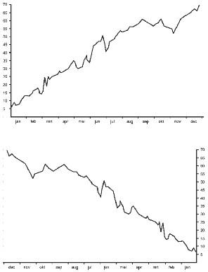
Among the most convincing examples of this are the graphs we see every day. We involuntarily assume that their lines begin on the left and end on the right. If the right end is higher than the left, then we perceive the line as rising, whereas if the right end is lower we assume the line is falling. We’re so inflexible in this regard that no businessman in his right mind would try to illustrate his company’s annual report with graphs that work the other way, even though they would contain precisely the same information.
 | Conventions overpower reason. The two graphs contain exactly the same data covering the same period, yet the line in the top graph appears to rise reassuringly whereas the line in the bottom graph startles us by appearing to fall. |
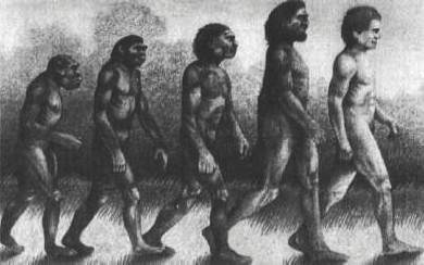
Rising and falling are actually rather strange concepts in this case, since lines on a page are inert. They don’t actually move an inch. Nonetheless we perceive movement. We feel we’re looking at a development that runs from left to right. This applies not only to real lines but even to imaginary ones. An image of the evolution of man that is famous and erroneous in equal measure is called the March of Pro gress. It is derived from the ancient
scala naturae
, literally the stairway of nature but generally known as the Great Chain of Being, which rep resents a God-given, unchangeable hierarchical arrangement of the universe. It is a pecking order with God at the top, followed by angels and then human beings. Next come animals, below them are plants and finally, right at the bottom, simpler materials such as soil and rock. Com bined with ideas about the development of life on earth that came into vogue after the publication of Darwin’s
Origin of Species
in 1859, the idea grew up that evolution led from the simple to the in creas ingly complex, culmi nat ing in high-grade organisms with the near-divine human being as the pinnacle of development so far. That idea, which became established more widely after the publication in 1936 of a book by the American phil osopher Arthur Oncken Lovejoy called
The Great Chain of Being
, has been depicted and reproduced thousands of times – not to speak of the endless stream of more or less comical variations on it. The great palaeontologist Stephen Jay Gould is said to have left a collection of several hundred versions when he died in 2002.

The March of Progress.
In its original form the March of Progress is a line procession of beings that, studied from left to right, are seen to be increasingly human.
Homo sapiens
takes the lead, self-consciously walking upright, while a hunchbacked species of primal ape lurches along at the rear. From a neutral perspective it’s an absurd picture that makes no sense at all. Modern man, who chronologically brings up the rear, is at the front. He’s followed by his own ancestor, who in turn marches ahead of his forebears. Yet we are untroubled by this, because our perspective is anything but neutral. We interpret the sequence as an imaginary line, a movement through time from left to right, so the image makes sense and everyone is in his proper place: the little hunchback comes first, then the others and finally, on the right, we ourselves. Moreover, each individual walks from left to right, in the direction of time, from his own pre liminary stages towards his successor. This too fits with our perception of reality. In fact the picture accords not just with our experience but with our desires, since in the person of the man at the head of the line we walk, heads raised, towards the future. Were we to reverse the image it would seem as if evolution were moving in the wrong direction, as if we were walking further and further into the past, an ability reserved exclusively for Merlin, the wizard of Arthurian legend.

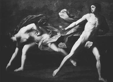
Guido Reni,
Atalanta and Hippomenes
, 1625.
Our tendency to see pictures as naturally progressing from left to right is no recent invention. In 1625, for instance, Guido Reni made use of it in his painting of the contest between Atalanta and Hippo menes. Atalanta, the great huntress of Greek mythology, had hundreds of suitors on account of her many talents. To rid herself of the attentions of all those aspiring gentlemen, she promised to marry anyone who could beat her in a sprint. She knew what she was about, since no one could run faster than she could, but Hippo-menes took up her challenge and managed to outdo her in a typically classical Greek manner, by cheating with a little divine assistance in the form of three golden apples. During the decisive race he dropped one of the apples every time Atalanta threatened to pass him. Each time he did so she was unable to resist the temptation to pick it up. Reni’s painting shows one such fatal moment. Even without knowing the story, it’s immediately clear what’s happening: Hippo-menes rushes forward, in the usual direction of movement, while Atalanta turns back. Clearly she is doing something stupid. Indeed, she loses the race.
Comic strips offer even more opportunities for working with the symbolism of direction. W. A. Wagenaar, a psychologist at Leiden Uni versity and a Tintin fan, once tallied up all the acts and transitions in three Tintin books and discovered that in three out of four cases the characters move from left to right, even when their movement takes several frames to portray. More interestingly still, movements towards the left almost always have a bad outcome. The man who moves his finger from right to left to ring Tintin’s doorbell falls unconscious on the doormat as soon as the alert reporter opens the door. When Captain Haddock crosses the frame from right to left in an attempt to escape, he is recaptured in no time. And so on. This is Tintin’s Law, and it is reminiscent of the messenger in the theatre of the ancient world: entering on the right – and therefore moving towards the left – is a sign to the audience that something ominous is happening.
Similar rules apply to film. Cars, ships and planes mostly set off from left to right across the screen. If they move from right to left then we tend to be watching them arrive somewhere. Only in the case of great distances between generally familiar places does another criterion disrupt this pattern: geography. Ships travelling from Europe to America usually sail from right to left and vice versa. A train journey from Beijing to Moscow will be shown right to left, as will a plane trip from Calcutta to London. Western filmmakers comply with our habit of using maps with north at the top. They have little choice, since their overwhelmingly Western audiences see a ship sailing from left to right as moving from west to east.
Of course it’s no coincidence that we interpret pictures the way we do. Experiments have shown that broadly speaking we actually look at them from left to right. The direction of movement in the picture coincides with the order in which we perceive it. Perhaps this is also part of the reason for the great popularity achieved and retained, through both libertarian and prudish periods, by one of the most remarkable paintings of all time, despite the fact that it is an image that makes the average American parent rush to place a hand over the innocent eyes of her – or indeed his – child. The painting is called
Gabrielle d’Estrées and One of her Sisters
, painted sometime around 1594 by an unknown artist referred to simply as belonging to the School of Fontainebleau. It’s one of a series of paint ings of the same women in roughly the same setting, and in that sense it’s reminiscent of a photo session by a modern-day photographer. This particular painting, however, is the most famous of the series by far.
We are looking at the woman with whom King Henri iv of France was deeply in love from 1591 until her death at the age of 28, but could not marry because he already had a wife. That did not prevent him from conceiving no fewer than three children with her and regularly conferring titles and their accompanying fortunes upon her. It is skilfully painted, with pleasingly self-assured mastery, especially when it comes to the main subject, Gabrielle herself. She is placed in the best position to emphasize her importance, where the viewer’s gaze comes to rest after gliding over the painting from left to right. This also means that Gabrielle occupies the traditional position of the wife in double portraits, to the left of her partner, one result being that the light coming from the left as we look at her falls on her face, lighting it with agreeable softness. That’s not all. The most important elements of the picture are on a fluid line running from top left to bottom right, from the face of Gabrielle’s sister, the Duchess de Villars, to the hand with which she pinches Gabrielle’s nipple between thumb and forefinger, and then on to the ring that Gabrielle is holding in a similar manner. The other lines of the composition harmonize with these so that they reinforce each other. All this makes the painting satisfying to look at, even a little slick.
If that were all then the picture would have excited few people other than admirers of apple-shaped breasts. The fact it has intrigued so many is attributable to two ways in which the canvas creates a sense of tension in the viewer. Firstly, of course, there is the bizarre pose with its incomprehensible symbolism: two women, one of whom affectedly holds the other’s nipple between thumb and fore finger in precisely the way the other is holding her ring. It’s unusual at the very least. The ladies are also startlingly naked, yet they sit or stand as if dressed to the nines. The second source of tension is less noticeable, and as far as we can tell it has in fact passed unnoticed; but perhaps precisely for that reason it contributes to the painting’s mysterious power of attraction, the excitement that makes us look and go on looking: the composition’s three figures are all left-handed. The duchess holds the nipple with her left hand, Gabrielle does the same with her ring, and to anyone who looks closely it becomes clear that even the seamstress in the background is embroidering with her left hand. This is unique, and slightly disturbing. It seems we sub-consciously feel something is not quite right without being able to say what it is.
