The Puzzle of Left-Handedness (14 page)

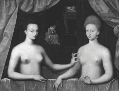
School of Fontainebleau,
Gabrielle d’Estrées and One of her Sisters, c
. 1594.
Studies show that we initially look at a composition from left to right, but why is this? It can’t have anything to do with our eyes, since they move as easily in one direction as the other. So why not begin on the right, or somewhere in the middle? It seems that some people do.
In the days when Congo was a Belgian colony, in other words before 1960, mining engineers worried about the many mistakes made by poorly trained Congolese miners, and all the damage and accidents that resulted. They decided to do something about it. Wherever it was deemed necessary, clear, simple rules would be displayed so that there could no longer be any misunderstandings about the proper ways to use equipment or what to do in an emergency. This was not particularly easy, since workers recruited from the local population were almost entirely illiterate. Education would have been wasted, after all, on people who were to spend their lives smashing chunks of ore and rock out of the walls of subterranean vaults.
Nevertheless, a solution soon seemed to have been found. Instead of written instructions, simple illustrations, rather like cartoon strips, would be used to show what was supposed to happen in concrete terms. Even the stupidest Congolese couldn’t go wrong, they thought.
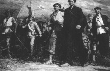
The Long March
, Shao Shan Mao Zedong Museum, Changsha.
Not so. Instead of fewer accidents there were considerably more, and more mistakes were made too. After extensive investigation, some one eventually pointed out what was wrong: the cartoons were designed to be read from left to right. It hadn’t occurred to anybody that although this might be obvious to a Belgian, who had been to school and had grown up in a completely literate world, it was not at all clear to an illiterate Congolese, who had no idea where to begin. As a result the local miners regularly drew quite different conclusions from those intended.
Indeed it does turn out that the kind of rules of looking that we are discussing here depend to a great degree on the direction of writing. Wagenaar’s Tintin’s Law works the other way around with right-to-left writers such as Israelis and Arabs, as any cartoon strip created by them demonstrates. China has never had a true left-to-right tradition. Chinese characters were traditionally written from top to bottom in columns running from right to left, so the Chinese look at images differently from the way we do. In the Mao Zedong Museum in Changsha, for example, a painting is on show that depicts the Long March. It’s a fantastic piece of in-your-face propaganda, with a mass of strong, resolute fighters on their way to inevitable victory under the inspiring leadership of Mao Zedong. Or is it? To us it seems a strange image, since the entire stout-hearted company is marching ominously towards the left of the frame, in other words in the wrong direction. Such a picture would never be composed that way either in Russia or in the Western world.
Reading and writing, the skills that have done more than anything to make the tempestuous cultural and economic development of human ity over the past six to seven thousand years possible, turn out to influence us even in contexts that involve no words at all.
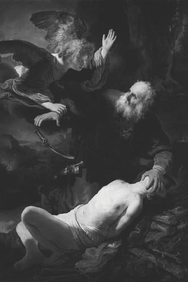
Rembrandt van Rijn,
Abraham and Isaac
, 1634.
18
Dead Men and Voluptuous Women
Some time between 1655 and 1658, Nicolaes Maes painted the sacrifice of Isaac. The patriarch Abraham is on the point of taking the life of his son Isaac for the greater honour and glory of the Lord when an angel restrains him at the very last moment. God has already seen enough to be convinced. It’s an extremely familiar subject, but Maes, supreme craftsman and artist that he was, has done his best to turn it into something extraordinary. The result is an uneasy, unstable picture, as becomes all the more clear when we compare it to the standard composition Rembrandt used some twenty years earlier to depict the same scene. Rembrandt’s painting somehow makes more sense. It seems more natural. This again probably has to do with the way we read.
Just as we see the sloping lines in graphs rise or fall, paintings have a rising and a falling diagonal. The rising line begins at the bottom left, the descending line at the top left. They are of crucial importance, as demon strated by the fact that they constitute the main difference between the sacrifice scenes painted by Maes and by Rembrandt. In Rem brandt’s painting, Abraham’s knife has threatened until a fraction of a second before to move down the falling diagonal and cut Isaac’s throat, but in Maes’s picture, should Abraham raise his hand the knife will meet poor Isaac’s throat by moving diagonally upwards, from right to left. This is highly unusual. Murder attempts in paintings usually happen from left to right along the falling diagonal, as in Rembrandt’s depiction. The weapon, whether a knife, sword, axe or club, usually strikes the victim from high on the left, and in most cases the victim too is aligned with the falling diagonal. He either lies along it, wounded or dead, or flees towards the bottom right.
An outstanding example of this use of the diagonal is Francisco Goya’s
Highwaymen Attacking a Coach
. It’s a dramatic scene, one that suggests there was nothing new about the cowboy films made many years later, but note the positions of the various characters. The leader of the highwaymen stands high on the coach-box, triumphant, pointing his gun downwards with studied nonchalance as he gazes along the descending diagonal at the distressed passengers. His accomplices, especially the one on the left, are busy dealing with a traveller who is still putting up resistance. He’s about to use his knife to silence the poor man for ever, and that knife too will strike home along the falling diagonal. Two women beg for their lives, on their knees, hands raised. The one whose face is visible looks back up along the falling diagonal at the highwayman on the left, who has his eyes fixed on her. The male passengers are dead, or soon will be, and all three are lying along the descending diagonal. Note too that Goya adheres to Tintin’s Law: on its doomed journey, the coach travels from right to left across the canvas.
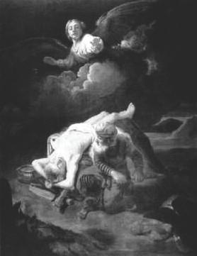 | Nicolaes Maes, The Sacrifice of Isaac , c. 1657. |
It’s not particularly odd, when we stop to think about it, that blows and stabs take place along the falling diagonal. For a start, most thrusts of this kind are in a downward direction. Second, victims have a tendency to fall over and artists often anticipate this for dramatic reasons, so the murderer or would-be murderer almost automatically stands above the losing party. The preference for left-to-right thrashing and stabbing is explicable too, since for Westerners that is the standard direction in which such things are depicted. The murder weapon gains as it were extra speed and force when it moves from left to right. The same goes for flight. He who flees must be quick and the suggestion of speed is not helped by having him scrabble against the most natural direction of movement. Scenes of Adam and Even being expelled from paradise therefore almost always have the same composition: the Angel of Vengeance floats somewhere in the top left-hand corner, while Adam and Eve leave the Garden of Eden at the bottom right.
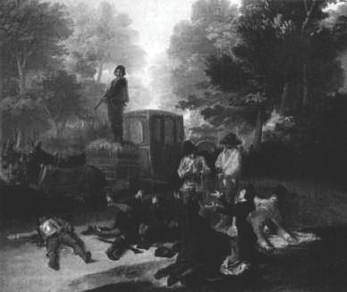
Francisco Goya,
Highwaymen Attacking a Coach
, 1786–7.
More striking still is the fact that the victims of lethal violence often lie along the falling diagonal, even in photographs. Take press pictures of mafia victims on village squares in southern Italy, which appear in the newspapers from time to time. They lie motionless, naturally, so the photographer can take his time choosing the angle that suits him best, which is very often one in which the body lies head first down the descending diagonal, precisely as in Manet’s
Dead Matador
. That painting in turn closely resembles the seventeenth-century
Dead Soldier
by an unknown Italian painter, currently in the National Gallery in London, which some people claim had a strong influence on Manet, al though Manet experts contest this. The experts may be right, since victims of violence posed in this way have simply been placed in the standard position.
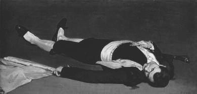
Edouard Manet,
Dead Matador
, 1865.
The reason why the falling diagonal is so popular in these pictures of corpses cannot be a direct consequence of the way we perceive movement in pictures. After all, the dead do not move, so in paintings they shouldn’t give any impression of dynamism. Is it perhaps the descending aspect that’s relevant here? Could it be a way of indicating that the person depicted came to a bad end? Does the body almost literally slide out of the painting towards doom, dispatched by violence that apparently originates at the top left?
This is not such a ridiculous idea as it might seem. In Goya’s painting the power relationships coincide with the course of the violence, from top left to bottom right. The chief highwayman and his main accomplice look down with superior expressions at the pleading woman at the bottom right, who looks up at them submissively in the opposite direction. This slipping away downwards towards the right emerges even more clearly in Dirck van Baburen’s painting
Prometheus Being Chained by Vulcan
(1623), which can be seen in the Rijksmuseum in Amsterdam. Prometheus is lying in the worst possible position, chained up in the lower right-hand corner, against the frame. It seems as if but for that frame he would slide off the canvas completely. Like Manet’s matador and all those other prostrate victims, he lies head first, unable to see what he’s sliding towards. It’s a picture of utter powerlessness.
| A victim of the Mafia photographed in 1992 according to the rules of visual art. Note the many falling lines. | 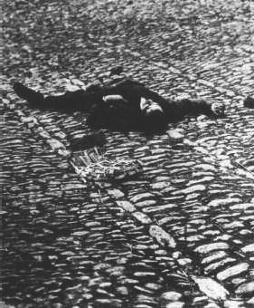 |
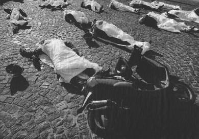
Anti-Mafia demonstration in Naples, 2005.
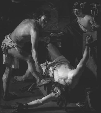
Dirck van Baburen,
Prometheus Being Chained by Vulcan
, 1623.
Most paintings of murders, assaults and torture adhere to the same pattern. Power, especially oppressive power, comes not only, as Mao Zedong would have it, from the barrel of a gun but in most cases from the top left, moving with gravity and in the direction in which we read.
Of course other considerations apply as well. Compositional difficulties or competing conventions and the desire to treat a subject in an entirely new way can lead to an image that appears to go against the grain. Nicolaes Maes’s
The Sacrifice of Isaac
is one example. But often the artist nevertheless submits to these laws of perception, perhaps without even being aware of it. Take for example Goya’s most famous painting,
The Third of May 1808
, which depicts the execution of 43 rebels in Madrid, one of a number of harsh reprisals by Napoleon’s occupying armies in Spain for the Madrid uprising against the French.
The firing squad carries out its bloody work from right to left, giving Goya the opportunity to portray the soldiers from behind as an ano nymous killing machine. At the same time he allows us to look straight into the emotional faces of the victims, who meet their tragic fate no less conventionally along the falling diagonal, as further emphasized by the angle of the hillside in the background. Goya has the next group of condemned men approach from the distance on the right. They are mov ing leftwards against the falling diagonal, trudging up towards the place of execution, high on a hill.
