The Puzzle of Left-Handedness (15 page)

It’s very different for women. Not many women die in paintings, aside from the occasional Lucretia or Cleopatra. They far more often lie naked in charming postures, draped across chairs and settees, or slumber quasi-innocently in delightful groves. At best they have a good time with a swan, like Leda, or in the case of Europa lovingly embrace a tempting bull. But does this mean that the effect of the diagonal direction, so powerfully present in scenes of violence, is irrelevant in portraits of women?
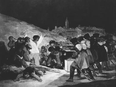
Francisco Goya,
The Third of May 1808
, 1814.
Not when it comes to violence or unwilling submission, which often means sexual violence. When Gustav Klimt depicted Leda yielding to the swan, in a painting tragically lost to fire in 1945, he showed her on the point of being penetrated from left to right. In the strange painting
Scorpion
by Norbert Tadeusz there’s a particularly powerful suggestion of subjugation and sexual assault. On the face of it nothing is happening, but the sunbathing woman looks even more tormented than Baburen’s Prometheus. Here too the victim lies head first along the falling diagonal.
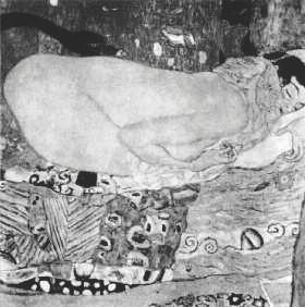 | Gustav Klimt, Leda and the Swan , 1917. The painting was lost in 1945 when German troops set fire to Immendorf Palace. |
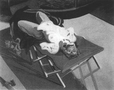
Norbert Tadeusz (1940–2011),
Scorpion
.
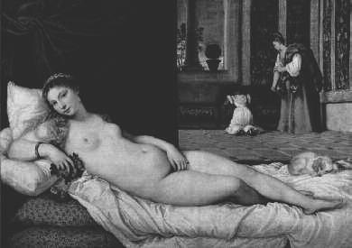
Titian,
Venus of Urbino
, 1538.
These compositions are fairly exceptional, however. Most female nudes appear to be in fine fettle. Nevertheless, the diagonal is of importance in their pictures too, if rather less prominently so.
The best example of a recumbent nude is perhaps Titian’s
Venus of Urbino
, a painting that was a source of inspiration to dozens of later artists. The
Olympia
that helped make Manet famous is directly derived from it. Despite the fact that Venus is lying along the falling diagonal, the painting is not ominous in any way, if anything quite the opposite. Titian’s beauty resolutely looks us in the eye, clearly the mistress of the situation, and partly for this reason she seems a little naughty. The lapdog at the foot of the bed – such a powerful symbol that even today many prostitutes go around in the company of a similar animal – is an additional indication of her boldness.
Impertinence seems to be a hallmark of nudes depicted along the descending diagonal. They often seem rather less virtuous than average, making eye contact with the viewer more often and with a slightly cheekier look. This is almost inevitable, since to make the light, which usually shines from the left, fall softly on her face, the artist has to turn the woman’s head slightly towards us. This suggests she’s deliberately looking at us. Nudes that lie along the rising diagonal more often sleep the sleep of the virtuous, or imagine themselves unobserved. It’s as if they are protected from sliding towards moral turpitude by looking from the right side of the painting towards the left. This outcome is far less obvious than the effects we’ve noted in scenes of violence, and there are far more exceptions to the rule, but it’s difficult to avoid the impression that for female nudes too, the falling diagonal is a slippery slope – the difference being that they find themselves not in a physical danger zone but in a moral one.
19
Mary’s Little Troublemaker and Other Portraits
Anyone who has regularly examined depictions of the Madonna with child in galleries and museums must surely have wondered why painters so rarely manage to portray an agreeable-looking divine infant. Instead of a podgy little pink delight that sends everyone into ecstasies, we are generally treated to a horrid, blubbery, prematurely aged dwarf. There may well be entirely prosaic, practical reasons for this. Real infants are as intractable as they are endearing. They refuse to sit still, cry at the most inappropriate moments and need almost constant care. In short, they’re incapable of posing properly. A great many painters must therefore have done most of the job from memory or with the aid of a doll.
What those painters probably didn’t know is that they were responsible at least in part for their subjects’ objectionable behaviour, at least if we’re to believe the research published by Canadian child psychologist Lee Salk from 1960 onwards. Salk investigated how mothers prefer to carry their offspring and discovered that over 83 per cent of right-handed women in his study held the child with their left arm. This appears logical, since it leaves the right hand free for other tasks, but there seemed to be something else going on, since even of the left-handed mothers Salk studied, almost 80 per cent preferred to use the left arm to carry an infant.
That preference, Salk decided, is the result of what he called ‘imprinting’. In the womb the child had become used to hearing and feeling its mother’s heartbeat and after birth that same auditory input had a calming effect. He played the sound of a normal heartbeat to 100 infants in a hospital maternity ward, at the volume they would have heard it before birth, and compared them to a control group. Sure enough, the first group turned out to cry less, to go to sleep more easily and even to grow more quickly than the children deprived of heart-music. It’s true that our hearts are only a fraction to the left of the centre of the chest cavity, but because of the greater pressure in the left ventricle and therefore in the left breast, the pumping of the heart sounds louder on that side. If you hold your child on the left, Salk concluded, it will make less noise. Which is exactly what mothers like to hear.
Painters generally don’t know a great deal about baby-care. Their concern lies with the composition of the painting, which doesn’t always coincide with the interests of mothers and children. This was demonstrated in 1973 by Richard Uhrbrock, an American psychology professor with a great interest in Madonnas. Of the more than 1,100 Madonnas he examined, 45 per cent held the Christ child in the left arm, 38 per cent in the right. The remaining infants, some 8 per cent, sat in the middle of the lap. Uhrbrock felt the percentage of left-arm-sitters was remarkably high, but if Salk is right it’s actually remarkably low. It means that in at least 20 per cent of their sittings the painters of the pictures examined by Uhrbrock must have personally ordered the model to place the child on her right arm. Infants are creatures of habit, whose behaviour is unlikely to improve when they’re made to comply with unfamiliar whims, so there must have been good reasons for all those painters and models to have insisted on their choice in the face of the inevitable grouching and whining.
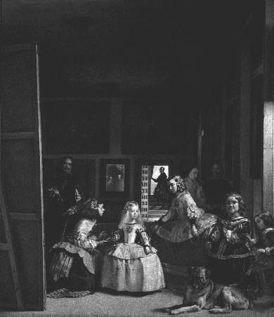
One of those reasons is demonstrated by the famous painting
Las Meninas
, or
The Maids of Honour
, by the Spanish painter Velázquez. It’s an artfully arranged composition that nevertheless manages to look like a domestic snapshot of part of the personal entourage of King Philip
IV
of Spain. The subject is ostensibly the little blonde princess in the splendid white outfit at the centre. She is Philip’s only surviving child, the
infanta
Marguerita, and she is accompanied by her two maids of honour, Maria Augustina Sarmiento, who holds her right hand, and Isabel de Velasco. But there is a great deal else of interest in the painting, including Velázquez himself, who stands to the left of the canvas, busily painting a large picture, so large in fact that his canvas has been plumped right down on the ground. It’s as if we, the viewers, are ourselves the subject of his next painting, although, as we will shortly see, we are not.
Clearly the painter is right-handed. If we imagine that the
infanta
and her entourage were not in the picture, then Velázquez is using the most simple standard composition for a portrait by a right-handed artist. The easel stands in front of the painter slightly to his right, the subject slightly to his left, in the same direction as the viewer. As we can tell from the patch of light on his forehead, the light is shining from the painter’s left, so that the unfinished painting will be well lit, but this also means the light is falling from his left onto the subject.
Diego Velázquez,
Las Meninas
, 1656.
Las Meninas
is therefore painted from the position of the model for this fictional canvas, so from our perspective the light falls from right to left, making the work an exception to the rule. In traditional portraiture the light shining across the canvas is far more likely to fall from left to right, exactly as Velázquez shows within the painting. In collections held by the Rijksmuseum in Amsterdam and the Mauritshuis in The Hague, for example, this is true in more than 80 per cent of cases. The fall of light has consequences for the position of the person or persons in the picture. If they turn slightly to the right (from our perspective), away from the source of light, then their faces remain in shadow. If they look towards the left of the picture instead, their faces will be lit up. That effect too can be seen in
Las Meninas
, but in reverse. The
infanta
looks in the direction of the beams of light and her face is not only well lit, it’s clearly a point of special interest in the picture. She is the most important figure among the group of girls, more important than Isabel de Velasco, whose face is in shadow since she is looking away from the source of light, and more important than the dwarf María Bárbola who, even though she is closer to the window, is looking almost directly at us and therefore catches the light rather less.
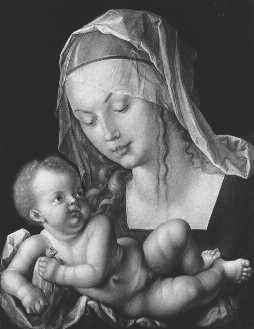
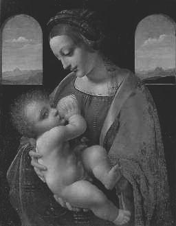 | Two classic versions of the Madonna and Child. On the left Leonardo’s Madonna Litta , 1490, on the right Albrecht Dürer’s Madonna of the Pear , 1512. The light falls from the left, shining directly on Mary’s face and softening its contours. As usual, the babies are fairly hideous. |
In the standard composition, therefore, the subject of the portrait looks towards the left of the picture, showing the painter and viewer his or her left cheek. This is one of the reasons why Madonnas are twice as likely to hold a child on their right arm than we would expect from Salk’s data. A Madonna and child is a composition that can easily be painted in a studio. After all, the model is usually an anonymous girl, not a demanding client who must be catered to in her own home. The studio would be laid out for maximum efficiency, which for a right-handed artist meant the light would fall from his left. To catch the full light without any additional artifice, the model would therefore have to turn her head to the left as we look at her, in other words to her right, but at the same time a Madonna needs to look down lovingly at her child, which must therefore sit at her right breast. Were it on her left side, she would be looking away from the infant, as if she’d rather be without it, which of course would not do at all.
| |  |
The angle of the light, however important, is only one factor in determining the appearance of a portrait, which is why by and large there are just as many portraits in which the subject shows the right cheek as there are in which the left cheek is turned to the viewer, although according to some the left cheek is slightly overrepresented. If we treat portraits of men and women separately, however, the proportions change dramatically. In the Rijksmuseum and Mauritshuis collections, almost two out of every three men show their right cheek while for women precisely the reverse applies. Other collections produce similar figures. Clearly this is something we need to explore further.
Quite a few explanations have been put forward for the suspected slight preponderance across the board of left-cheeked portraits. The simplest is that it’s more natural and easier for a right-handed person to draw a profile facing towards the left of the picture. This makes sense if we consider spontaneous sketches made without a model, or mindless doodling during boring meetings, but it would say little for the craftsmanship of a professional painter if he allowed himself to be guided by such considerations. Other theories refer to the social relationship between the artist and the model, or even to the way our brains recognize faces. None of them are satisfactory, for two reasons.
First they assume that all things being equal there is an absolute preference. In other words if a model of a given status prefers to be shown from a particular direction, then the same must apply to all models of the same status. Similarly, if it has to do with the way the brain recognizes faces, then the same preference would be at work in all cases. But coins show that this is not so. They always feature kings, emperors, gods or other superior folk and we look at them every day with the same brains, yet there is no way of guessing which profile will be used. The same Uhrbrock who studied the baby-carrying arm discovered that on American coins and commemorative medals the person portrayed looks to the left in two out of every three cases, but in the large collection of European coins at the Hamburger Kunsthalle, which covers 25 centuries, the proportions are almost exactly the reverse. Moreover, none of the theories explain why the difference in orientation between portraits of men and of women is so marked.
As to the latter question,
Las Meninas
may once again provide an answer, since not we but the royal couple, Philip iv and Mariana of Austria, are the models for the portrait that Velázquez is shown painting. They can be seen in the mirror in the middle of the back wall of the room.
*
Their mirror image shows that Mariana must be standing to the left of her husband, and this cannot be coincidental. For a double portrait, certainly until the eighteenth century, this was the standard arrangement. Since man and wife invariably stand or sit turned towards each other, such portraits almost always show the left cheek of the woman and the right cheek of the man.
| Albrecht Dürer, double portrait on separate panels of Hans and Felicitas Tucher, 1499. The light falls from the front left, emphasizing the angular face of the self-assured Hans and the soft, round features of his rather sceptical-looking wife. |  |
