Why the West Rules--For Now (26 page)
Read Why the West Rules--For Now Online
Authors: Ian Morris
Tags: #History, #Modern, #General, #Business & Economics, #International, #Economics

In 2000
CE,
most geographers classified Tokyo as the world’s biggest city, with about 26.7 million residents.
*
Tokyo, then, scores the full 250 points allotted to organization/urbanism, meaning that for all other calculations it will take 106,800 people (that is, 26.7 million divided by 250) to score 1 point. The biggest Western city in 2000
CE
was New York, with 16.7 million people, scoring 156.37 points. The data from a hundred years ago are not as good, but all historians agree that cities were much smaller. In the West, London had about 6.6 million residents (scoring 61.80 points) in 1900
CE,
while in the East Tokyo was still the greatest city, but with just 1.75 million people, earning 16.39 points. By the time we get back to 1800
CE,
historians have to combine several different kinds of evidence, including records of food supply and tax payments, the physical area covered by cities, the density of housing within them, and anecdotal accounts, but most conclude that Beijing was the world’s biggest city, with perhaps 1.1 million souls (10.30 points). The biggest Western city was again London, with about 861,000 people (8.06 points).
The further we push back in time, the broader the margins of error, but for the thousand years leading up to 1700 the biggest cities were
clearly Chinese (with Japanese ones often close behind). First Chang’an, then Kaifeng, and later Hangzhou came close to or passed a million residents (around 9 points) between 800 and 1200
CE.
Western cities, by contrast, were never more than half that size. A few centuries earlier the situation was reversed: in the first century
BCE
Rome’s million residents undoubtedly made it the world’s metropolis, while Chang’an in China had probably 500,000 citizens.
As we move back into prehistory the evidence of course becomes fuzzier and the numbers become smaller, but the combination of systematic archaeological surveys and detailed excavation of smaller areas still gives us a reasonable sense of city sizes. As I mentioned earlier, this is very much chainsaw art. The most commonly accepted estimates might be as much as 10 percent off but are unlikely to be much wider of the mark than that; and since we are applying the same methods of estimation to Eastern and Western sites, the broad trends should be fairly reliable. To score 1 point on this system requires 106,800 people, so slightly more than one thousand people will score 0.01 points, the smallest number I felt was worth entering on the index. As we saw in
Chapter 2
, the biggest Western villages reached this level around 7500
BCE
and the biggest Eastern ones around 3500
BCE.
Before these dates, West and East alike score zero (you can see tables of the scores in the appendix).
It might be worth taking a moment here to talk about energy capture as well, since it poses very different problems. The simplest way to think about energy capture is in terms of consumption per person, measured in kilocalories per day. Following the same procedure as for urbanism, I start in the year 2000
CE,
when the average American burned through some 228,000 kilocalories per day. That figure, certainly the highest in history, gets the West the full compliment of 250 points (as I said earlier in the chapter, I am not interested in passing judgment on our capacities to capture energy, build cities, communicate information, and wage war; only in measuring them). The highest Eastern consumption per person in 2000
CE
was Japan’s 104,000 kilocalories per day, earning 113.89 points.
Official statistics on energy go back only to about 1900
CE
in the East and 1800 in the West, but fortunately there are ways to work around that. The human body has some basic physiological needs. It will not work properly unless it gets about 2,000 kilocalories of food per day
(rather more if you are tall and/or physically active, rather less if you are not; the current American average of 3,460 kilocalories of food per day is, as supersized waistbands cruelly reveal, well in excess of what we need). If you take in much less than 2,000 kilocalories per day your body will gradually shut down functions—strength, vision, hearing, and so on—until you die. Average food consumption can never have been much below 2,000 kilocalories per person per day for extended periods, making the lowest possible score about 2 points.
In reality, though, the lowest scores have always been above 2 points, because most of the energy humans consume is in nonfood forms. We saw in
Chapter 1
that
Homo erectus
was probably already burning wood for cooking at Zhoukoudian half a million years ago, and Neanderthals were certainly doing so 100,000 years ago, as well as wearing animal skins. Since we know so little about Neanderthal lifestyles our guesses cannot be very precise, but by tapping into nonfood energy sources Neanderthals definitely captured on average another thousand-plus kilocalories per day on top of their food, earning them about 3.25 points altogether. Fully modern humans cooked more than Neanderthals, wore more clothes, and also built houses from wood, leaves, mammoth bones, and skins—all of which, again, were parasitic on the chemical energy that plants had created out of the sun’s electromagnetic energy. Even the technologically simplest twentieth-century-
CE
hunter-gatherer societies captured at least 3,500 calories per day in food and nonfood sources combined. Given the colder weather, their distant forebears at the end of the Ice Age must have averaged closer to 4,000 kilocalories per day, or at least 4.25 points.
I doubt that any archaeologist would quibble much over these estimates, but there is a huge gap between Ice Age hunters’ 4.25 points and the contemporary gasoline-and electricity-guzzling West’s 250. What happened in between? By pooling their knowledge, archaeologists, historians, anthropologists, and ecologists can give us a pretty good idea.
Back in 1971, the editors of the magazine
Scientific American
invited the geoscientist Earl Cook to contribute an essay that he called “The Flow of Energy in an Industrial Society.” He included in it a diagram, much reprinted since then, showing best guesses at per-person energy consumption
among hunter-gatherers
, early agriculturalists (by which he meant the farmers of southwest Asia around 5000
BCE
whom we met in
Chapter 2
), advanced agriculturalists (those of northwest Europe
around 1400
CE
), industrial folk (western Europeans around 1860), and late-twentieth-century “technological” societies. He divided the scores into four categories of food (including the feed that goes into animals whose meat is eaten), home and commerce, industry and agriculture, and transport (
Figure 3.1
).
Cook’s guesstimates have stood up remarkably well to nearly forty years of comparison with the results gathered by historians, anthropologists, archaeologists, and economists.
*
They only provide a starting point, of course, but we can use the detailed evidence surviving from each period of Eastern and Western history to tell us how far the actual societies departed from these parameters. Sometimes we can draw on textual evidence, but in most periods up to the last few hundred years archaeological finds—human and animal bones; houses; agricultural tools; traces of terracing and irrigation; the remains of craftsmen’s workshops and traded goods, and the carts, ships, and roads that bore them—are even more important.
Sometimes help comes from surprising directions. The ice cores that featured so prominently in
Chapters 1
and
2
also show that airborne pollution increased sevenfold in the last few centuries
BCE
, mostly because of Roman mining in Spain, and in the last ten years, studies of sediments from peat bogs and lakes have confirmed this picture. Europeans apparently produced nine or ten times as much copper and silver in the first century
CE
as in the thirteenth century
CE,
with all the energy demands that implies—people to dig the mines, and animals to cart away the slag; more of both to build roads and ports, to load and unload ships, and carry metals to cities; watermills to crush the ores; and above all wood, as timber to shore up mineshafts and fuel to feed forges. This independent source of evidence also lets us compare levels of industrial activity in different periods. Not until the eleventh century
CE
—when Chinese documents say that the relentless demands of ironworkers stripped the mountains around Kaifeng so bare of trees that coal, for the first time in history, became an important power source—did pollution in the ice return to Roman-era levels, and only with the belching smokestacks of nineteenth-century Britain did pollution push seriously beyond Roman-era levels.
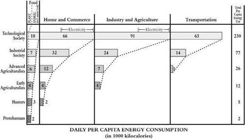
Figure 3.1. The Great Chain of Energy in numbers: the geoscientist Earl Cook’s estimates of energy capture per person per day, from the time
of Homo habilis
to 1970s America
Once again, I want to emphasize that we are doing chainsaw art. For instance, I estimate per-person energy capture at the height of the Roman Empire, in the first century
CE,
around 31,000 kilocalories per day. That is well above Cook’s estimate of 26,000 calories for advanced agricultural societies, but archaeology makes it very clear that Romans ate more meat, built more cities, used more and bigger trading ships (and so on, and so on) than Europeans would do again until the eighteenth century. That said, Roman energy capture could certainly have been 5 percent higher or lower than my estimate. For reasons I address in the appendix, though, it was probably not more than 10 percent higher or lower, and definitely not 20 percent. Cook’s framework and the detailed evidence constrain guesstimates pretty tightly, and as with the urbanism scores, the fact that the same person is doing the guessing in all cases, applying the same principles, should mean that the errors are at least consistent.
Information technology and war-making raise their own difficulties, discussed briefly in the appendix and more fully on my website, but the same principles apply as with urbanism and energy capture, and probably the same margins of error too. For reasons I discuss in the appendix, the scores will need to be systematically wrong by 15 or even 20 percent to make a real difference to the fundamental pattern of social development, but such big margins of error seem incompatible with the historical evidence. In the end, though, the only way to know for sure is for other historians, perhaps preferring other traits and assigning scores in other ways, to propose their own numbers.
Fifty years ago the philosopher Karl Popper argued that progress in science is a matter of “
conjectures and refutations
,” following a zigzag course as one researcher throws out an idea and others scramble to disprove it, in the process coming up with better ideas. The same, I think, applies to history. I am confident that any index that stays close to the evidence will produce more or less the same pattern as mine, but if I am wrong, and if others find this scheme wanting, hopefully my failure will encourage them to uncover better answers. To quote Einstein one more time, “
There could be
no fairer destiny for any theory … than that it should point the way to a more comprehensive theory in which it lives on.”
WHEN AND WHERE TO MEASURE?
Two final technical issues. First, how often should we calculate the scores? If we wanted to, we could trace changes in social development from year to year or even month to month since the 1950s. I doubt that there would be much point, though. After all, we want to see the overall shape of history across very long periods, and for that—as I hope to show in what follows—taking the pulse of social development once every century seems to provide enough detail.
As we move back toward the end of the Ice Age, though, checking social development on a century-by-century basis is neither possible nor particularly desirable. We just can’t tell much difference between what was going on in 14,000 and the situation in 13,900
BCE
(or 13,800 for that matter), partly because we don’t have enough good evidence and partly because change just happened very slowly. I therefore use a sliding scale. From 14,000 through 4000
BCE,
I measure social development every thousand years. From 4000 through 2500
BCE
the quality of evidence improves and change accelerates, so I measure every five hundred years. I reduce this to every 250 years between 2500
BCE
and 1500
BCE,
and finally measure every century from 1400
BCE
through 2000
CE.
This has its risks, most obviously that the further back in time we go, the smoother and more gradual change will look. By calculating scores only every thousand or five hundred years we may well miss something interesting. The hard truth, though, is that only occasionally can we date our information much more precisely than the ranges I suggest. I do not want to dismiss this problem out of hand, and will try in the narrative in
Chapters 4
through
10
to fill in as many of the gaps as possible, but the framework I use here does seem to me to offer the best balance between practicality and precision.