Build Your Own ASP.NET 3.5 Website Using C# & VB (79 page)
Read Build Your Own ASP.NET 3.5 Website Using C# & VB Online
Authors: Cristian Darie,Zak Ruvalcaba,Wyatt Barnett
Tags: #C♯ (Computer program language), #Active server pages, #Programming Languages, #C#, #Web Page Design, #Computers, #Web site development, #internet programming, #General, #C? (Computer program language), #Internet, #Visual BASIC, #Microsoft Visual BASIC, #Application Development, #Microsoft .NET Framework

Managing Content Using Grid View and Details View
453
Customizing the GridView Columns
Our next task is to customize the columns displayed by the GridView. In this case,
our goal is to prevent the EmployeeID column from appearing, but the techniques
we’ll learn here can be used to make all sorts of customizations.
Filtering Table Columns
This is rather obvious, but it has to be said: the columns you can display in the
GridView must be a subset of the columns you’re retrieving from the database.
For example, unless you modify the database query to retrieve the employees’
passwords, it’s not possible to display them in the grid.
If you wish to restrict the information that appears within your GridView, you can
select the columns you want to display by making a few simple modifications. When
you simply bind an SqlDataReader to the GridView, you’re presented with a quick,
simple representation of the data you’ve retrieved from the database, with automatically generated column headers. One of the properties available to GridView is AutoGenerateColumns, which is set
to True by default. If you want to name the columns that your GridView displays
manually, you must set this property to False.
If you set this property to False and test it in the browser, you’ll find that the grid
doesn’t display any more. The reason for this is simple: as the GridView can’t generate its own column headers, you must manually specify the columns that you want displayed. To do so, list the columns inside the
tags, as shown below:
Dorknozzle\VB\03_AddressBook.aspx
(excerpt)
>
HeaderText="Mobile Phone" />
Licensed to [email protected]

454
Build Your Own ASP.NET 3.5 Web Site Using C# & VB
Notice that each column that we want to display is created using a BoundField
control inside a set of
has a DataField property, which specifies the name of the column, and a HeaderText
property, which sets the name of the column as you want to display it to the user.
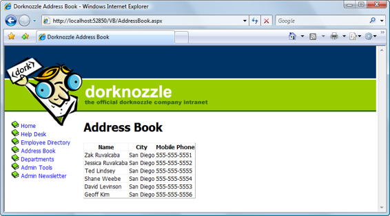
Now, save your work and view it in the browser. This time, only the columns that
you specified to be bound are displayed in the GridView
, as Figure 11.3
indicates. Note that if you don’t include the HeaderText property for any of the bound columns,
those columns won’t have a header.
We’ve now succeeded in displaying only the information we want to display, but
the GridView still looks plain. In the next section, we’ll use styles to customize the
appearance of our GridView.
Styling the GridView with Templates, Skins, and CSS
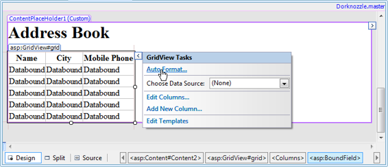
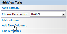
The GridView control offers a number of design-time features that are tightly integrated with the Visual Web Developer designer. As with the DataList class, when you click the grid’s smart tag, you get quick access to a number of very useful fea
tures, as Figure 11.4 illustrates.
Figure 11.4. The smart tag options of GridView
If you click the
Auto Format…
link from the smart tag menu and choose one of the
predefined styles, Visual Web Developer generates a number of template styles for
you, like this:
Licensed to [email protected]

Managing Content Using Grid View and Details View
455
Figure 11.3. Displaying selected columns
>
HeaderText="Mobile Phone" />
ForeColor="White" />
ForeColor="#333333" />
HorizontalAlign="Center" />
ForeColor="White" />
However, this time, let’s not rely on the predefined templates; let’s define our own
styles through CSS. Additionally, we want to add a new skin definition for the
GridView (you learned about skins back in
Chapter 5
), so that all the GridView controls throughout the site have a standard appearance.
Licensed to [email protected]
456
Build Your Own ASP.NET 3.5 Web Site Using C# & VB
Open your
Dorknozzle.css
file from the
App_Themes/Blue
folder and add these styles to it:
Dorknozzle\VB\04_Dorknozzle.css
(excerpt)
.GridMain
{
border-right: gainsboro thin solid;
border-top: gainsboro thin solid;
border-left: gainsboro thin solid;
border-bottom: gainsboro thin solid;
background-color: #333333;
width: 400px;
}
.GridRow
{
background-color: #FFFAFA;
}
.GridSelectedRow
{
background-color: #E6E6FA;
}
.GridHeader
{
background-color: #ADD8E6;
font-weight: bold;
text-align: left;
}
Now, modify the skin file
SkinFile.skin
in
App_Themes/Blue
by adding this skin
definition:
Dorknozzle\VB\05_SkinFile.skin
(excerpt)
Finally, make sure that your GridView declaration in
AddressBook.aspx
doesn’t
contain any styling details. It should look like the excerpt shown here:
Licensed to [email protected]

Managing Content Using Grid View and Details View
457
Dorknozzle\VB\03_AddressBook.aspx
(excerpt)
HeaderText="Mobile Phone" />
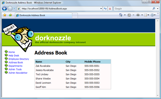
Figure 11.5. The styled address book
All the styling we need is already defined in the skin file; we’d only need to define
new properties if we wanted to alter the default values provided through the skin
file. Save your work and view the results in the browser. Do they look like the display
Congratulations! You’ve harnessed the power of CSS and skin files, and combined
it with the flexibility of GridView to create a good-looking address book. And it was
easy, too!
As you can see, you can style the items in the GridView by altering their font types,
colors, and sizes. You can also style the column headers and apply an alternating
Licensed to [email protected]
458
Build Your Own ASP.NET 3.5 Web Site Using C# & VB
item style to the rows in the table. Now, when the GridView is viewed in the browser,
we see a little more room between cells, and the lines surrounding the GridView
are gone.
Selecting Grid Records
We’ve already made quite a few changes to the display of our GridView. The next
step will be to allow users to select any of the rows in the GridView so they can
view more information about the listed employees.
We can create several types of columns in a GridView in addition to the BoundField
columns we’ve already seen. For instance, we could create a ButtonField column,
which displays a button in each row. Here’s a complete list of column controls and
their descriptions:
BoundField
As you’ve already seen, the BoundField provides flexibility in presentation by
allowing you to specify which columns will appear within the GridView. When
the grid enters edit mode, this field renders itself as an editable text box, as
we’ll see later.
ButtonField
Use the ButtonField to display a clickable button for each row within the
GridView. When it’s clicked, the button triggers a configurable event that you
can handle within your code to respond to the user’s action. A button can trigger
the following event types: Cancel, Delete, Edit, Select, and Update.
CheckBoxField
The CheckBoxField displays a checkbox in each row, allowing you to easily
present Boolean data in the display.
CommandField
The CommandField column automatically generates a ButtonField in your grid.
The actions performed by these buttons depend on the grid’s current state. For
example, if CommandField is set to generate
Edit
buttons, it will display an Edit
button when the grid is in non-editable mode, and will display
Update
and
Cancel
buttons when the grid is being edited.
Licensed to [email protected]

